OVERVIEW
Our site was in need of an overhaul. The former one was more of a stop-gap while we focused on our clients. That often happens. Clients come first. But we're happy that we took a little time to be selfish and look after our own needs.
CONCEPT
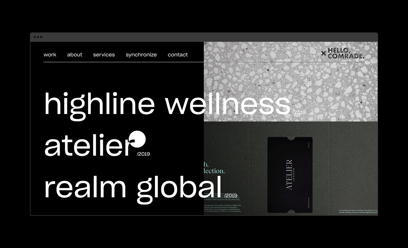
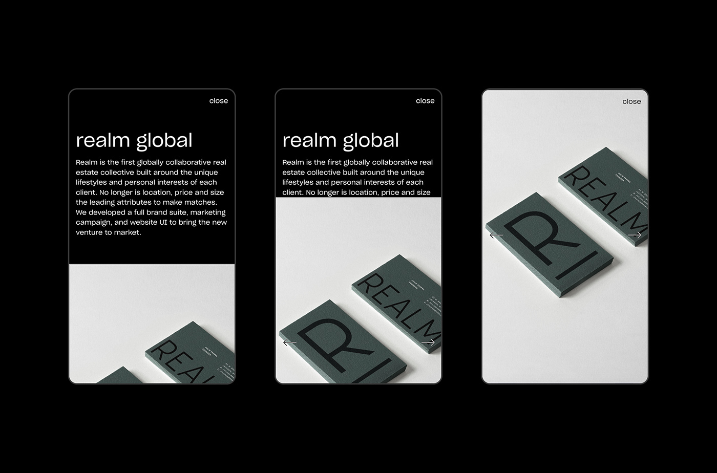
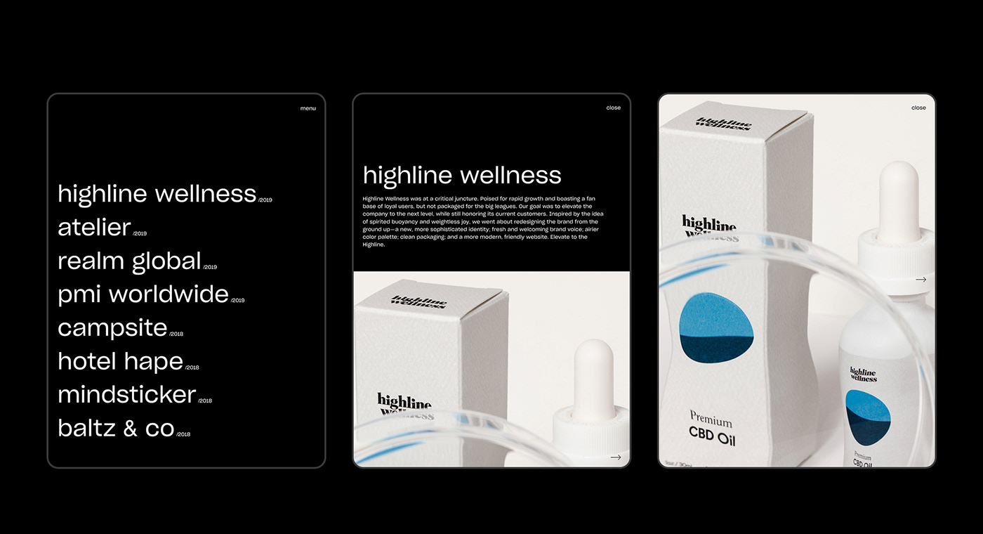
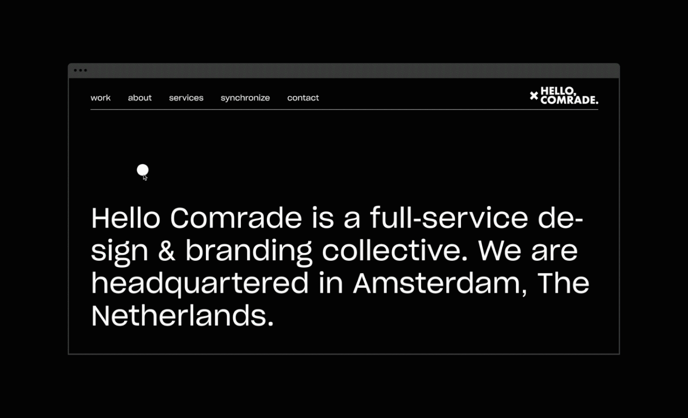
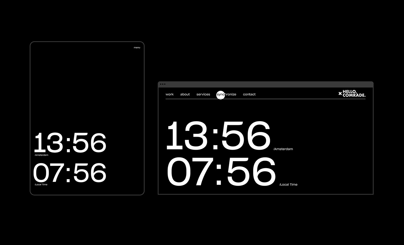
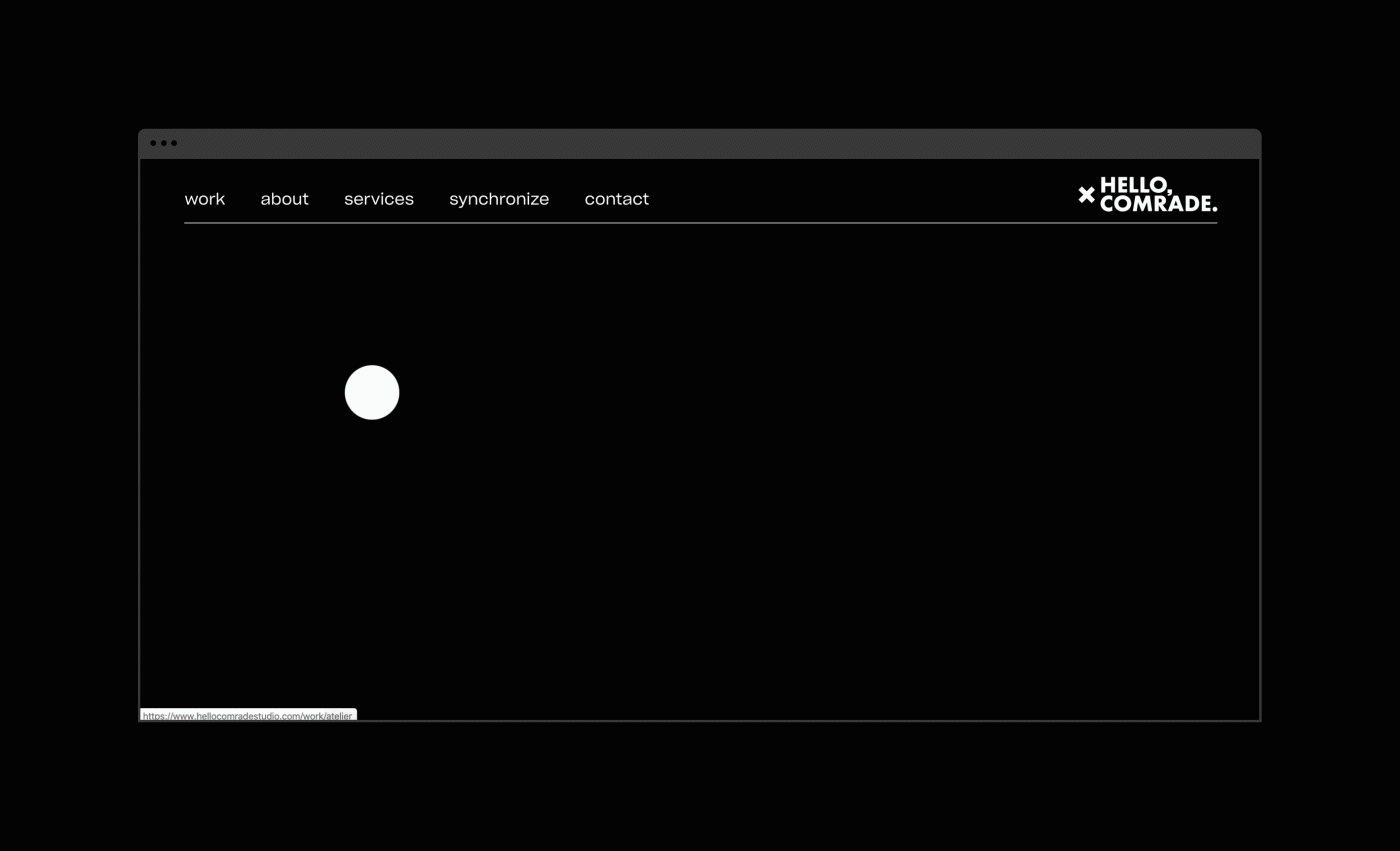
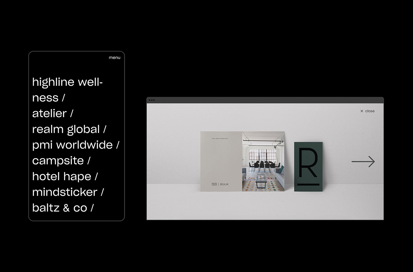
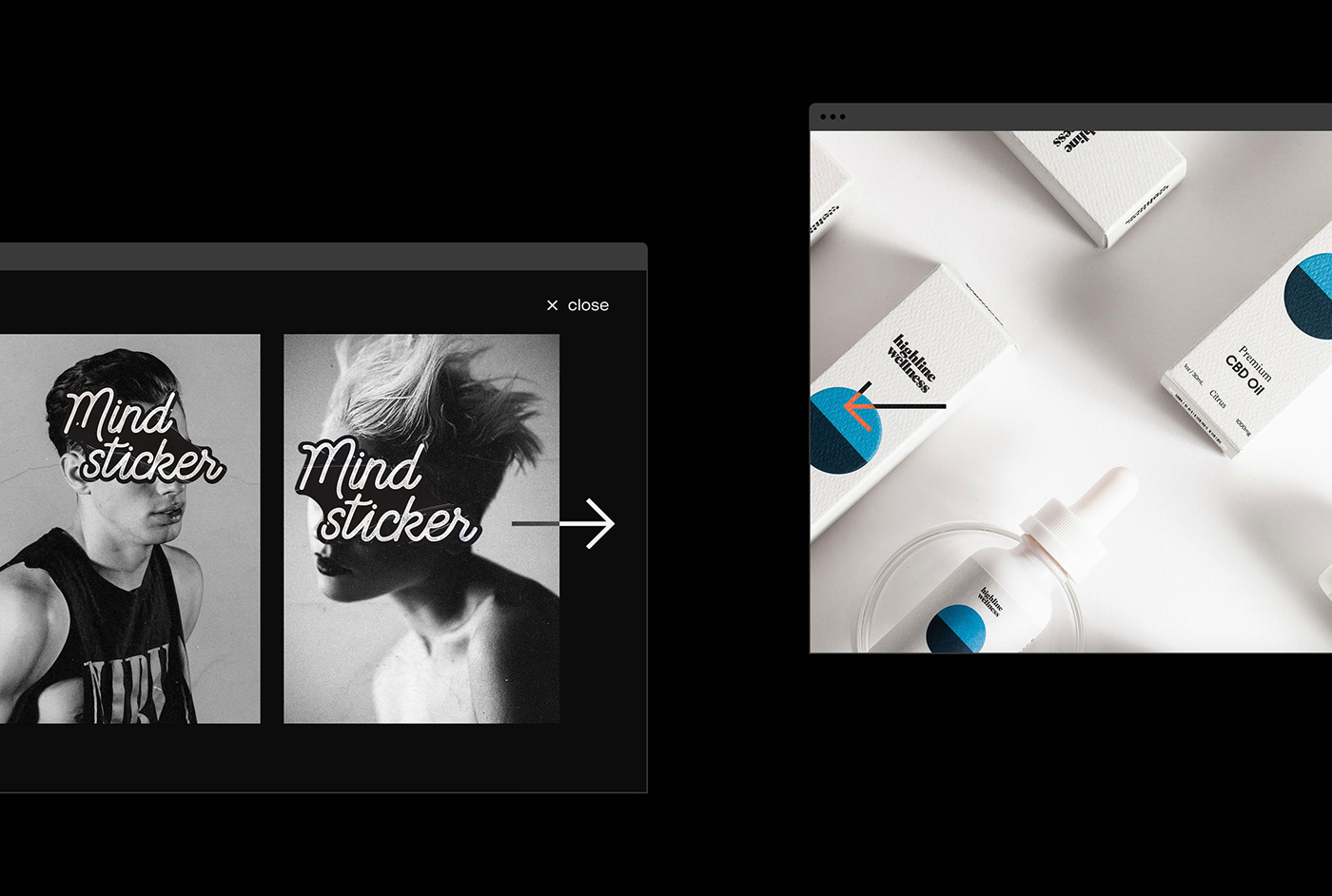
The interface design was centered around minimalism. Generally sparse, and at first glance a bit bland, but speckled with surprising interactions like inverted type during mouse-overs and full-screen sliders that rise up over text. By combining a mix of a brutalist, monotoned landscape with flashes of bold, bright imagery, we hope to draw visitors’ attention to what really matters: The work.
CREDITS
Studio: Hello Comrade (hellocomradestudio.com)
Art Direction & Design: Spencer Woolcott, Hello Comrade
Copywriting: Spencer Woolcott, Hello Comrade
Development & Interactions: Dries Bos, Dries Bos Studio
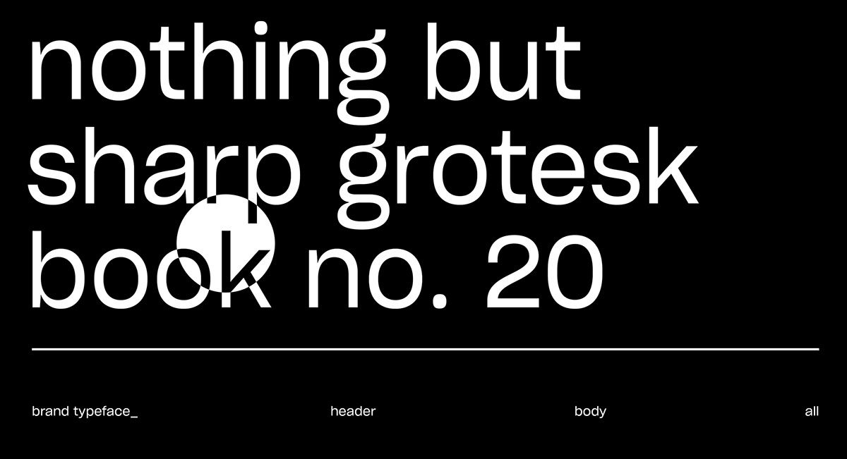
Typeface: Sharp Grotesk No. 20 Book, Sharp Type