PT
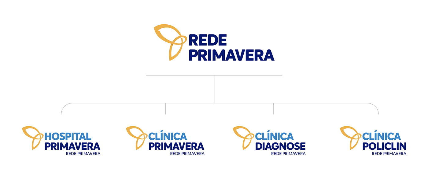
A Rede Primavera nasceu em Sergipe através da unificação das Clínicas Diagnose, Policlin e do Hospital Primavera.
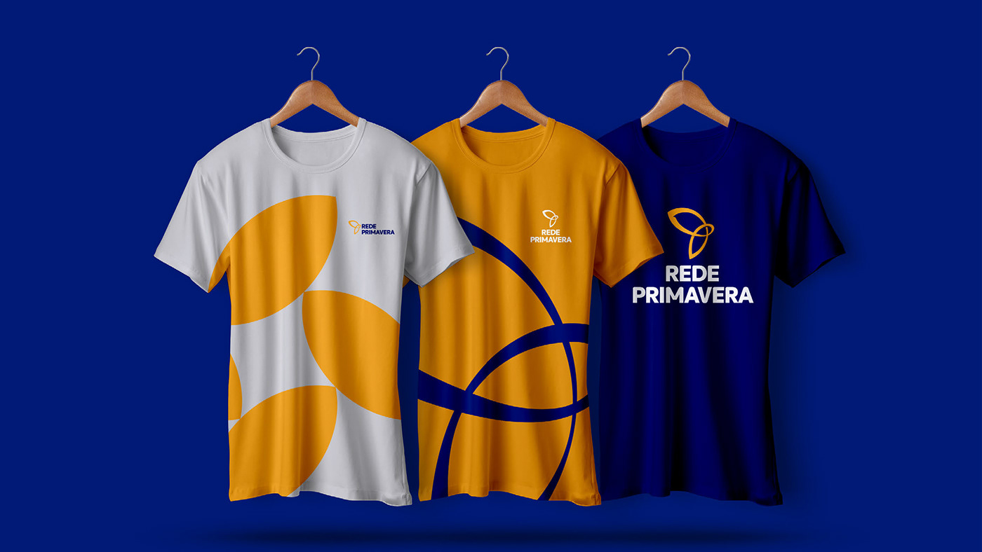
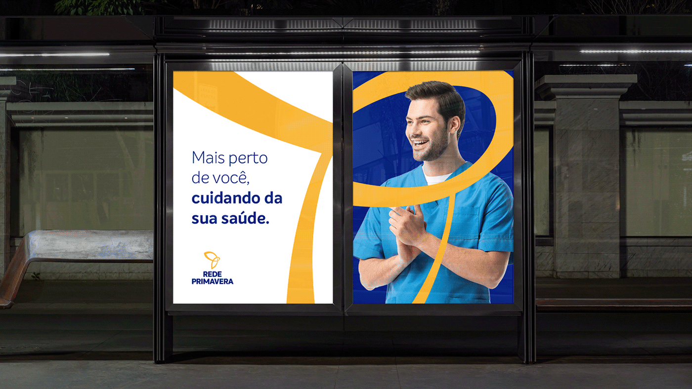
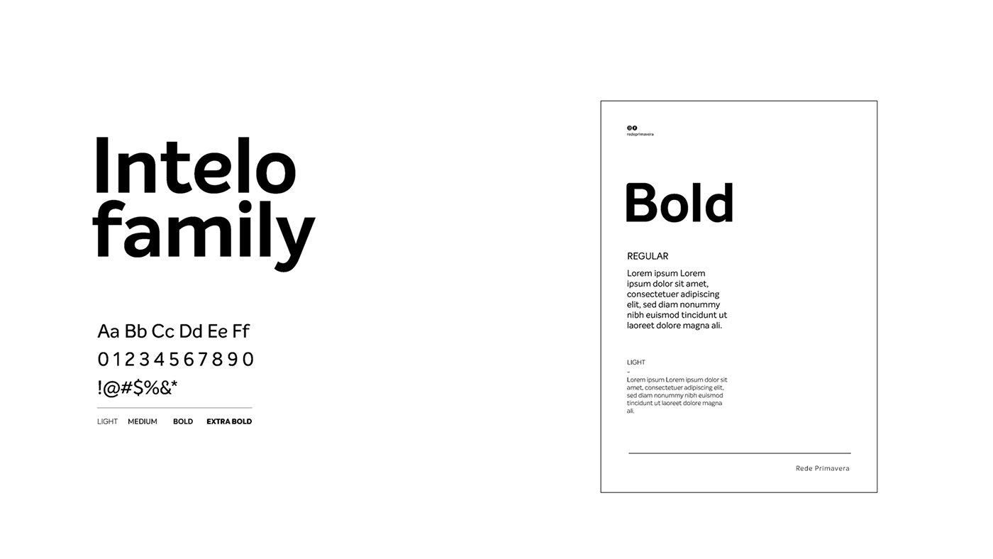
Hospitais são conhecidos por proporcionar segurança e confiança, mas podemos ir além disso com uma proposta de valor e branding mais humanizados, focados em proximidade e empatia. Fizemos um redesign na identidade visual da rede, mantendo as cores atuais, porém atualizando os tons para um estilo mais moderno. Buscamos uma fonte padrão e neutra que se integre com todos os públicos e que seja legível em diferentes meios. Escolhemos um estilo humanístico que reflete nosso compromisso em criar uma marca próxima e conectada com nossos pacientes.
EN
The Primavera Network was born in Sergipe through the unification of Clínicas Diagnose, Policlin and Hospital Primavera.
Hospitals are known for providing security and trust, but we can go beyond that with a more humanized value proposition and branding, focused on proximity and empathy. We redesigned the network's visual identity, keeping the current colors, but updating the tones for a more modern style. We are looking for a standard and neutral font that integrates with all audiences and is readable in different media. We chose a humanistic style that reflects our commitment to creating a brand that is close and connected with our patients.
Hospitals are known for providing security and trust, but we can go beyond that with a more humanized value proposition and branding, focused on proximity and empathy. We redesigned the network's visual identity, keeping the current colors, but updating the tones for a more modern style. We are looking for a standard and neutral font that integrates with all audiences and is readable in different media. We chose a humanistic style that reflects our commitment to creating a brand that is close and connected with our patients.

PT
O ícone da borboleta foi além, evoluiu.
Ele não representa apenas transformação e renascimento, hoje temos a união da borboleta, de pétalas da primavera unidas em um ciclo que demonstra a solidez dos processos adotados pela instituição e o elo formado pela envolvimento dos profissionais e clientes.
Com essa padronização, reforçamos os valores e atributos como confiabilidade, qualidade e humanidade
EN
The butterfly icon went further, it evolved.
It does not just represent transformation and rebirth, today we have the union of the butterfly, of spring petals united in a cycle that demonstrates the soundness of the processes adopted by the institution and the bond formed by the involvement of professionals and clients.
With this standardization, we reinforce values and attributes such as reliability, quality and humanity