


[EN]
TAPIOCA OBA
Year: 2021
Category: Food
Category: Food
Context
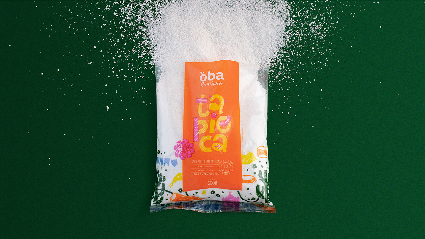
Tapioca is 100% a Brazilian product and we’ve noticed that the other brands don’t emphasize this enough on their packages. Our main goal was to increase focus on the product’s region of origin and to bring along our Brazilian pride, metaphorically taking the customers on a visual trip through Brazil’s Northeast region.
Tapioca is 100% a Brazilian product and we’ve noticed that the other brands don’t emphasize this enough on their packages. Our main goal was to increase focus on the product’s region of origin and to bring along our Brazilian pride, metaphorically taking the customers on a visual trip through Brazil’s Northeast region.
What we did in this project
Packaging design
Packaging design
Development
Tapioca is an extremely versatile product, part of the daily life of Brazilians and native from the Northeast Region of our country. Aiming to highlight this region’s culture, we've created a packaging that contains Northeast-inspired illustrations, using woodcut as our main inspiration. This colorful, joyful packaging design can adorn every kitchen.
The inspiration for the packaging came from the lovely visual elements that are present in “cordel literature” (popular printed booklets produced mainly in the Northeast of Brazil and sold in street markets). The illustrations, as well as the lettering, were created based on woodcut technique characteristics. Traditional elements of the Northeastern culture were also portrayed, such as the accordion, the mandacaru, the cassava and the half-moon hat.
As a result, a vibrant label full of positive energy was created. It’s amazing to think that a little bit of our studio and of our creativity are now inside so many homes, thanks to this project, which is an accurate depiction of our country. Besides, being able to see such a colorful package on a daily basis is certainly a great way to inspire and to bring positive energy to the consumers!
[PT]
TAPIOCA OBA
Ano: 2021
Setor: Alimentação
Setor: Alimentação
Contexto
A tapioca é um produto 100% brasileiro, e nós sentimos que as marcas no mercado não exploram esse importante atributo nas embalagens. Nosso objetivo foi potencializar a origem do produto e resgatar o orgulho do nosso território, transportando os consumidores diretamente para o nordeste.
O que fizemos?
Design de embalagem
Desenvolvimento
A tapioca é um produto versátil presente no dia a dia dos brasileiros e característico do nordeste do país. Pensando em evidenciar a cultura da região, fizemos uma embalagem com ilustrações de elementos nordestinos, utilizando como inspiração de técnica a xilogravura. A embalagem é colorida, alegre e enfeita a cozinha.
A inspiração para a embalagem surgiu a partir das encantadoras figuras presentes na literatura de cordel. As ilustrações trazem características da técnica de xilogravura, assim como o lettering.
Retratamos alguns elementos tradicionais da cultura nordestina, como a sanfona, o mandacaru, a macaxeira e o chapéu meia lua.
Como resultado temos um rótulo vibrante e que exala boa energia. Com ele, temos a oportunidade de entrar na casa de muitas pessoas com uma embalagem que é a cara do Brasil. No dia a dia, abrir a geladeira e encontrar o produto colorido, inspira e energiza quem o consome.


Conceito e direção criativa: Juliana Zarattini, Marjorye Cavazotto e Caroline Celli
Layout: Juliana Zarattini, Marjorye Cavazotto, Marina Fujimori e Rodrigo Lourenti
Ilustração: Marina Fujimori
Lettering: Juliana Zarattini
Apresentação: Camila Ragghianti e Rodrigo Lourenti
Fotografia: Nathalie Portela
Atendimento: Rita Fernandes
Finalização: Rodrigo Lourenti e Cláudio Ramos
3D: Rodrigo Lourenti


