PT. Pangan Jaya Bersama - Logo of Pangan Jaya Bersama is built based on the name of the company consisting of 3 words, namely Food, Jaya and Bersama. Food is interpreted as a source of food or drink. Jaya is interpreted as prosperity, prosperity, fertility and blessing. While Bersama is interpreted as a process of mutual effort, please help to realize the same goal.
The logo is built on that value, and the logo is made using an abbreviation of the name of the company that becomes PJB. The PJB logo is formed in such a way that it becomes a unique logomark.
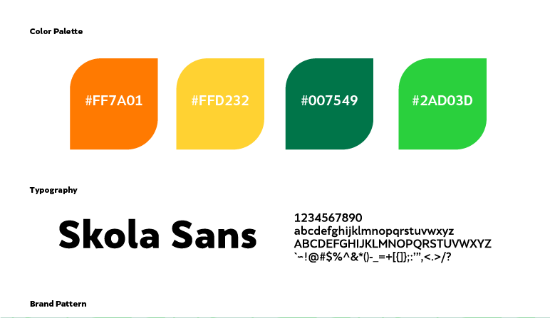
The logo is enriched with the addition of green and orange, where the green in the letter J represents the word 'Jaya' meaning: prosperity, prosperity, fertility and blessing. The orange color in letter B which represents the word 'Together' means: light / spirit. Whereas the letter P representing the word "Food" is a combination of the letter J that meets the letter B so that it forms the letter P, the combination form wants to convey the message, "to get prosperous food, it is necessary to work together passionately"