Challenge
The Tanquinho Fit is a store of natural products and healthy food from Dourados MS. The project consists of the Rebranding where a new positioning, purpose and identity was developed. The challenge was to create a new brand and logo aligned with the purpose and personality of the company. In this process the archetype was important to find the personality and sensations that the company wanted to transmit to its target audience.
Positioning
The new brand was developed with the help of the Archetype to find the goal and thus create a positioning and strategy. Tanquinho Fit is positioned with the profile of Caring, Helping people to have a better quality of life, aligning physical activity with a healthy diet. Through this profile was placed in the branding project all the characteristics and sensations that the brand would like to convey to the target; Among them we can highlight: Quality of Life, Taste, Fitness, Food, Passion, Lifestyle. In the project the base was to create a brand identity aligned with the mission and the values that the brand has in its essence.
Strategy
The process of brand creation begins with an immersion, where a briefing was made with the owners of the company and knowing the physical space of the same to know the personality and define the strategy to develop the new brand. In this process the brand was diagnosed, analyzing the current problem that was not to convey to the public in a correct way how the brand would like to position itself. After making the diagnosis, define the purpose, positioning, sensations; so the strategy was designed to create the visual identity and create the visual universe that conveys the essence of the brand and the strategy of disclosure where each sign, colors, refers to the identification of the brand.
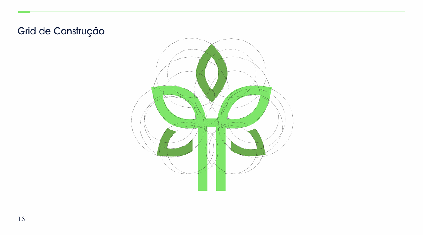
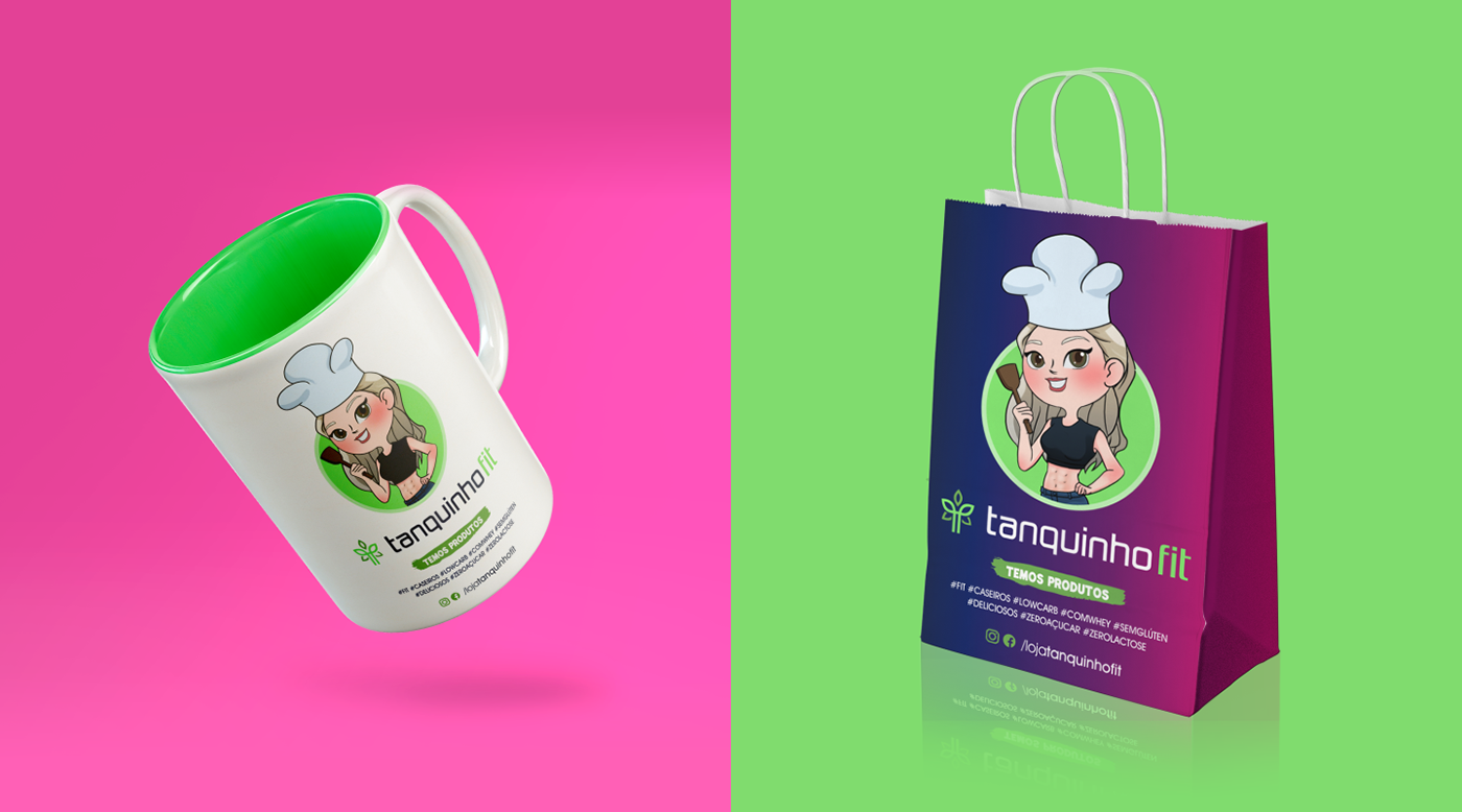
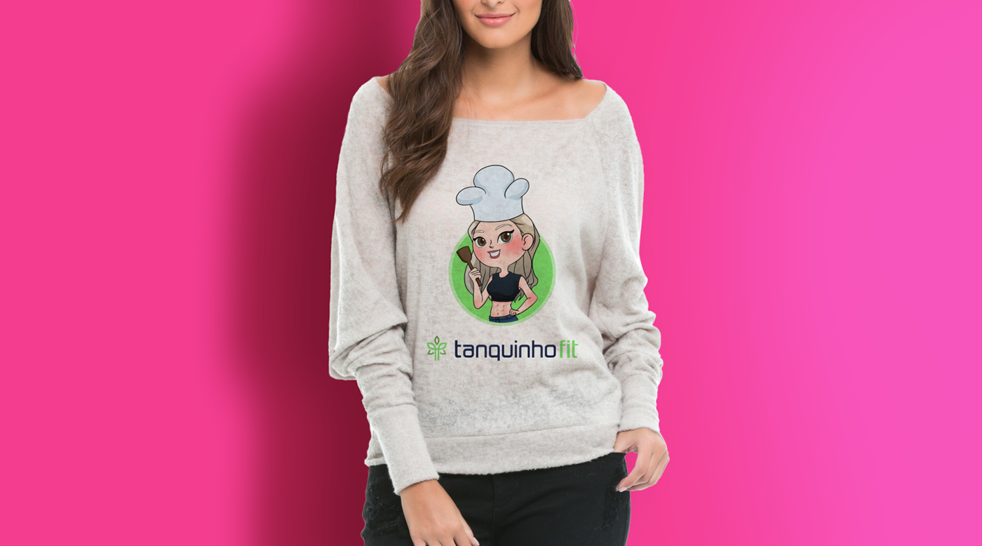
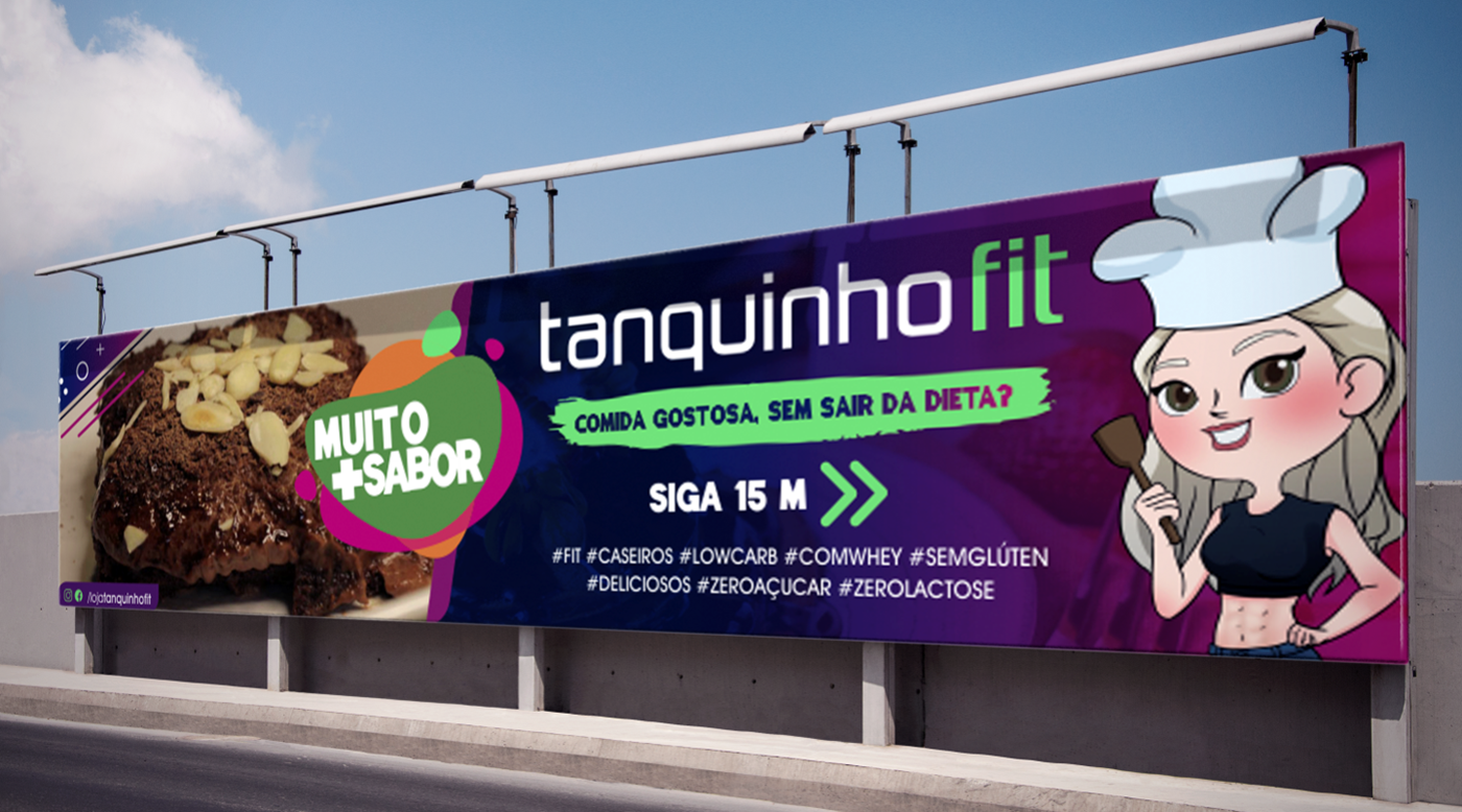
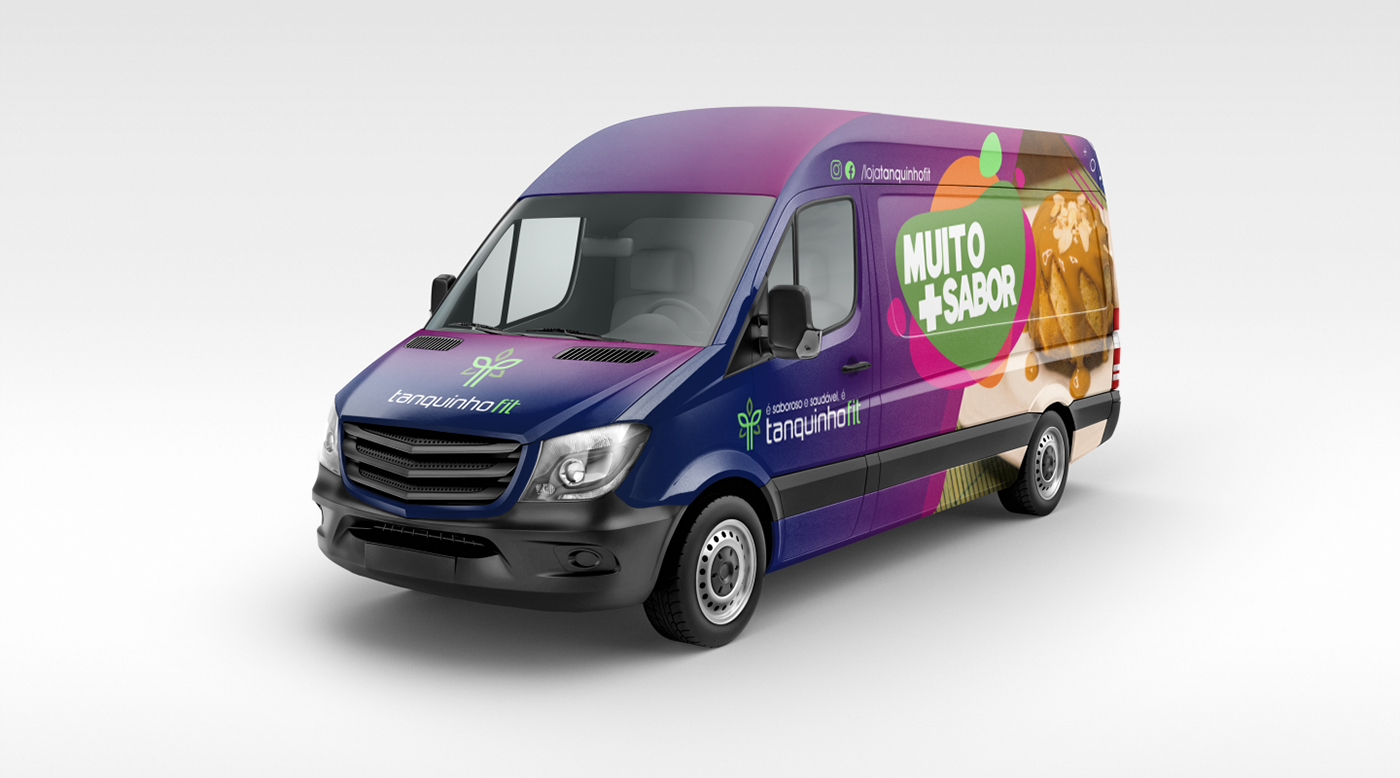
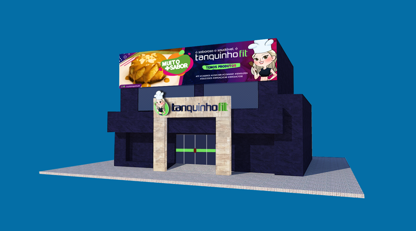
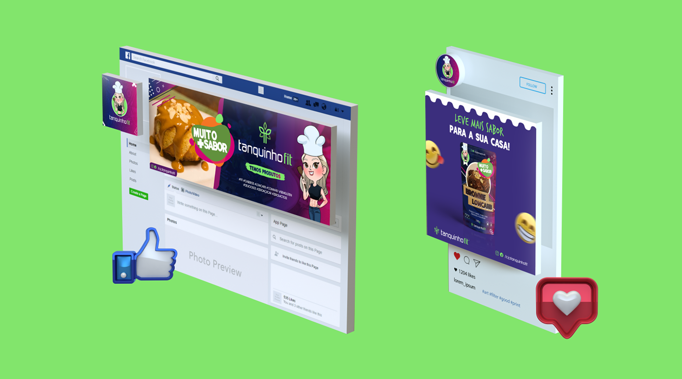
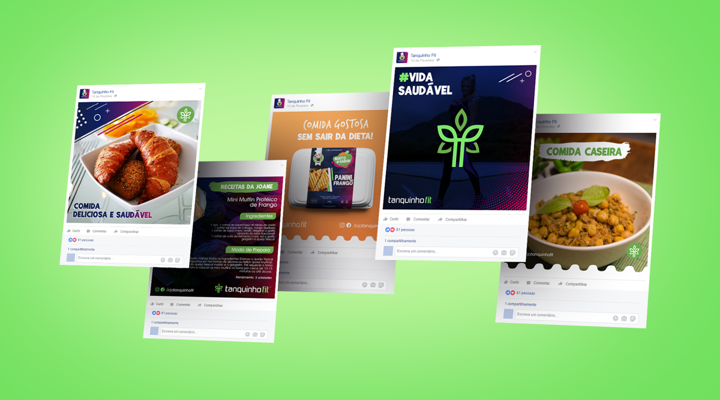
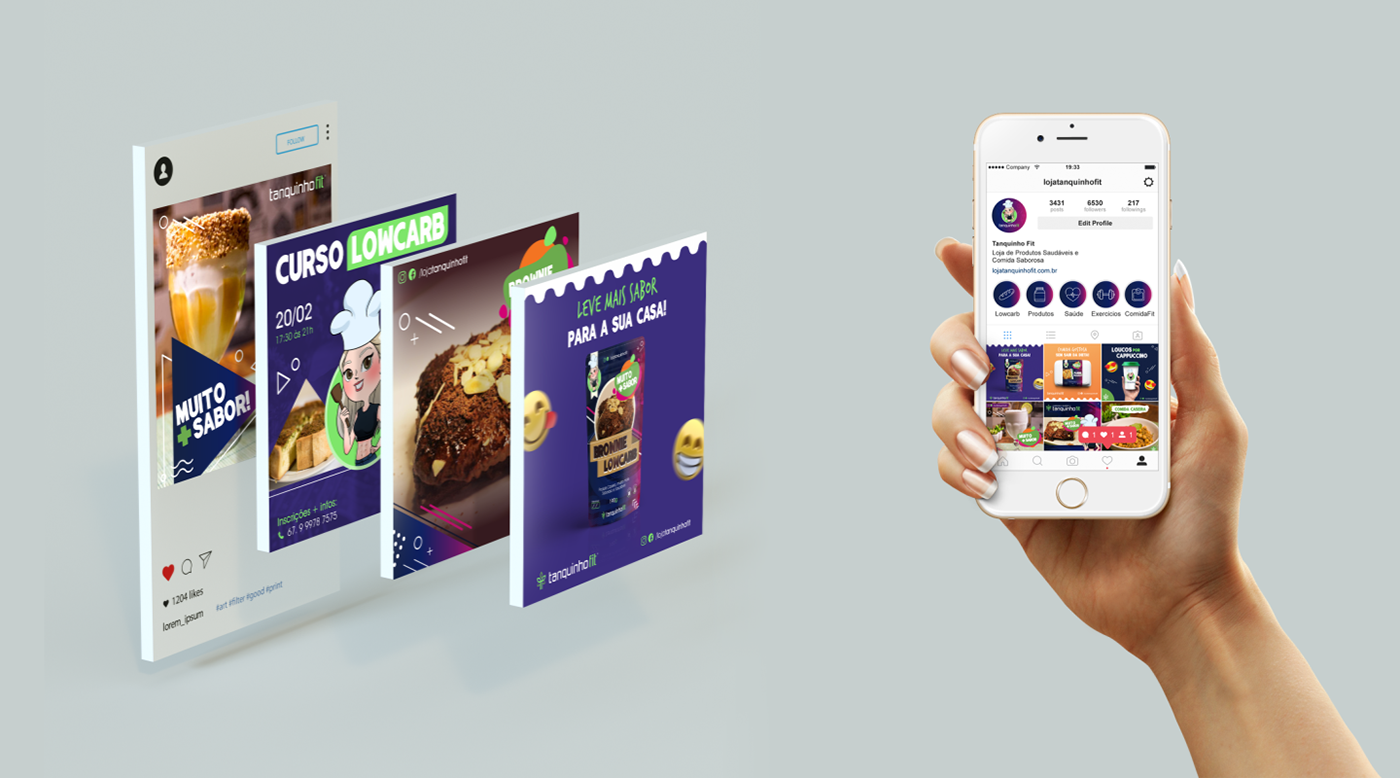
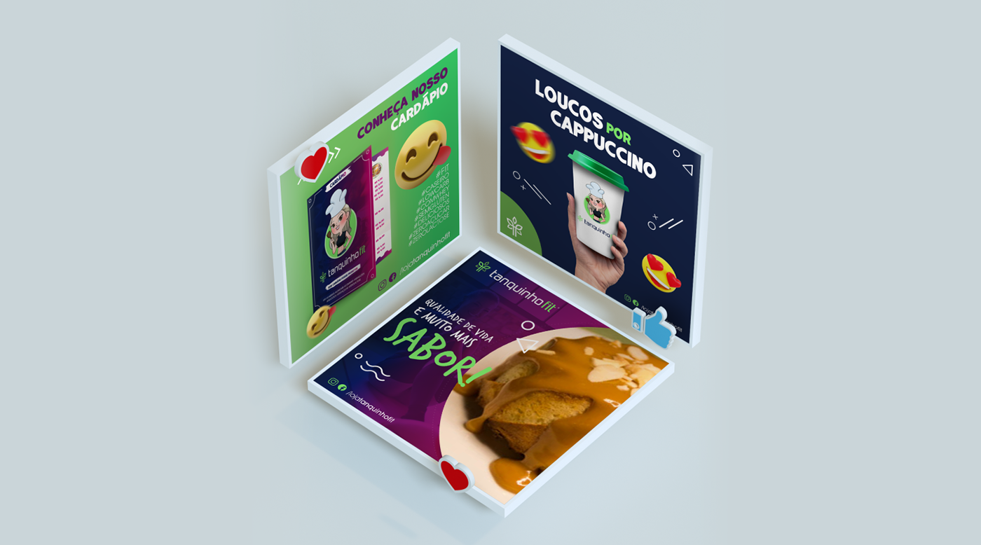
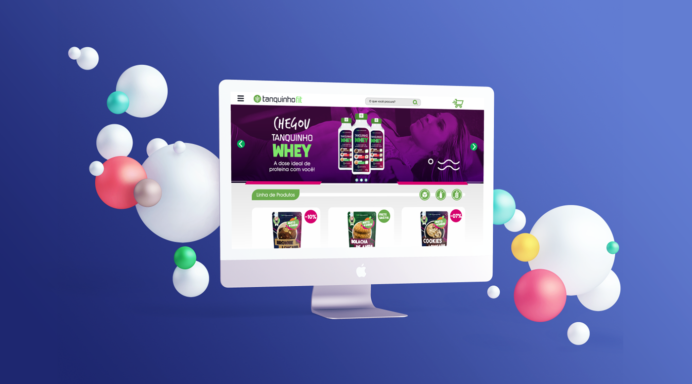
Visual identity
With the purpose of the defined brand, as well as its personality, was created the positioning of the brand and its management strategy and from there was developed the Visual Identity, aligned to all these characteristics. Through the old problem of the brand that was not to recognize and convey to the public its purpose; this time the visual project was to create a logo aligned to these characteristics and thus define the Concept of: Good Form, through a healthy diet and physical activity. In this process was created a set of keywords where it aimed to identify in the visual identity of the brand: Health, Food, Leaves, Fitness, Female, Body, Movement, Physical Activity. After developing the concept of logotitpo, the next step was to create a color palette that identifies the brand, which conveys joy, taste and health in a fun and personality-like way. A new typography was used to give more harmony to the project and especially to adapt to the new positioning of the company.