VISUAL IDENTITY & BRANDING
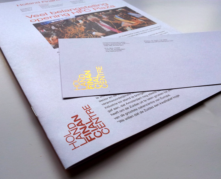
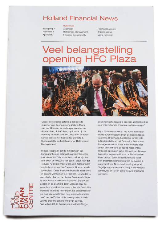
A fresh visual identity for a Dutch foundation, Holland Financial Centre. HFC's main purpose is to strengthen the Dutch financial sector. The logotype resembles the bar charts used in the market. The international financial sector is saturated with blue, so the main symbolic color, orange, helps to distinguish HFC apart as a Dutch entity. The typographic solution uses title communication broken down to its root essence to focus complicated themes into their most simplistic form. Varying font weights help to create the flow and rhythm to reading relating back to the motion of the market. Metallics give the rich history a visual presence and the combined result is something uniquely
Holland Financial Centre.
A full brochure series was created for each theme and compiled into a open-ended box for easy reference to both the corporate brochure and its counterparts.
Copyright: Total Identity, Amsterdam
Holland Financial Centre.
A full brochure series was created for each theme and compiled into a open-ended box for easy reference to both the corporate brochure and its counterparts.
Copyright: Total Identity, Amsterdam
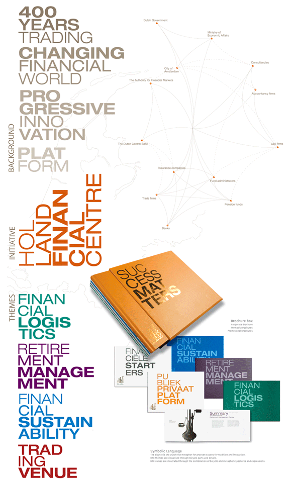
Metallics help to accentuate the identity from the crowd and is used whenever possible.
The logo never competes for vertical space, leaving it ample room to grow. The ceiling is never capped as they say, relating back to the Dutch financial market.
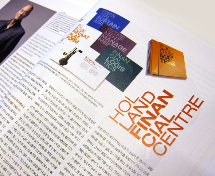
Featured by IN Magazine, print and online, South Korea.
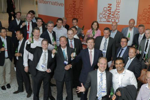
Celebrated in Monaco, 2012
Photo courtesy of Holland Financial Centre.
Photo courtesy of Holland Financial Centre.
THX FOR STOPPING BY
I APPRECIATE IT
B)
I APPRECIATE IT
B)


