As I continue to evaluate site architectures I experiment with site mapping techniques to reveal relationships between the user interface and the information architecture.
At the beginning of this project we interviewed at least 70 people at all levels of the organization, in their offices, online and in their homes (salespeople) about how they used their international intranet.
Here's what they said about a 10 year-old intranet developed without any central oversight:
IT is:
“a big black hole”
“old news”
“you use it because you must … the shortfalls [are] taken for granted”
Workarounds:
Establish well-worn paths, save everything, print everything, “phone a friend”, go elsewhere
Causes:
Navigation is difficult at best, absent at worst;
The naming of things varies too much across the site and often inconsistent within an area;
Content is scarce, often dated, lacks version control;
Content is too difficult to use;
Easy fixes:
Break out of frames;
Provide persistent, primary navigation;
Organize materials along sales divisions, not resource type or routine tasks;
Update content regularly, keep organized;
Flag both New and Last Updated;

The homepage looked like this.
(Please ignore the colored ovals and numbered call-outs; they're remnants of a presentation outlining major issues with the site and quick fixes.)
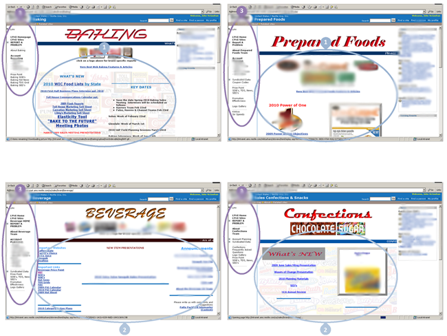
Major section pages appeared as they do above. While there was a modicum of consistency in content-element types and in the layout, beneath the surface much remained a mystery!
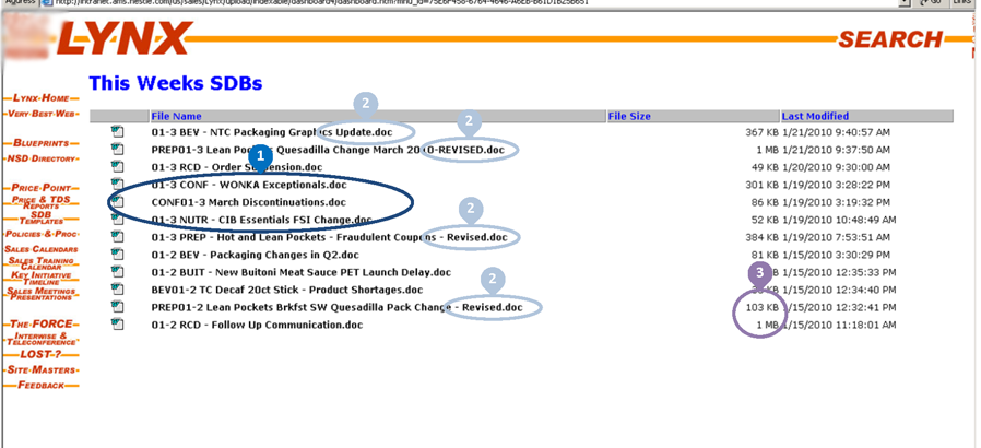
Another layer down and we find repositories for all kinds of files in all kinds of sizes with no apparent naming or labeling (file size) conventions.
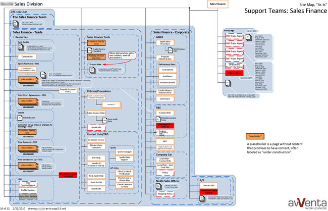
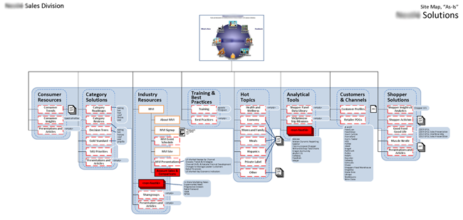
After reviewing the key or legend for the site I mapped "as-is", scroll quickly through nine (9) of the twelve (12) pages of the site map. Note how the patterns that emerge are less structural than they are dysfunctional.


Site map p.1
Site map p.2

Site map p.3

Site map p.4

Site map p.5

Site map p.6
Site map p.7 (This actually was an attempt to fix the navigation as found on the home page.)

Site map p.8
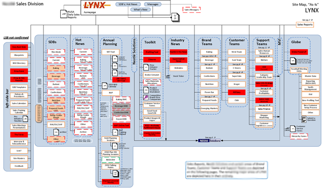
Site map p.9
At the end of the interview process we finally uncovered the fact that these sales and support personnel were not only expected to use this intranet, reviews of job performance depended upon it!
Yes, we too thought it excessive to interview 70-some people as the client requested. Normally less than half of that amount should more than suffice. It wasn't until we interviewed the last three (3) people did the ambivalence about this intranet reveal itself to be not only about using it on a daily basis, using it effectively was a major criterium for evaluating job performance.
So, how shall we help these people?

The proposed UI above depicts how top-level navigation might be organized and displayed. Note how sections are organized across sales divisions as opposed to resource type (PDF vs. PPT) or routine tasks like "retrieve promotional materials". (Please refer to "Easy Fixes" in the user research above.)
Please note: details have been scrubbed to protect the delectables.

This wireframe demonstrates how news ("SBDs") for each division could display on the homepage in a single view. For those sales people who worked across divisions, especially for supervisors and their support staff, this provided a very convenient "dashboard" of all of the important, current communications across the sales divisions.
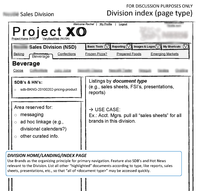
Upon reaching a sales division landing page, SDBs and "Hot News" ("HN's") continue to display for that division along with contextual messaging and resource provisions organized by "document type", that is, "sales sheets", "presentations", "reports", etc.

Upon reaching a landing page for a particular brand, continue to display contextual messaging and then organize resources according to "purpose". In other words, if a "sales sheet" was intended to be used for a branded beverage of "Cocoa", list those together and apart from sales sheets intended for someting like "Coffee."
In the end, I collaborated with IT and other content managers to validate the sketchy wireframes above. All agreed that the simplified navigation and content layout would serve their needs as providers in this intranet and the needs of their users as well.
2010

