Background
The following is a simple example of the type of "client experience" documentation a team of 5 of us created for the administrative center of a "cash management portal" to be used by corporate clients of a very, very large bank.
As one of 3 teams, "Admin. Center" was by far the smallest. Other groups boasted 6-10 UX practitioners or more. The entire UX enterprise used Axure and each group worked in their own "shared project". Since the application was highly sophisticated, we had developers to produce prototypes. As a result we only generated specifications with Axure.
Each UX designer was assigned a sub-section of the requirements developed collaboratively with the business, IT and UX for every new release cycle. Documentation would open with a user flow for the wire frames that followed. Refining requirements for a future release would always overlap the development of wire frames for the next release.
Shown below is a version of the flow for creating and edting User Groups and a select sample of corresponding wire frames.

The wire frame below (AC-119) displays a typical modal overlay for viewing "details" in the administrative center for things like "User Groups", "User", "Account", "Account Groups", "Organizations", "Clients", etc. All modal overlays had pre-defined dimensions and other attributes dictated by a style guide developed in tandem with each release cycle.
We added annotations (numbered yellow boxes) only when a new element appeared in the interface. Text with dashed underlines indicate that an enhanced "tooltip" would display more complete information on that data point upon hovering the cursor above it. (Or, in Javascript lingo, "onMouseOver".) The empty space between the "major action buttons" on the bottom bar and the end of the list of assigned users represents the fixed dimensions of the modal overlay chosen for this type of display.

Although not included in the user flow above I have included the "Create User Group" wire frame here. You'll note the only annotation is on the far-right major action button, "Submit for Approval". Most modifications of most application entities required approval from an "S.A.". (I forget the exact designation but one might think of an S.A. as a super-administrator.)
Please note other major actions, like "Add Products" and "Clone Entitlements", are not featured in the user flow above. Those paths would have been covered in another user flow and illustrated in discrete wire frames.

The action of creating a list from an exisitng list, here performed through what we referred to as a "twin-list selector", is practically identical when creating and/or editing a group of users, accounts, etc.
My work on this project ended in 2010. Since then advancements in both broswers and markup and scripting technologies have seen accompanying advancements in UX design.

The concept of adding or editing a contact profile for a user group was new to the release represented in our initial user flow. All values encompassed by angular brackets are variables that, in the wire frame, describe the nature of the variable (e.g., pre-populated, editable).

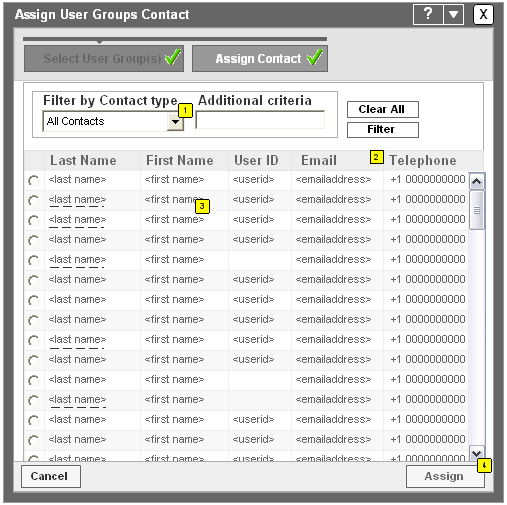
The wire frame below is but one option in the flow of selecting a user group and then assigning a contact for that group. The "progress meter" with green checkmarks, what we referred to as a "process funnel", was a frequently re-used UX pattern.
The following wire frame demonstrates another means of selecting contacts first and then assigning them to a user group or account groups and/or other appropriate application entities.

Finally, once a contact has been defined and/or assigned to an <application entity>, the user returns to the maximized, parent browser window and returns to a non-modal (and non-modeless) environment.
Note that the "Administration" tab is highlighted, along with the secondary "Requests" tab below. Submitting adds and edits to <application entities> almost always added a row to the "Requests" list in the Admin. tab, which displays details like "ID", "Status", "Client ID", type, date and so forth.
Nearly all user flows we created in Admin. Center, as well as those in other "tabs" or "centers" like "Payments" and "Reports", would begin from this maximized, parent window.


