
The ask in this project was to re-think the UI of an existing application whose central features included complex search facilities on thousands of people with sophisticated definitions, rankings and relationships, in addition to groups and engagement ("Activities") management. No less necessary: create a modular structure that allows for easy modifications across multiple deployments. My prior experience with search applications and solid foundation in information architecture proved to be valuable assets in this effort. (Work had been done already by other UX practitioners on the administrative side.)

The "site maps" above and below represent the first set of requirements presented by the client. Thankfully, we also had the existing application, in multiple installations, to evaluate and then compare against these rather cryptic colorful boxes. Note the repetition of content types across the main sections identified here as "Home", "Individuals", "Groups" and "Activities". (See the third column in particular for redundant content-type defintions.)

The "Initial User Flow", beginning with log-in, then "Setting context", then viewing "Home-based" content relevant to the logged-in user before exploring the main sections of the site was a mandate from the client. At first it seemed odd but soon the reasoning and its necessity became apparent.
By "Setting context" the user narrows the universe of individuals, groups and activities they may access. Since this could include tens of thousands of entries, this was of paramount importance. Of course, this setting could be saved to expedite the journey for the user upon return but the screen always appeared in the log-in flow to allow a person to change context.

Below is another "requirements" document provided by the client. The wire frame includes primary navigation, a salutation message, a header indicating the current context ("Autoimmune") and additional filters for further refining context.
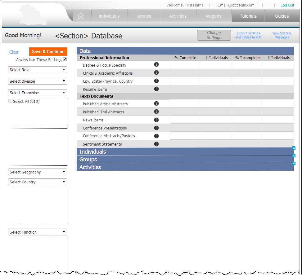
The main body of the page displays results (refreshed with each filter selection), both their type, number and percentage in the "Complete Data" and "Incomplete Data" columns. The grouping of results into "Data", "Individuals", Groups" and "Activities" is meant to give an overview of the filtered data accordingly. (The latter three would actually show a list, not just one item each.)
"Complete Data" is pre-loaded upon licensing the product. On occasion licensees of the product would want to add "individuals" not found in the database. Licensees may or may not be able to complete all fields for an individual record. These incomplete additions were necessary to include them on "Activities" invites and thus move forward with the creation of group expertise and engagement invites and feedback.

The screenshot below was taken from an instance of the application "as-is", minus the header and footer. This post-login screen displays a default set of individuals in five alphabetical columns, enclosed by a bar with actions buttons for the list. Below that begins an accordian of filters grouped by type.

As you can see, opening the accordians reveals nested accordians with multi-select lists. Note the horizontal scrollbars at the bottom of these multi-select lists. Any given instance of this application will have more or less and/or other multi-select lists under any sub-category of filters. Scalability and ease-of-use are the most immediate problems to tackle.
Also note that the "Text Analytics" filter toward the bottom of this cropped screenshot completely breaks the consistent if awkward filter pattern already established. Indeed, to use it brings the user to an entirely new screen of results and functionality, outside the realm of its brethren filters.
The good news? So many opportunities for improvement!

After numerous iterations, the screen below shows the last version I designed for displaying filter controls and their results when setting context. The "Data" accordian panel is open by default whether filters have been applied or not. As shown below, only "Select Role" is enabled. Each filter, at least the first three or four, requires a selection in its predecessor in order to be enabled.
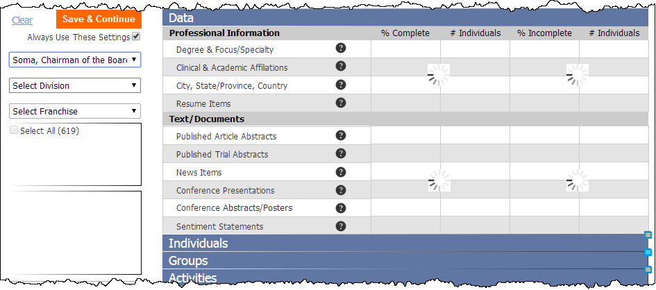
A close-up of the selections in the "Select Role" filter. I was instructed to limit the functionality I built into this prototype so only the "Soma" selection in this filter will trigger actions in the rest of the page.

Select "Soma ... " and watch the "Data" panel indicate that new information is on its way.
After making the first selection, all panels open with data presented in each column unique to the panel.

Jumping ahead, the screen below shows the third filter selection ("Autoimmune") with sub-filters not dependent on the parent filter.

The screen below shows the bottom of the page with all filter selections made.

After setting context, the screen designed below proposes a UI for navigating to "Individuals". Lots of elements are still in flux in this iteration, including the filters/context-setting options above the result set of individuals and the second column that would display groups and activities relevant to the individual selected in the left-hand column.

The modal overlay below demonstrates one option for adjusting "context" on-the-fly. All filter categories are presented at once, with the exception of "Text Analytics".

The modal overlay below demonstrates an option for adjusting "context" on-the-fly for "Text Analytics".

To be continued ... in the meantime, please try the prototype: http://dwhu3e.axshare.com/
Thanks! And please let me know what you think! kevinwbishop ... Gmail.


