


Club Refined
At Club Refined, we believe that having a self-care routine can help you de-stress, renew your energy, and most importantly, to feel confident within.
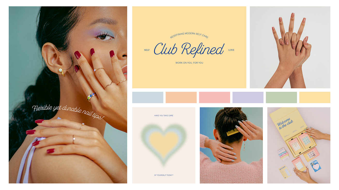
With the focus of providing female-based goods, the brand logo is constructed using a modern-vintage script typeface to represent a feminine and self-confidence look. The rest of the brand identity and packaging are inspired by the self-care culture itself. With the idea of embracing the importance of self-care, our color palette uses a range of pastel color, with a mix of soft gradient. The colors used are to portray a relax, soft, and calm vibe after using Club Refined goods.
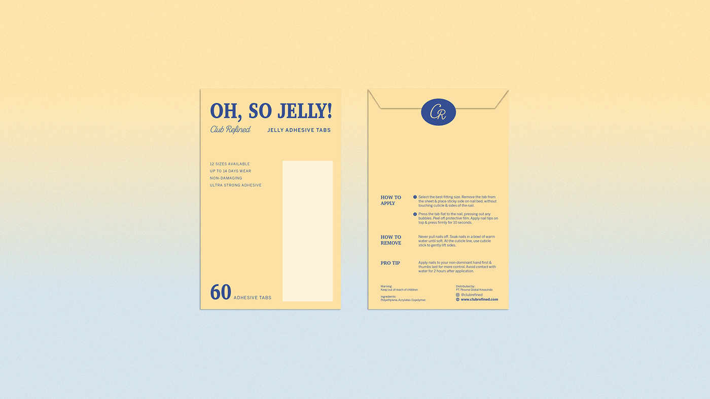
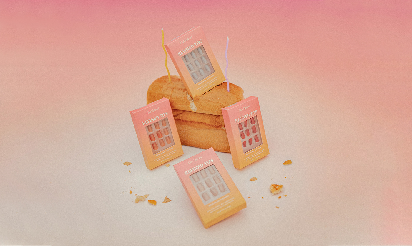
The first product launch is Refined Tips (Press on gel manicures), along with Oh, So Jelly! (jelly adhesive tabs) for refill purposes.


Club Refined
Brand Identity and Packaging:
Vianka | @cerealhours
Art Direction & Set styling:
Ivanka | @openseason.studio
Photography:
Julius | @jujudwarf


