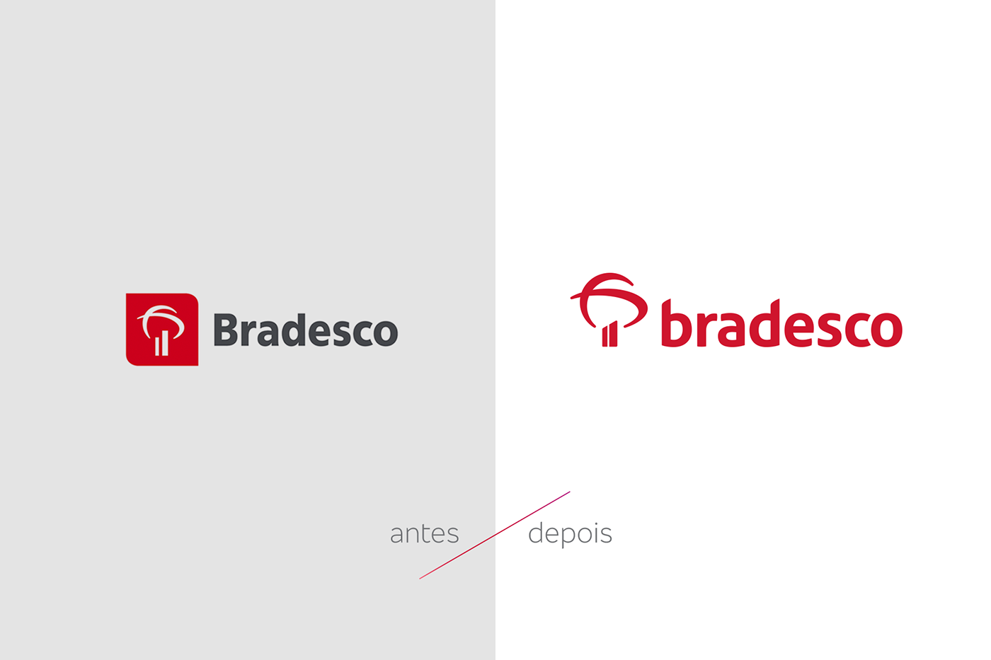
A vibrant visual identity for the new times of the brand.
Rebranding project made by Superunion São Paulo crew. A huge challenge to bring freshness and life for one of the major bank in Brazil. As a response to the ever-changing world, the traditional bank serenity gave space to be closer to its community through expressions of liveliness like every brazilians are.