Starpack
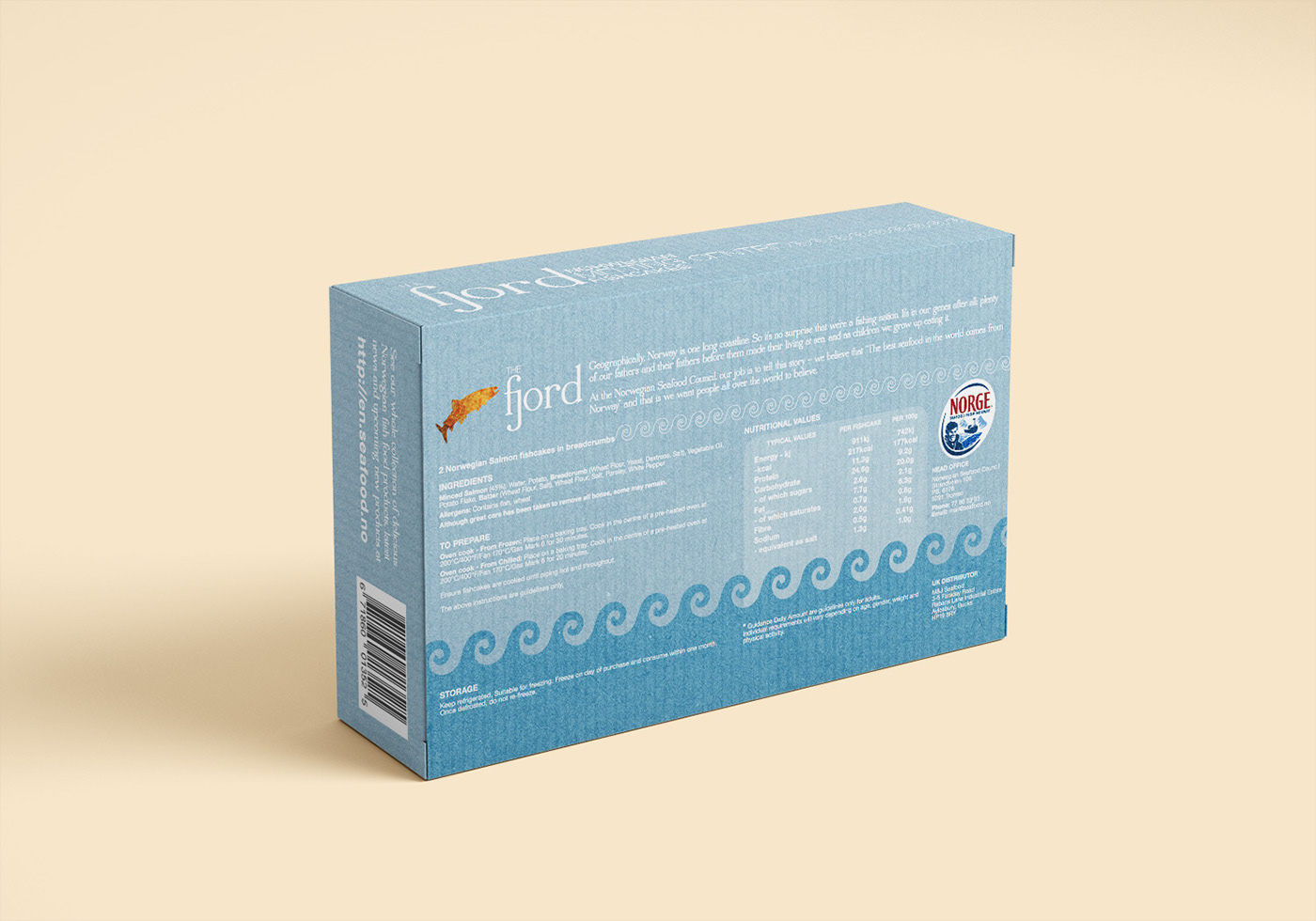
Norwegian Fishcake packaging
University project and a response to the Starpack 2014 brief for the Norwegian Seafood Council. The NSC wanted consumers to choose Norwegian seafood for their high quality, sustainability and great taste. The packaging was expected to stand out from the shelf with impact.
Scandinavian design was known for its distinct look and feel, but a direct application would confuse consumers and possibly have the opposite result. I chose to experiment between arty and commercial elements to find the balance.
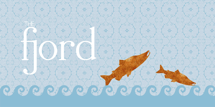
Front of pack evolution

Back of box development
Blue remained the essential colour for both flavours, so were the curly waves that visually tell consumers they're all about seafood. The fish-shaped cut-outs were to show off the fishcakes inside while adding a pleasant touch of fun.