


When I joined AvatarUX as Head of Creative Development, I had to wear many hats at the same time. Without a designer on board, I took up the task to squeeze in a little bit of time to design the game controls, which resulted in a full redesign of the existing UI for all AvatarUX games. The HUD exist to this day.
This project showcases the evolution of HUD and UI in various screen orientations. The main idea behind it was accessibility. We wanted to create the first player centered slots UI experience in the industry that is quite lagging behind others.

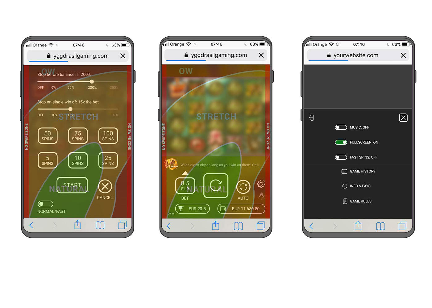
This is what our current HUD ended up looking like. We decided to skin the elements to make them fit the game's theme, but only to a limited degree. The progress containers are now fully customizable (they are hand painted and can have various shapes), while the buttons receive only a subtle recolor with each new game.
Keeping the most important interactive elements within the reach of the player's fingers was a very big challenge for the below screens. Many iterations were made between UI, UX, developers and QA to make sure we do not leave anything to chance. A simple element like the close [x] button has travelled many miles between various screen locations before it ended up in the traditional top right corner (notice that it's not at the very top edge though).

Button sizes, layout positioning, margins and spaces were following Google Material Guidelines as well as took in mind many other internal, proprietary framework specific, guidelines.
Even though I was designing a one off UI layout, a design system was in place to make sure we are secured for the future.

The final version of the in-game HUD ended up being skinned for every game, but the layout and functionality remained the same. The windows/popups aren't skinned and retained the simple, dark flat-design look.


