This week, we published the redesign improvements I proposed for an utility app of my current employer: +Recargas. I designed a visual revamp of both app and landing page, making it easier to use and cleaner to the eye, with the objective of providing users with a straight forward way of recharging.
Both App and Landing page follow the company brand guidelines, but I managed to introduce some modern UI elements to make the interactive elements more recognizable.
When you’re designing, either sketching or digitally, you get into a zone that allows you to jump from one screen to another without having to justify each particular decision you make. But looking back, there are a couple of design principles that were used intuitively in this deliverable:
Law of Aesthetic Usability Effect: Users often perceive aesthetically pleasing design as design that’s more usable.
The previous version of the app had the same functionality, but from a aesthetic perspective, it wasn’t very pleasant. Even tough I didn’t change the steps of the flow, those already were straightforward, using the app now feels like a more cohesive experience
The previous version of the app had the same functionality, but from a aesthetic perspective, it wasn’t very pleasant. Even tough I didn’t change the steps of the flow, those already were straightforward, using the app now feels like a more cohesive experience
Hick’s Law: The time it takes to make a decision increases with the number and complexity of choices.
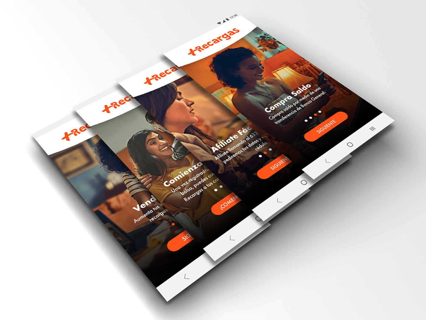
The app will have a couple of other features in the future, some of these options were present in the previous version but weren’t available (they appeared as "coming soon"). I proposed to remove them for the time being, so the only options presented to the user were the ones available at the moment of launch, so they don’t get lost in too many features.
From a functionality point of view, +Recargas empowers any individual to start an entrepreneur voyage, selling recharges for prepaid mobile plans (digital top-ups), without having to exchange a physical card or even money, avoiding any risk of contagion.
Each seller adds funds to his “wallet” with a simple bank transfer, that can be done electronically via online banking. The payment between seller and buyer could also be managed electronically, by the digital payment method of their choice, so the complete transaction could be done remotely without having to break quarantine.
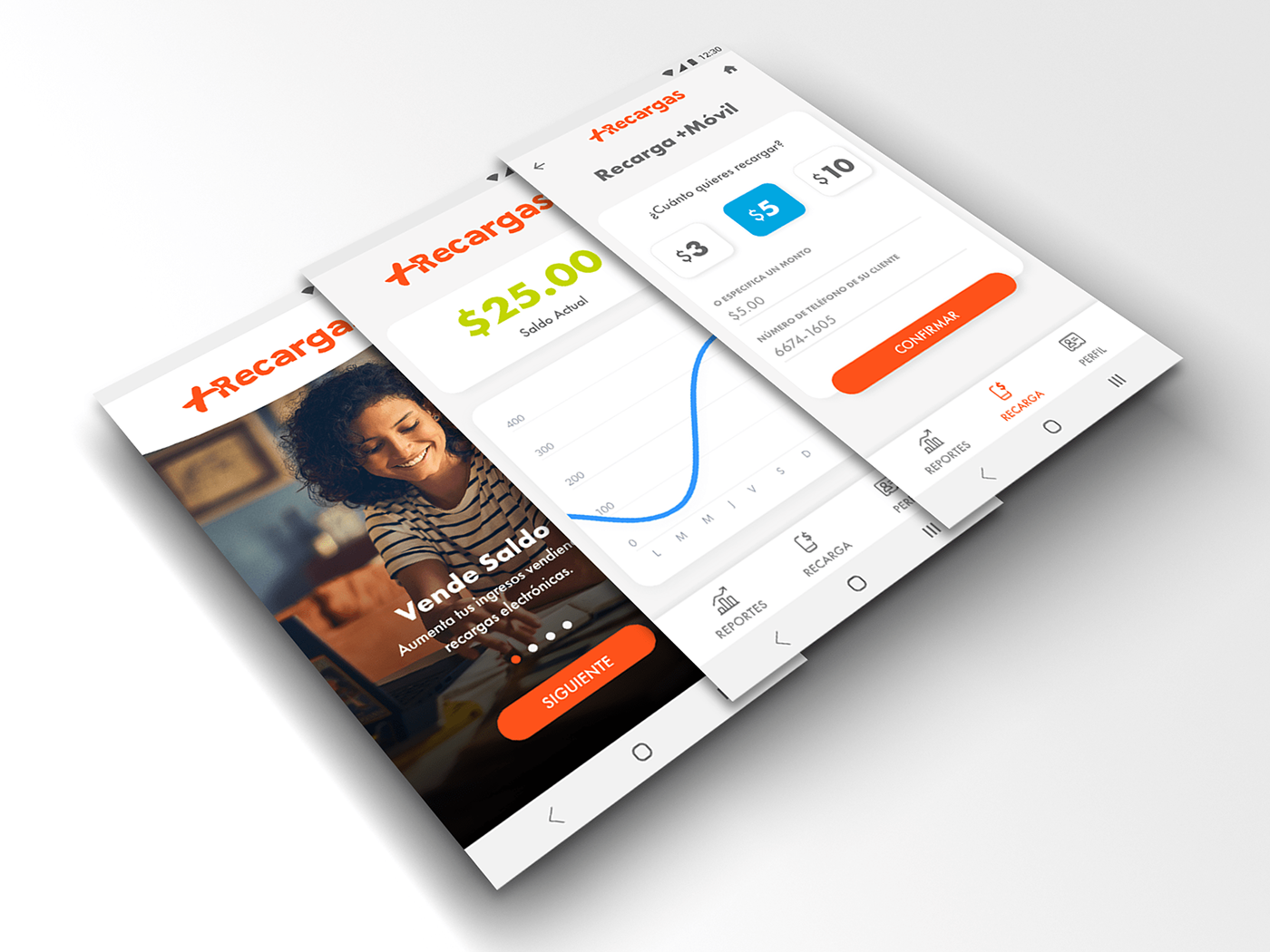
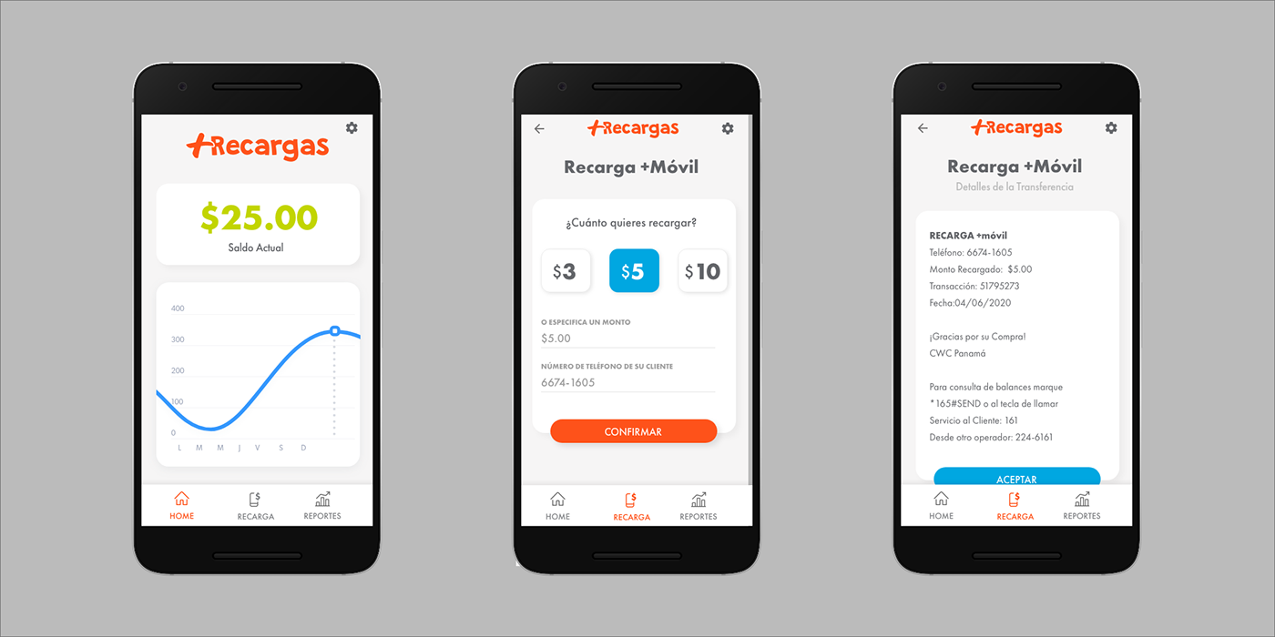
The recharge flow it’s so straight forward that only has two steps: the page where the seller inputs the buyer’s mobile phone number and the amount of money he want’s to top-up, and then a confirmation screen.
It has a featue to provide the seller with “fast options” so they just had to select between $3, $5, etc without having to input the amount. We polished that selector a little bit, so it looks more “clickable”. After this, the seller gets presented with a thank you page confirming his transaction and the buyer gets his credit immediately and also receives an SMS confirmation.
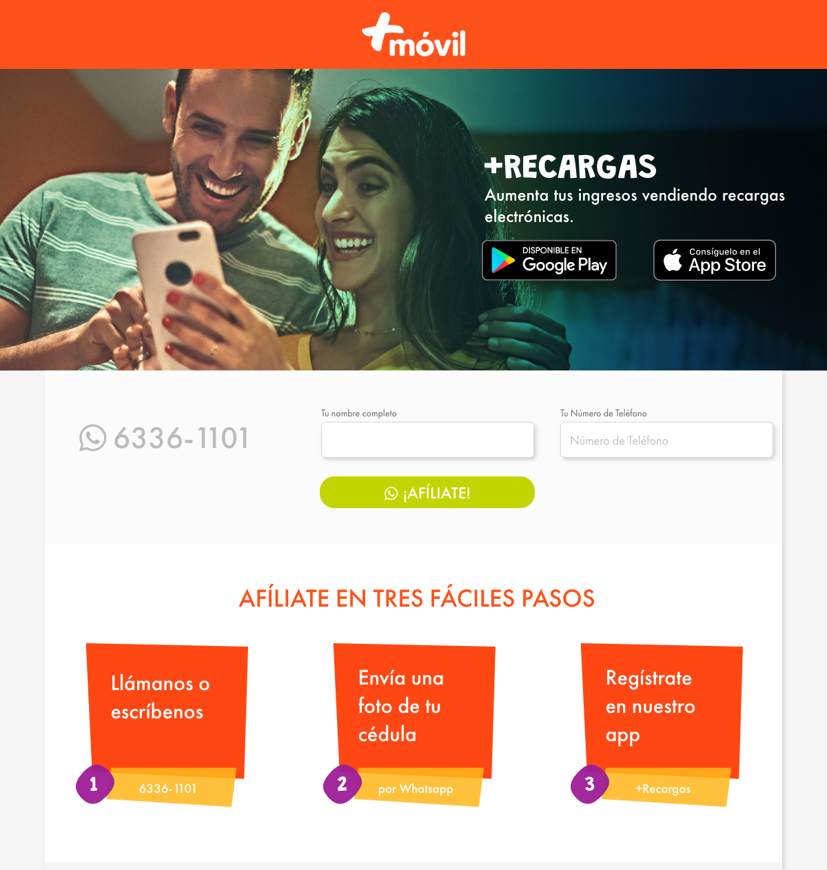
Landing Page
From a HTML/CSS perspective, I had the opportunity to play around with simple animations using CSS transitions (inspired by the folk of !important), providing the user some visual feedback to his interactions, like button hovers and such.

Done in Adobe XD
As always, I designed in Adobe XD aiming to output the proposal as fast as possible, reusing some design elements as “assets” (previously, “symbols”). XD also helped deliver the design elements to the development team thanks to it’s Design Specs feature.
If you own an Android Smartphone, you can download the app from the Play Store. We're working on a better onboarding process for the user and other improvements. If you have suggestions, shoot me a line.