Client: TEYST
Creative Agency: Black Mongrels
Year: 2017
Teyst is a phonetic spelling of the word “taste”. With food brands under their helm (The Daily Cut & Muchachos), the sensation of great flavours is of utmost importance to them and serves as a reminder to always embody good taste, style and class.
With a clear understanding of the company’s core values, the personality and voice were developed to define the brand’s identity in the marketplace.
1. Witty: Quirky in its approach and one that triggers curiosity.
2. Sophisticated: Gentleman outlook. Not loud nor brash.
3. Unique: Daring & different. One that is always looking at possibilities to create new products.
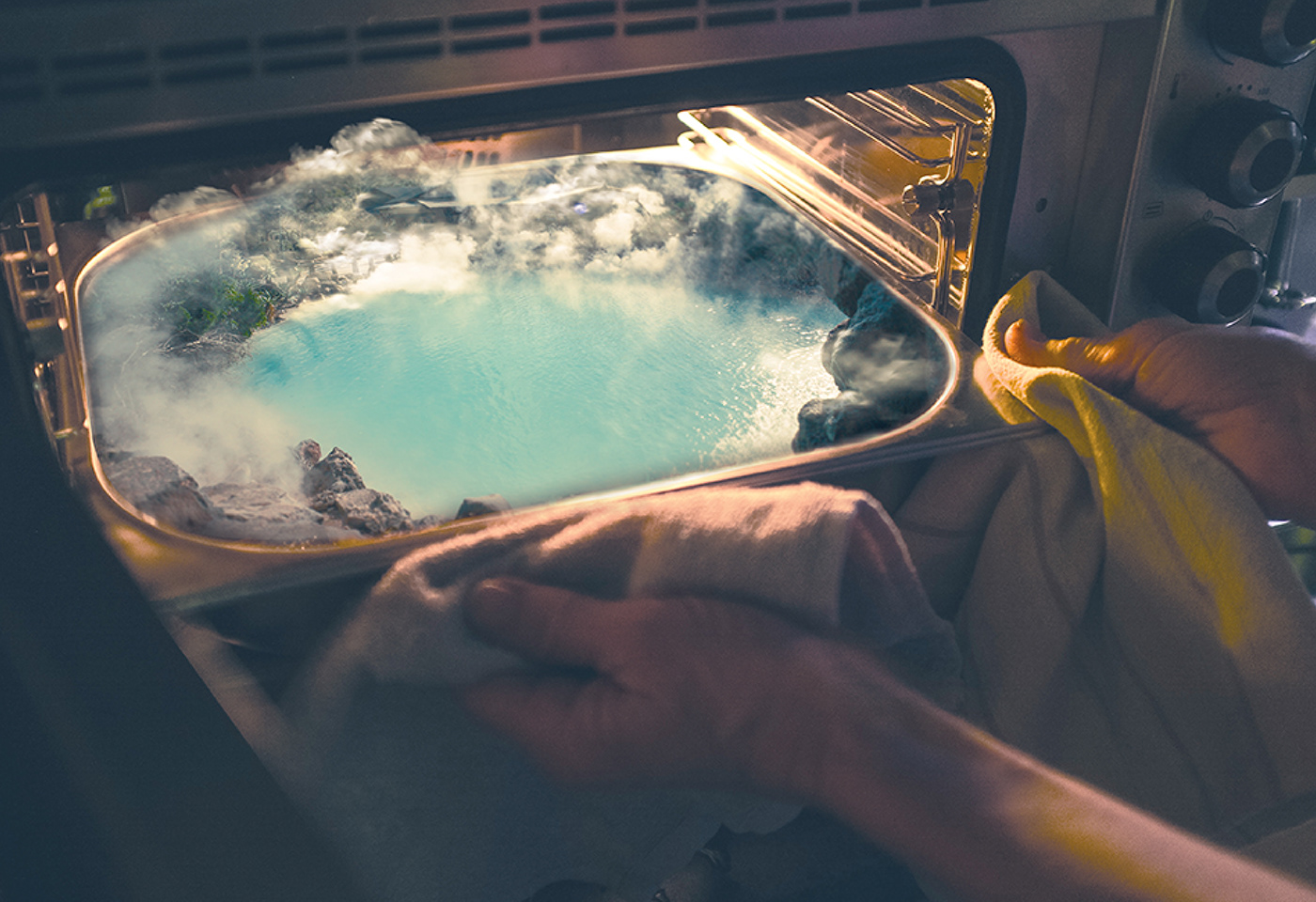
Terming it ‘A Beautiful Mismatch’, the concept approached the idea of combining and mixing two contrasting elements. This idea of juxtaposition follows throughout the entire branding, giving Teyst a competitive visual edge whilst setting itself apart from its competitors.
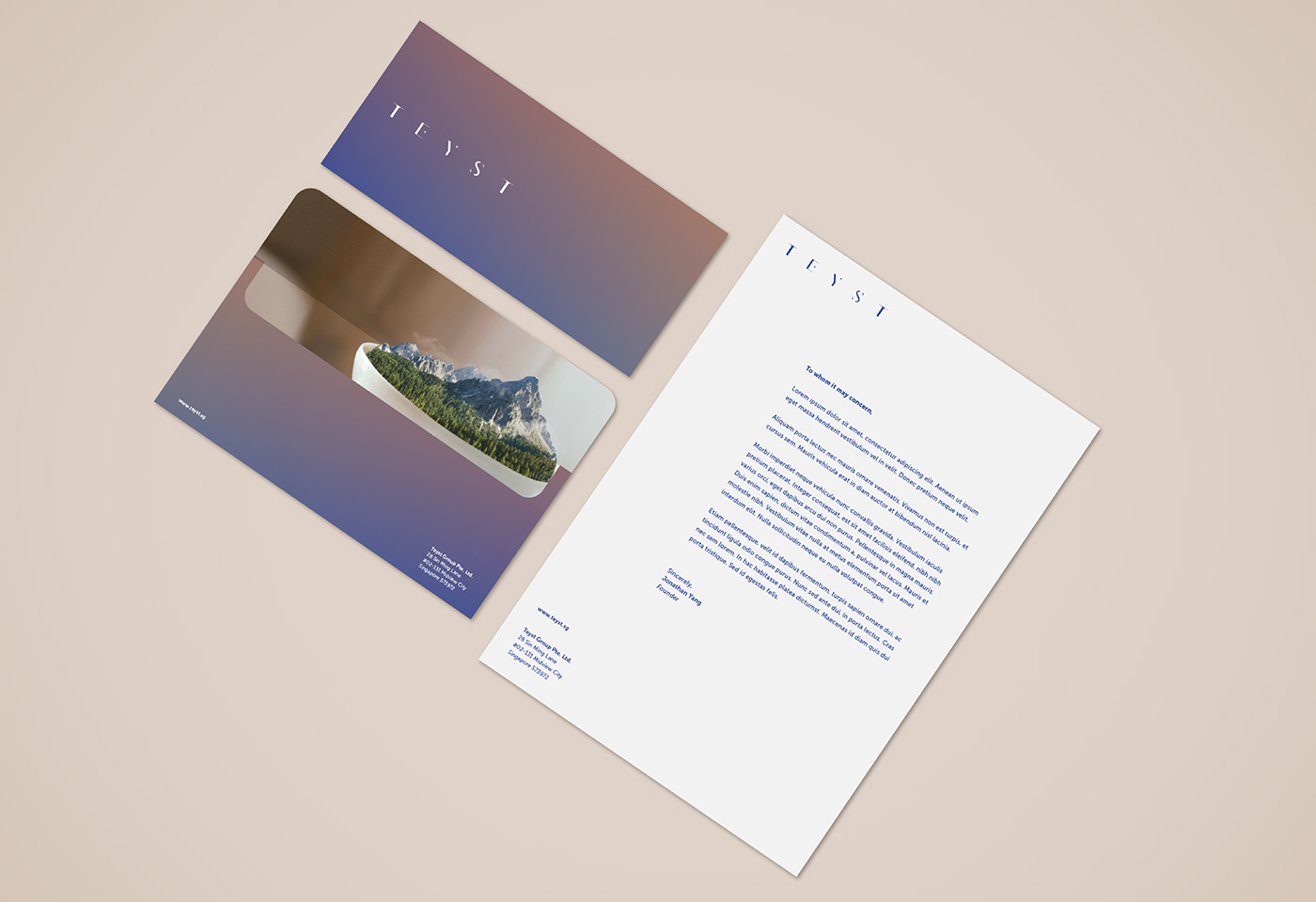
The key visuals of Teyst reimagines daily objects and weaves landscapes into Teyst environment and its product offerings. The visuals works as an artwork that reflects Teyst’s quirk, but also injects emotions of comfort and provide a sense of escapade for the mind.
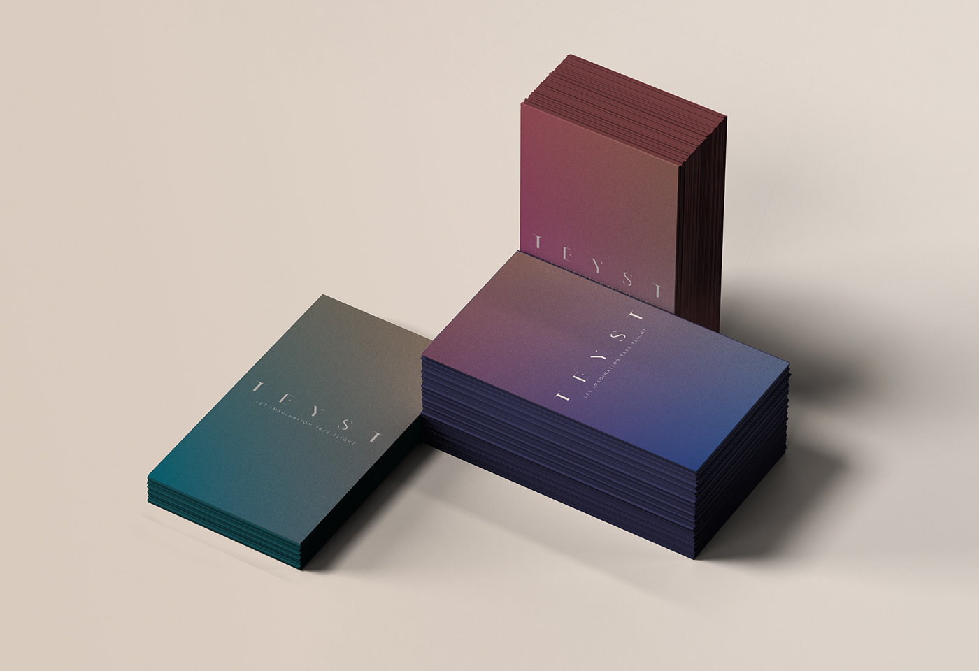
True to the concept, the logo design took on an unusual approach by combining serif and sans - serif fonts, giving it an experimental yet refreshing twist.
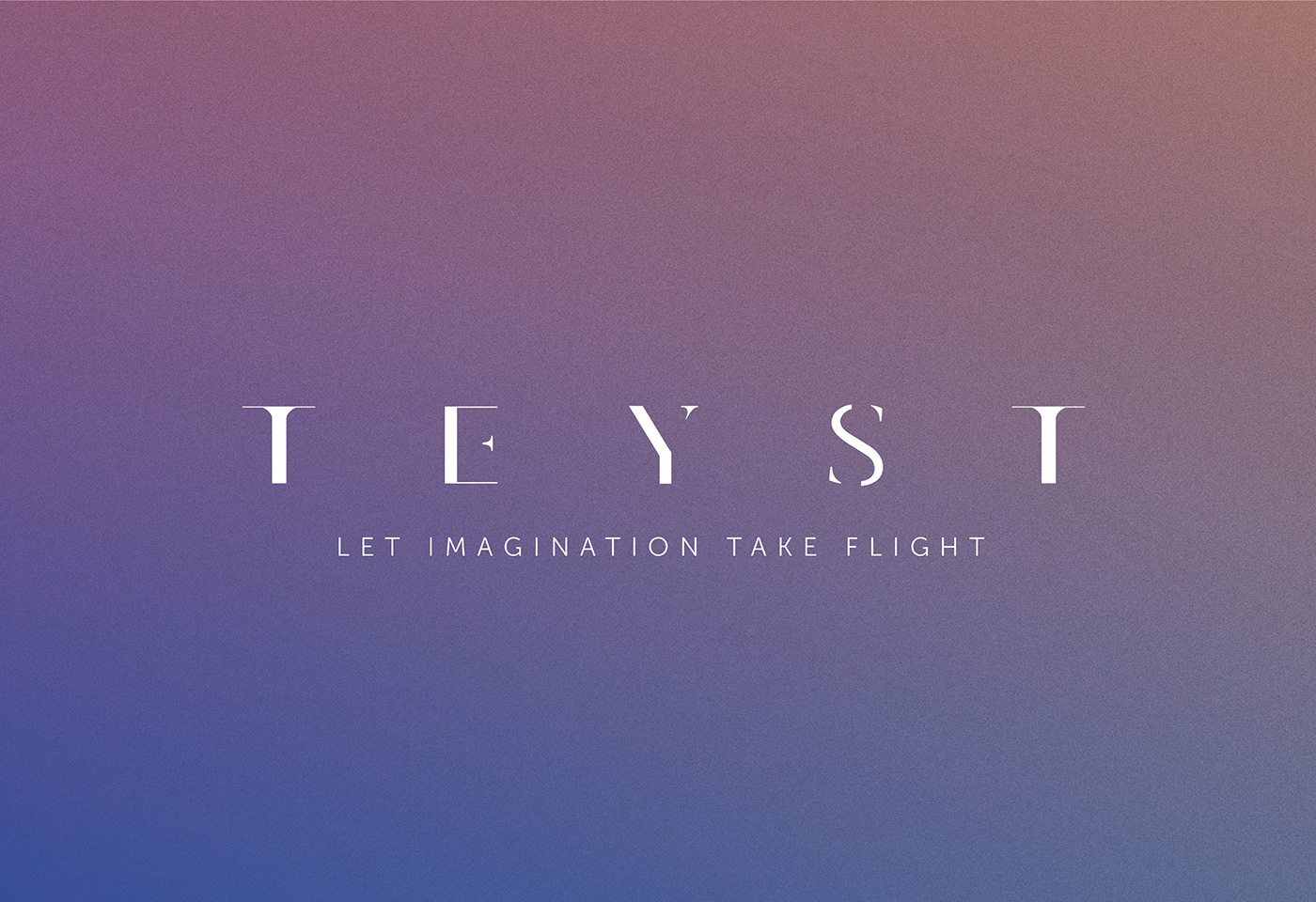

Colours in this branding approach act as a blend / diffusion in the world of juxtaposition that brings comfort to the mind, body and soul in Teyst’s product offerings. The choice of blue ties back to the company’s values: a place of honour and integrity whilst orange acts as an accent colour, bringing warmth and comfort.
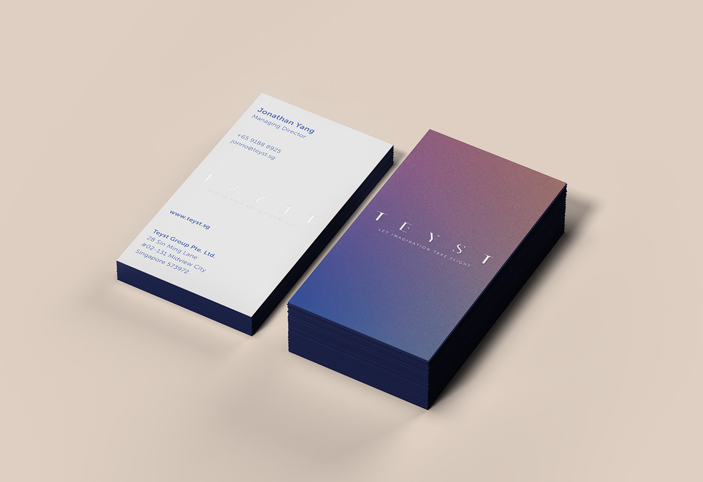
Secondary colour is introduced for differentiation purpose, for e.g. name
card. The grainy texture adapts the finishes of a film photograph, giving a raw experimental finish.