Premium Purity™ Visual Identity
ACT.Global’s Premium Purity™ reduces people’s exposure to microbes, airborne mold spores, VOCs, and NOx. Premium Purity™ in not just a solution, it also bring peace of mind to our clients.
The visual identity system has been created to ensure visual consistency and help us create a brand that is professional, high-end, and amicable.
--
The Premium Purity™ logo
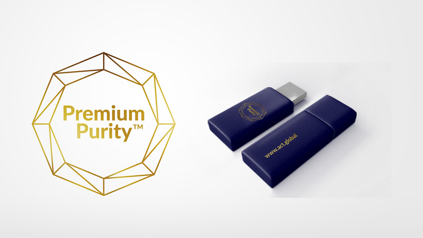
The Premium Purity™ logo is the setting stone of our branding. It is composed of the Premium Purity™ name tag, an octagon, and the ACT.Global www address.
The name tag and the www address is set in Lato Black. Steady, firm and reliable as our solution.
The octagon refers to the shape of the titanium dioxide in ACT CleanCoat™.
To achieve a balanced look, the nametag is centre aligning the nametag within the octagon. The www address is centred vertically in the octagon. Together these shapes form a unique and easily recognizable logo.

--
In a very small version, the logo can also be used without the www address.

--
Logo colors
The main color for the Premium Purity™ logo is gold.
Whenever possible, the logo should be printed in gold foil or another replication with a metal look. If possible, in digital media, the logo should be animated with highlights and shadows to represent a golden shimmer. If these options are unavailable, a static gold representation is called for.
If needed, the brightness of the logo can be adjusted to make it stand out from the background it is placed on.

The only other version of the logo is a negative version. It should only be used if it is absolutely impossible to use a gold version.

--
Primary color scheme
The Premium Purity™ color palette is rather simple. Besides the golden color of the logo, we have defined a dark blue that makes the logo stand out beautifully.
Premium Purity™ Gold | Pant. Pantone Gold Ink – PMS 871 | CMYK – | RGB – | Hex –
Premium Purity™ Blue | Pant. Pantone 5255 | CMYK 100/90/0/70 | RGB 0/0/67 | Hex 000043

Secondary color scheme
The color scheme is supplement with three secondary colors that are imported from ACT.Global’s color scheme.
White | Pant. – | CMYK 0/0/0/0 | RGB 255/255/255 | Hex ffffff
ACT Blue | Pant. 2995 | CMYK 85/3/0/0 | RGB 0/164/205 | Hex 00a4cd
Black | Pant. Black | CMYK 10/10/0/100 | RGB 0/0/0 | Hex 000000
ACT Pink | Pant. 225 | CMYK 0/80/0/0 | RGB 239/91/161 | Hex ef5ba1

--
Lato
Premium Purity™ uses Lato as its primary font. It is beautiful, available in many variations, web-compatible, and free. You can download it here:

--
Stay Bold
Premium Purity™ also has a display font, Stay Bold. Stay Bold is used to make the design more personal and living. The font is used in the first words of headlines, and always with capital letters. Stay Bold is a company font that can be found and downloaded from SharePoint.

--
International alternatives
If you need a font that is not part of the Latin or Cyrillic alphabet you may find a free google font that resembles Lato in visual expression. Please have the chosen font approved by HQ before using it. Thank you. https://www.google.com/fonts

--
The photo style – a uniform appearance
At ACT.Global, we like our pictures to be large and interesting. As we are in the business of sustainable disinfection, nature is one of our favorite objects.
No matter the object, our pictures always have an interesting angle. We see things from interesting angles; top view, ultra close-up, and mostly with a lot of calm copy space.
Below are some examples of our photo style.


--
Making the complicated simple
Statistics and graphs are essential. They make our invisible products visible – and Premium Purity™ is built on science and facts.
We always strive to use thin lines in our visual representations and, if possible, to stay within our primary colour scheme. However, understanding precedes visual design.


--
Examples


