


Casparo
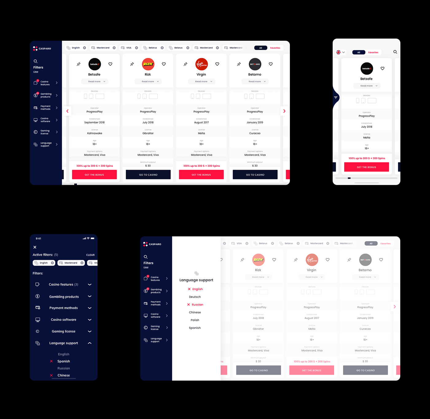
Casparo is an online casino comparison tool, made to provide players with the best deals in fair, licensed and legal casinos. The tool gathers hundreds of different websites and apps and enables users to compare tens of factors like game providers, payment methods, player support etc.
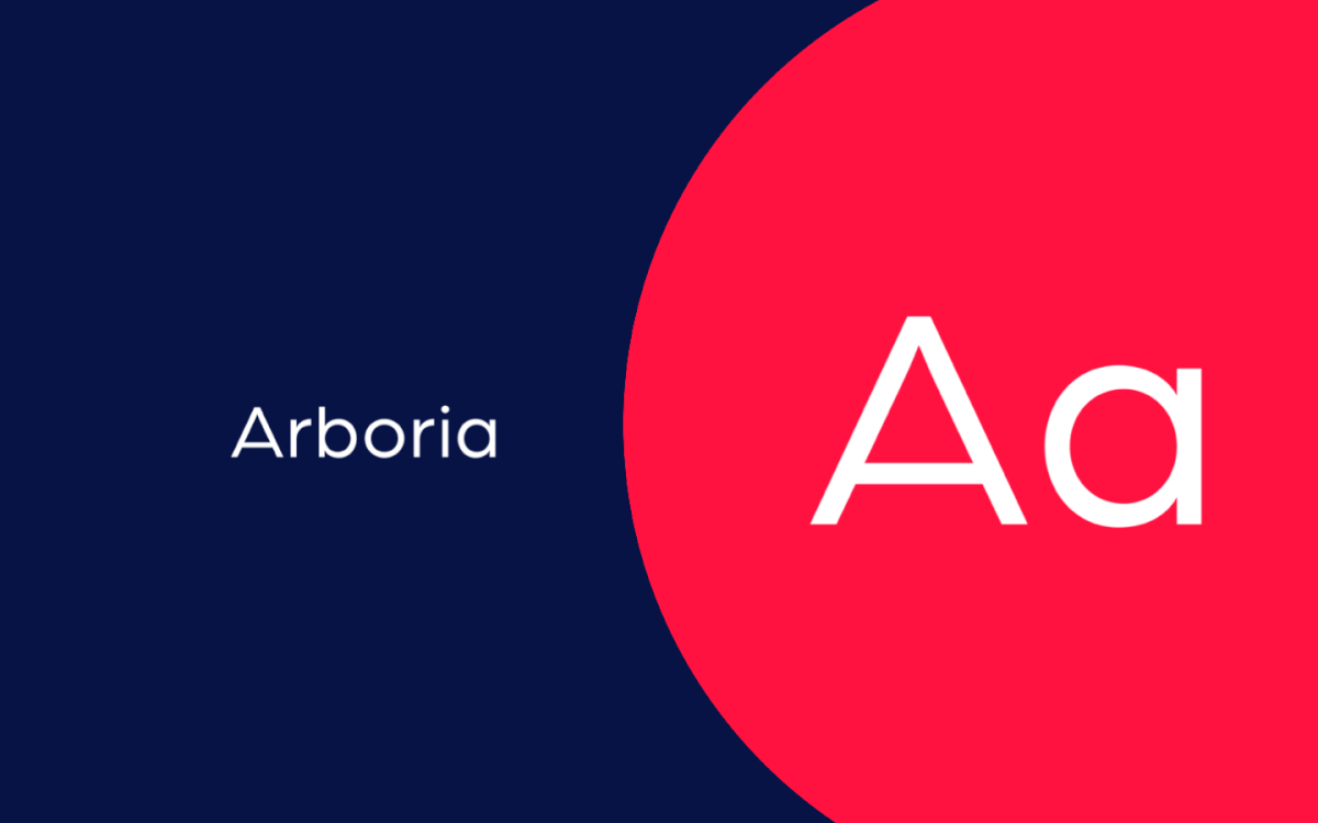
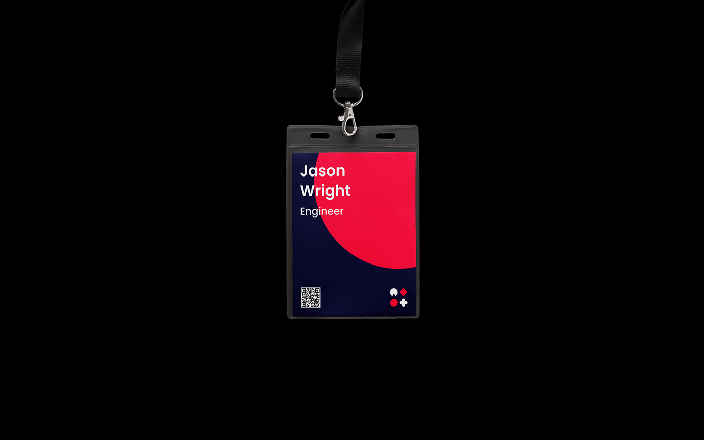
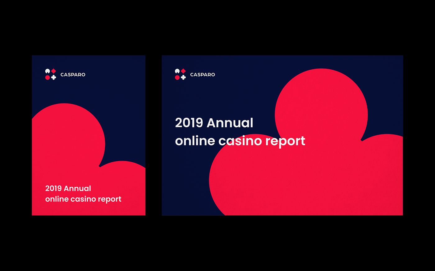
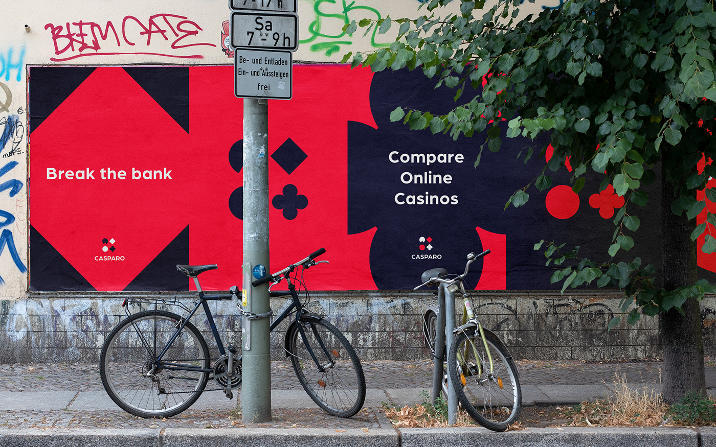
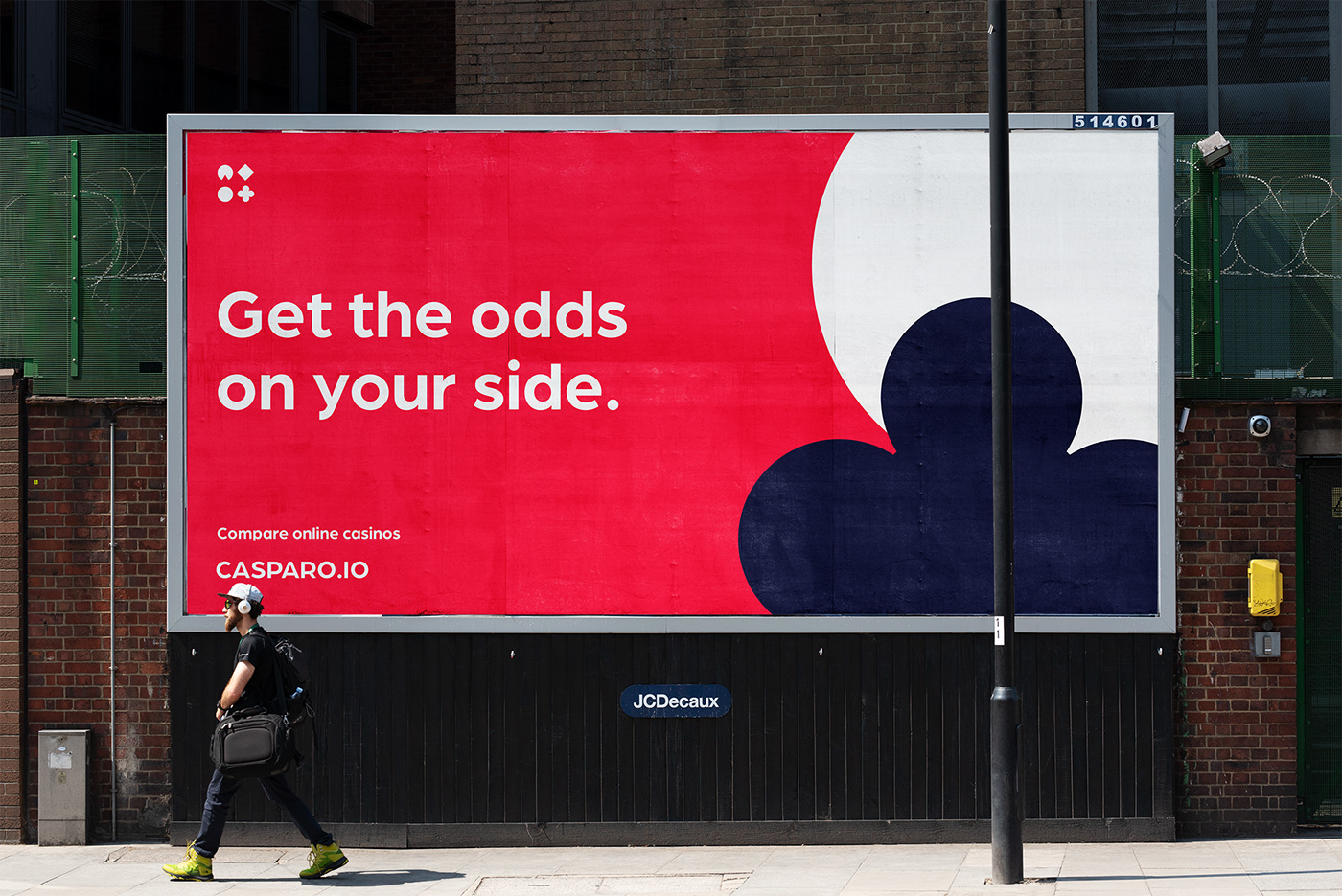
Our goal was to create bold identity subtly connecting the product to the casino world. As a base, we used modernized and abstracted versions of colors and shapes related to table games, slots and card games. We started with classic black and red and turned them into deep navy and saturated, pinkish red. We also used abstracted playing card suits symbols for the logo and most recurring visual elements. For the wordmark - we used Arboria font, which slightly lowered bars in uppercase letters add some vintage, old-school casino vibe to the modern, sans-serif font.
Another element important for us was motion. Since the product will be also strongly advertised digitally, we needed to supply the brand with recognizable motion design. To achieve that, we created movement patterns inspired by rotating and bouncing slot machine elements. All elements combined, we supplied Casparo with versatile and easy to use identity for both physical and digital applications.
Our role was also to design UX/UI of the web and mobile apps & design the product's website.


Thank you!
Herodot is a multidisciplinary team of skilful designers, developers and strategists who work together to develop striking digital products.
We are a trusted partner for many renowned companies, including major sports organizations and enterprise companies.
Want to work with us?
contact us via
or visit


