
Overview
Sense installs in your home's electrical panel and provides insight into your energy use through our iOS, Android, and web apps.
I started at Sense in 2017 as the first designer. I established Sense's first design guidelines and implemented them across all platforms, refreshing the apps visually.
1.0 Styleguide
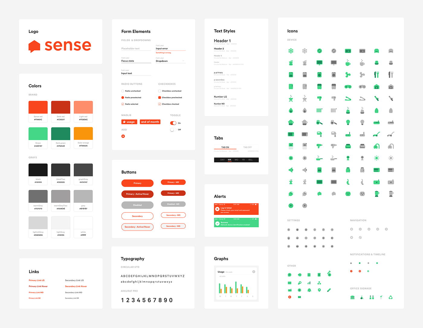
One of the first things I did when starting at Sense was to create a styleguide that could be used across our various products to establish brand consistency.
2.0 Design updates
2.1 UI changes
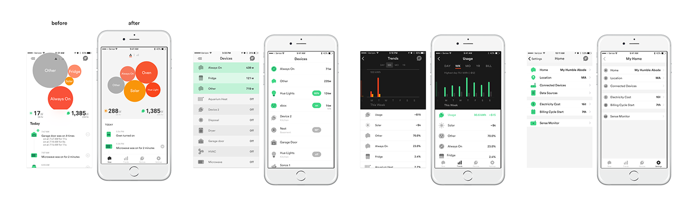
Using the styleguide as a reference point, we made some design changes to the mobile apps. We rounded the corners of our cards, bar graphs, and buttons in order to match our brand which features our very round device icons and rounded primary font, Circular.
We established a more consistent use of color; using our Sense orange for touch points and calls to action, and our green to show energy use in the graphs and on/off states. We changed the icons in the settings pages to be more consistent for easier scanning.
2.2 UX changes
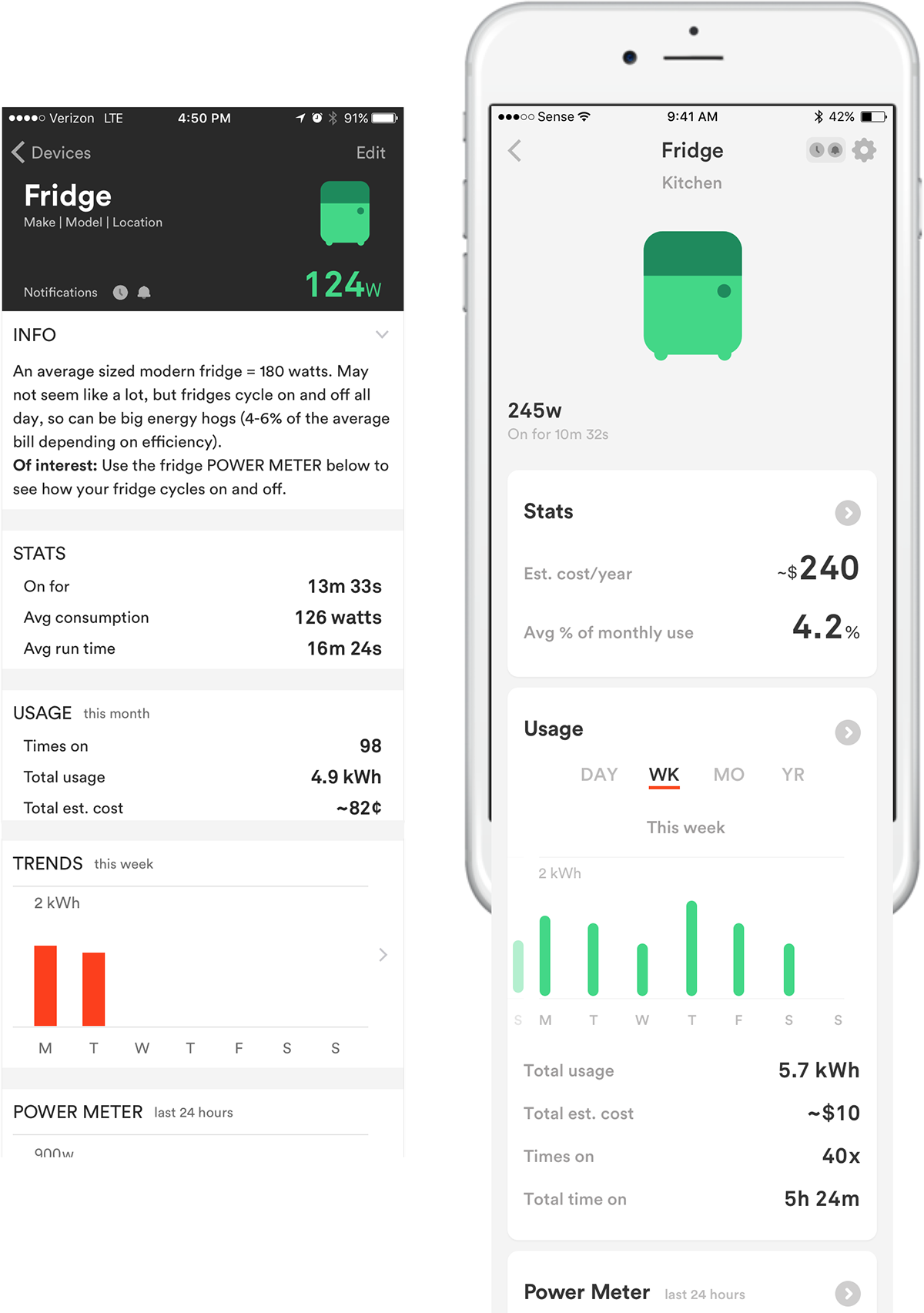
One question we kept coming back to was 'how do we make the app and stats easier to understand?'. We reworked the device details page and highlighted 2 of our friendlier and useful stats stats upfront ('cost per year' and 'average % of monthly use'). We placed the additional stats and text into a secondary screen.
We combined the old static graph and stats so that users can now scroll through trends over time and see dynamic stats.
We also created one spot for device settings and management; this was in 3 places before.
2.2.1 Tab bar navigation
We switched from our old hamburger nav to the tab bar to allow users to navigate the app easier and make some of our newer features more discoverable.

