


Open. Friendly. But most importantly, simple. It’s all about Rocketbank. A ‘classical’ bank means complicated tariff tables, endless agreements in minuscule letters, and lots of paperwork. That’s not us.

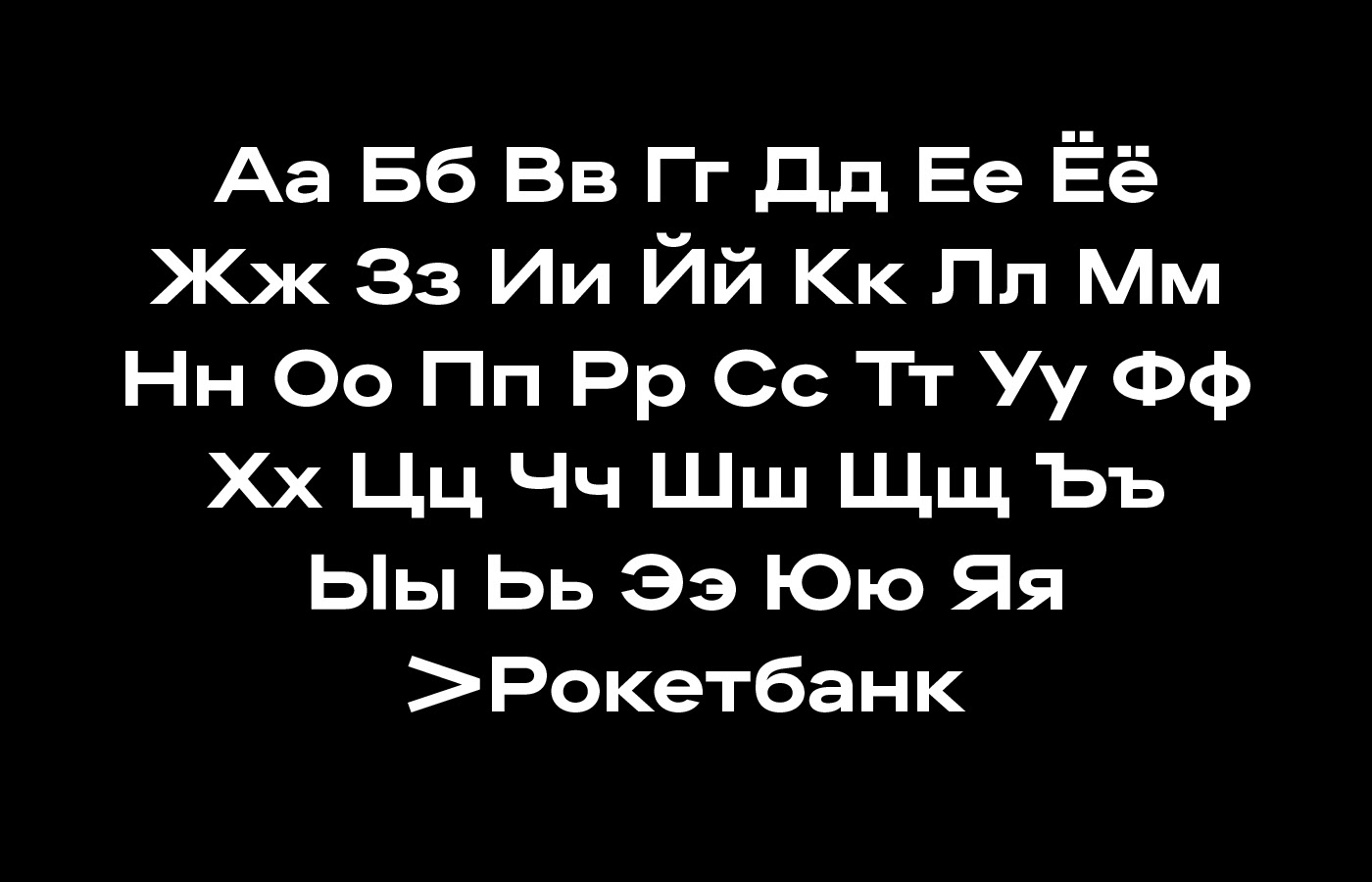
This arrow first appeared on our debit card Spring 2019 and led to an avalanche of changes. The update of our visual language had been brewing for a long time already. We started off with discovering our own unique voice. We created our corporate typeface.

The typeface creative brief sounded like that: ‘As if the neural networks were given the task of producing a font and it turned out to be an average grotesque but with human errors’. You can find out more about the typeface in its author’s instagram.
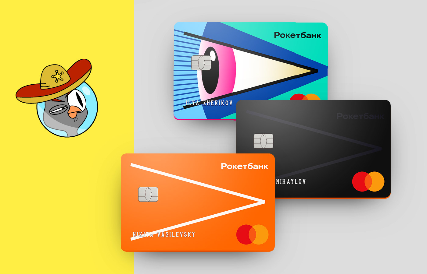
We’ve also got a new flexible identity. The new logo consists of two parts: the arrow and the text. They can be used both together and separately.
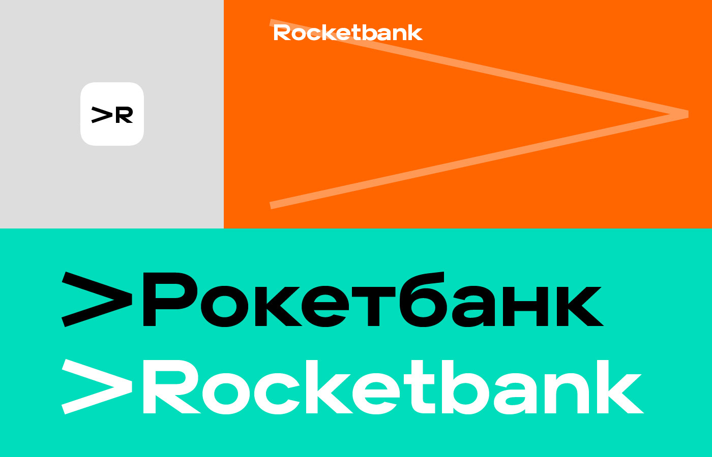
If the arrow is used separately it fills the entire layout.

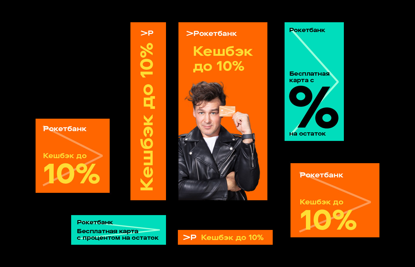
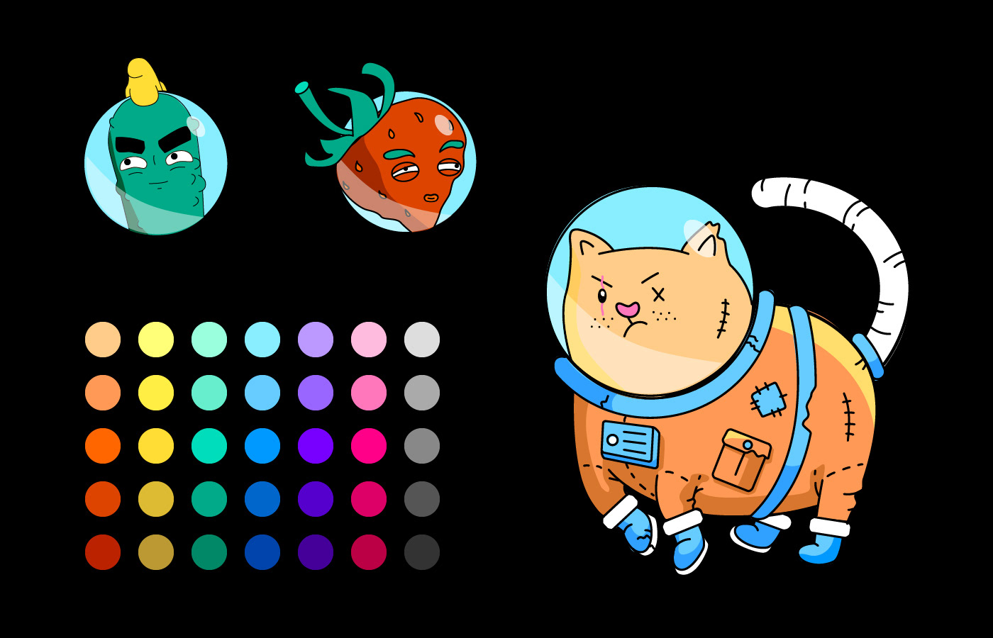
Rocketbank is not about halftones. We use a bright colour palette. Its basic colors are used in all of our designs, the additional colors are for illustrations.

Concept and design: Ilya Zherikov
Product design lead: Artyom Zimmer
Logo and typeface: Alexander Cherepanov
Motion design: Ksenia Dobrovitskaya
Illustrations: Elena Makushina
Original 'arrow' card design: Nikita Vasilevsky


