


I developed a unique creative direction for the Augmenta new website following the brand guidelines already made with a clean and elegant look and feel.
This project contains:
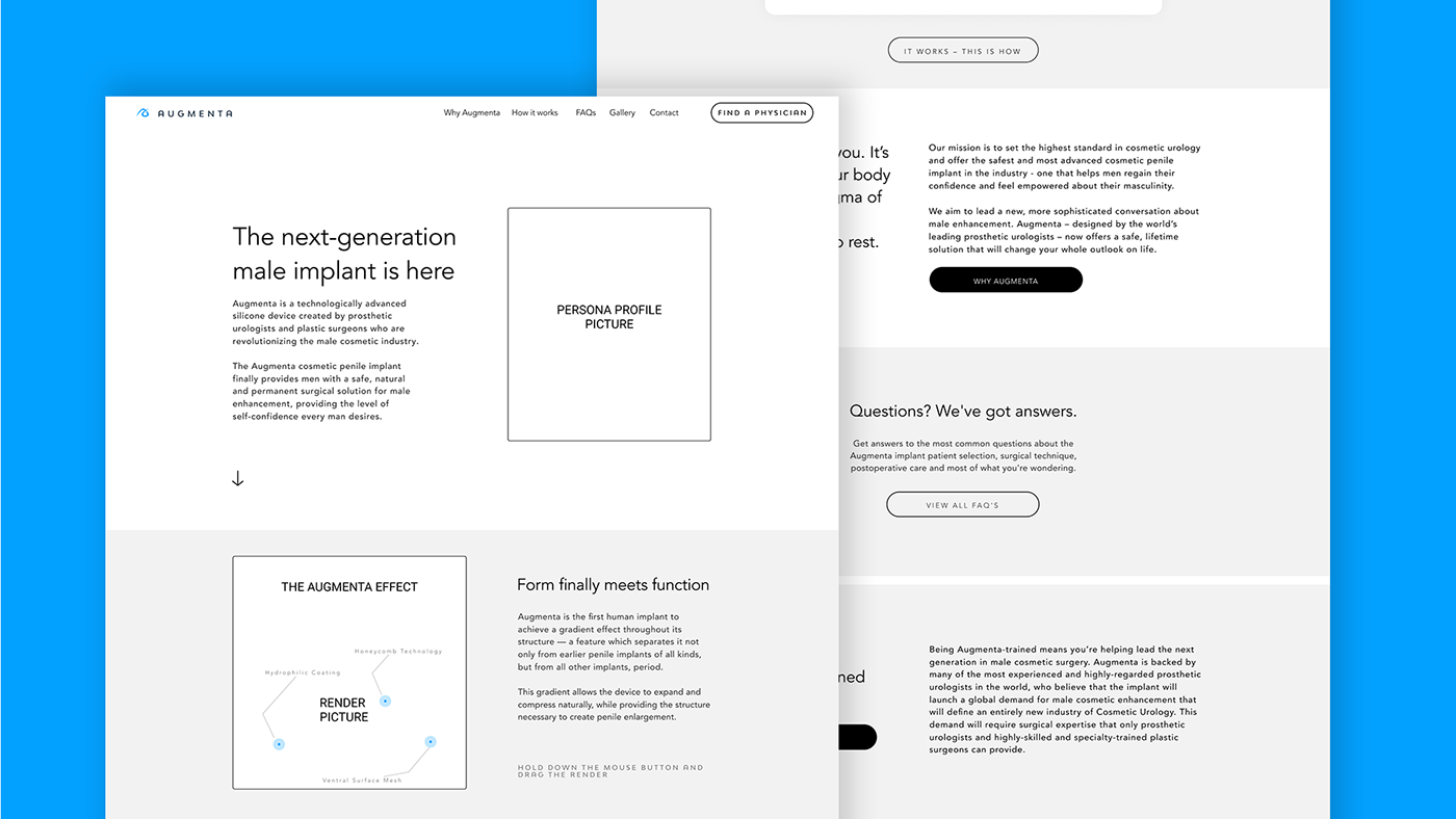
- Home page + interior pages design
- E-mail signup and social media links
- Custom CTA and form design
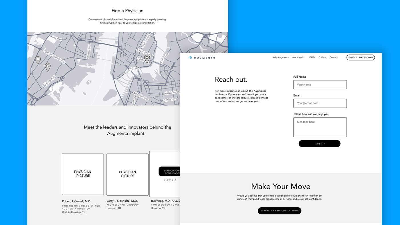
- Surgeon locator tool
- 3D model experience (featuring zoom and feature hot spots)
- Beautiful animations and mobile-friendly experience
- Standard SEO friendly sitemap and setup
USER PROFILE AND UX FLOW
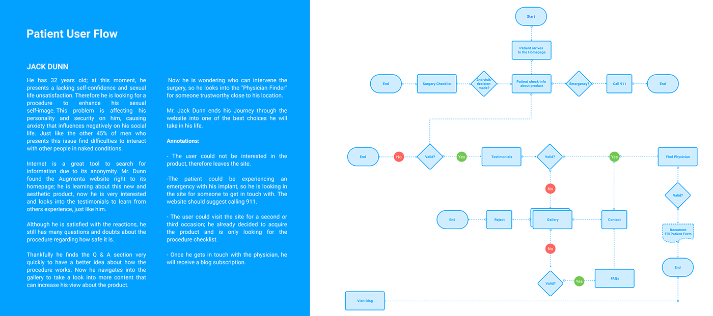
INFORMATION ARCHITECTURE
SUMMARY
The process to get into results was primarily, know more about the user and the reasons they have to visit a site like Augmenta.
I did two cases of study, one for a regular patient and other for a physician interested in the procedure.
The main focus of this project phase was Information Architecture. On chapter 1, it was created scenarios for the user flows to determine how they are going to navigate through the website, and this way, verified the info needed.
For chapter two and based on the site map you already made, it was enlisted all the partial content. The CTAs, features, and loopholes that the information or navigation system can have where exposed here.
After that, it was organized by categories and by hierarchy.
At last, in chapter 3, it was made a site flow integrating the architecture on a site flow with screen sketches.
This flow was made for a static website. The content will be pretty much the same, and the objective is education, communicate, and made contact for the first time with this professional product/procedure. Although, will have dynamic motions interactions to create a balance with the corporate site.
The site flow is based on user cycle navigation and a "Z" lecture. When people visit a website, especially the first time, they do not explore everything on the page carefully, and in detail, they scan it to find a hook which would catch their attention and convince them to spend some time on the website.
To make it cycling also we have on the homepage CTAs and footer the links to the content in different ways, so the user doesn't feel that is the same thing. This way, the user will read in a "Z" direction and cannot get lost in the optimal journey he should be doing: know the product - find a physician - make contact.
However, on the mobile version of the site will have the header on a Hamburger menu, having free the space making the interface full of air as well as save the place for other essential layout elements.

KEYS
- The header lecture is ordered based on the ideal hierarchy navigation for the user to accomplish the final goal.
- Based on research and study, A sign to call 911 for an emergency has been added since the product is related to surgery intervention. Stress cases should always be considered on surgical related sites. Since the user could be experiencing an emergency related with the procedure in question.
- The homepage includes breviaries of the essential info on each stage with a CTA to encourage the user to click and learn more.
- The content numbers are based on hierarchy.
- CTA on “Product” screen navigates to “Finder” screen through the interaction.
- CTA on “Finder” screen navigates to “Contact” screen through the interaction.
- CTA on “Testimonials” screen navigates to “Contact” screen through the interaction.
- CTA on “FAQs” screen navigates to “Finder” through the interaction.
- CTA on “Finder” screen navigates to “Contact” screen through the interaction.
- CTA on “Testimonials” screen navigates to “Contact” screen through the interaction.
- CTA on “FAQs” screen navigates to “Finder” through the interaction.
- The footer is arranged by hierarchy too, where the “Legal” and “Privacy Policy” are in 1st and 2nd place opening a new internal screen.
Also, a link to the blog and social media is an essential key to reinforce the Finder screen and Contact forms presence.
Also, a link to the blog and social media is an essential key to reinforce the Finder screen and Contact forms presence.
- I added a situational case where the user already decided to make the surgery with an Augmenta Physician. Then the site provides a downloadable PDF with all the surgery requirements. This way, the website becomes a continuous experience for the user to proceed on further steps.
WIREFRAMES
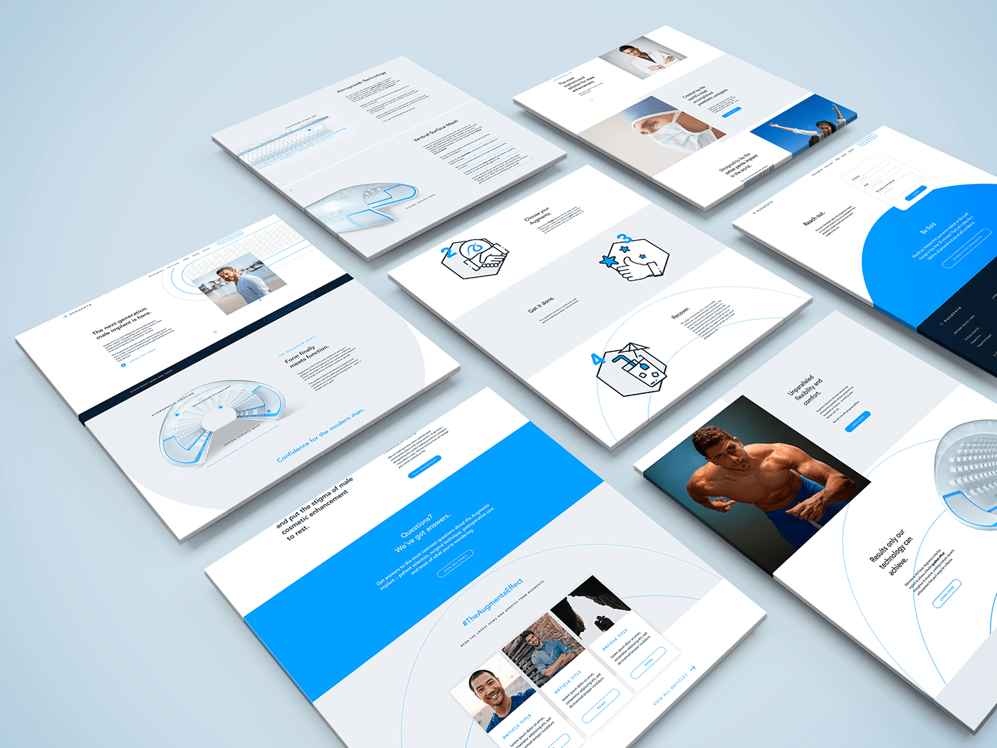
UI HIGH RESOLUTION


MOTION STUDIES
Please appreciate if you like this project!


