

Young Design Lions 2013 ̶ Philippine Entry
The Cannes Chimera is an initiative of Cannes Lions International Festival of Creativity in partnership with Bill & Melinda Gates Foundation. It aims to solve world problems one at a time every year. A Chimera Brief is given out to the Creative Community asking it to submit ideas on how to solve the problem for that year.
The Young Design Lions' task is to create a logo for this Brief.
The Creative community can help heal our wounded world.
Help, call for distress, healing, hope - concepts that are represented by a cross. Ideas, creativity, imagination, on the other hand, can be depicted by a pencil. Combining these well-known symbols, we created a logo for the Chimera Creative Brief: four pencil tips representing the Creative community converging towards one goal, targeting issues that need immediate attention, represented by the cross. Not only can this logo be universally understood, it’s also relevant to the purpose of the Cannes Chimera Initiative, which is to seek the efforts of the Creative community in helping to alleviate pressing issues worldwide.
Instead of a colorful logo, we decided on gray since it exudes seriousness, reflecting the gravity of the issues. Gray
also represents maturity and dependability, the kind of help the initiative is seeking.
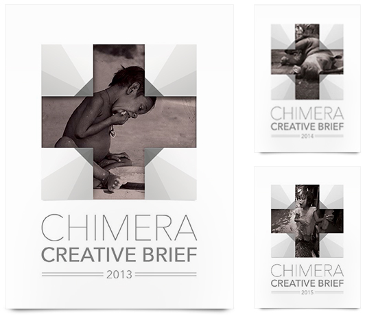
Different issues can be presented inside the “cross” of the logo, representing the problems tackled in the Chimera Creative Brief. The issues change annually, hence, the images as well. It will also appear that these images / issues are the target of the pencils that represent the Creative community.

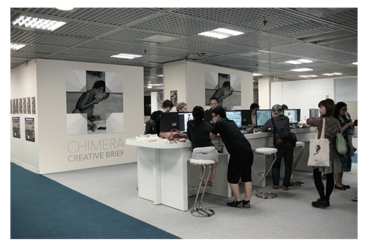
on-site application


