
ISTD: Circus Brief - "Distort Circus"
BRIEF:
The brief for Major 1 was set by ISTD and required the branding and application for the Museum of Circus, a hypothetical museum.
CONCEPT:
For this project, I took inspiration from the distortions of the body in contortion, a circus act.
I wanted to detract from the stereotypes and negativity surrounding the circus and challenge the public to alter their views.
As the brief was for ISTD and needed a predominantly typographic outcome, I created distorted type using glass bottles and liquid to capture my concept. The type and imagery I distorted were those commonly associated with circus - animal cruelty, clowns, harlequin/stripe patterns and generic western and circus fonts.
I wanted to invite people to view the circus from an alternative angle - skills of performers, visual beauty etc - and to see the mysterious side of circus in a positive light.
The marque itself is simply the word "circus" distorted to represent the concept (distort circus). It is contained within a circle to echo the continuous presence of circles in circus' make-up - 3 ring circus, tents, rings, the continuation of history/tradition, flexibility, fluidity etc.

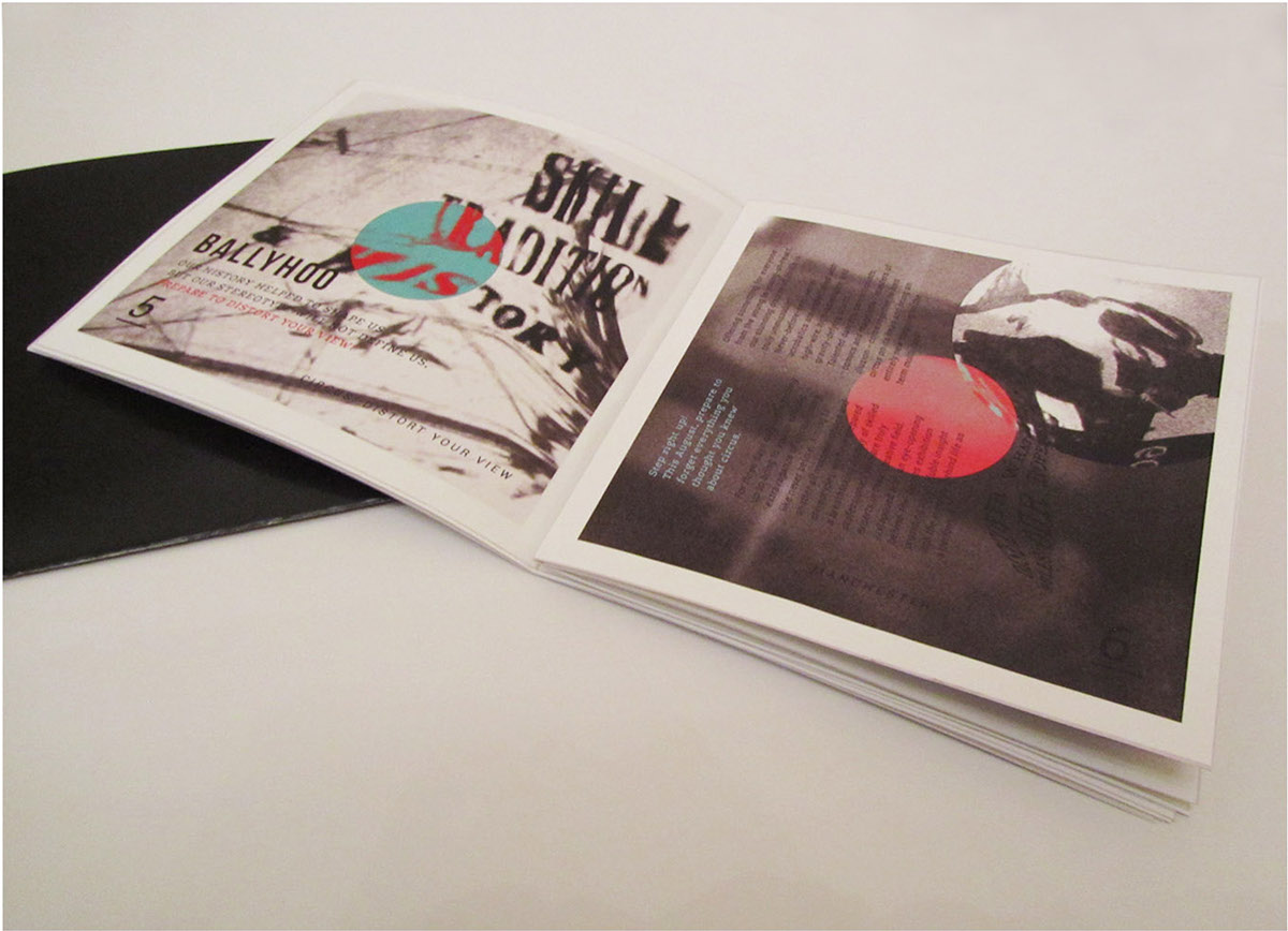
The programme of events is saddle-stitched and features distorted circus imagery to almost beyond recognition in order to capture the brand message of looking at circus differently and altering stereotypes. The colours reflect the personality of circus and challenge the viewer to look more closely at circus tradition (blue and red), as it is not what it seems.
The barcode is contained within a circle on the reverse to mirror the front cover and to continue the sub-theme of circles - a subtle nod to tradition.
The booklet is contained within a black cover slip to conceal the excitement and colour of circus hidden within and evoke curiosity. It forms a metaphor for the contrast between the bleak stereotype and the exuberant reality.

Circles are continued throughout the programme centred in the same position as the exterior marque. This represents that tradition still lies at the heart of circus despite many stereotypes being outdated.
The circles are the only areas inside the booklet that are coloured in the traditional red and blue of the cover.
The programme contains distorted type in common circus and western typefaces, illustrating stereotypical circus phrases such as "roll up, roll up" and "clown around". This juxtaposition reinforces the brand message.


To display the brand across other platforms I created tickets and popcorn boxes that I felt were appropriate to a museum.
Both feature type that is distorted across folds and from a change of perspective.
If viewed from a certain angle the word "popcorn" appears normal, yet from another angle is distorted. This creates a visual metaphor for the concept.
An additional popcorn box design features contrasting interior and exterior patterns which relate to those in the programme, whilst the side of the gift bag continues the interactive distortion of type through the fold of its structure.


I created a set of posters for the museum featuring imagery and distorted type consistent with those used in the programme.
The predictable visual language of circus posters has been distorted to encourage viewers to challenge their perception of circus and its stereotypes.
Angles of the building distort type so that although when viewed from one angle the text appears normal, when the viewer moves to view from another, their perception of the type changes.


