


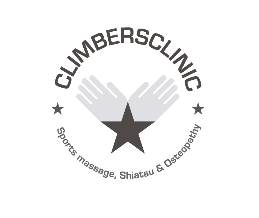
This ClimbersClinic rebranding was developed by working with the client, who had a clear idea of what they wanted. They are a clinic that is based at The Castle Climbing Centre and a lot of their clients are climbers, as you can imagine. The logo plays with ideas of revolution while referencing their hands-on practice.


The colour palette has evolved to more complex, mature colours from the bright primary colours originally used.


Their business cards are also used as flyers for people to take.


I created 4 different colour-ways of gift tokens for variety.
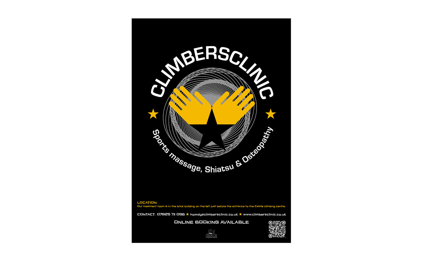

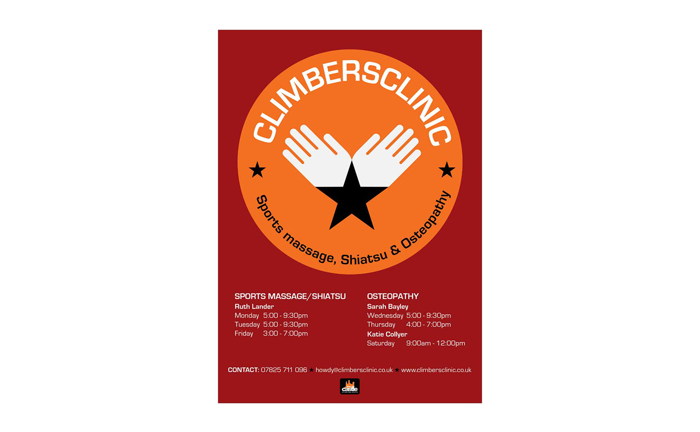
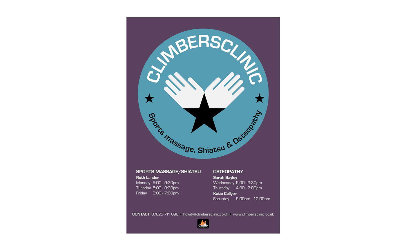
These posters needed to be eye catching but also contain the vital information about treatments and booking times.
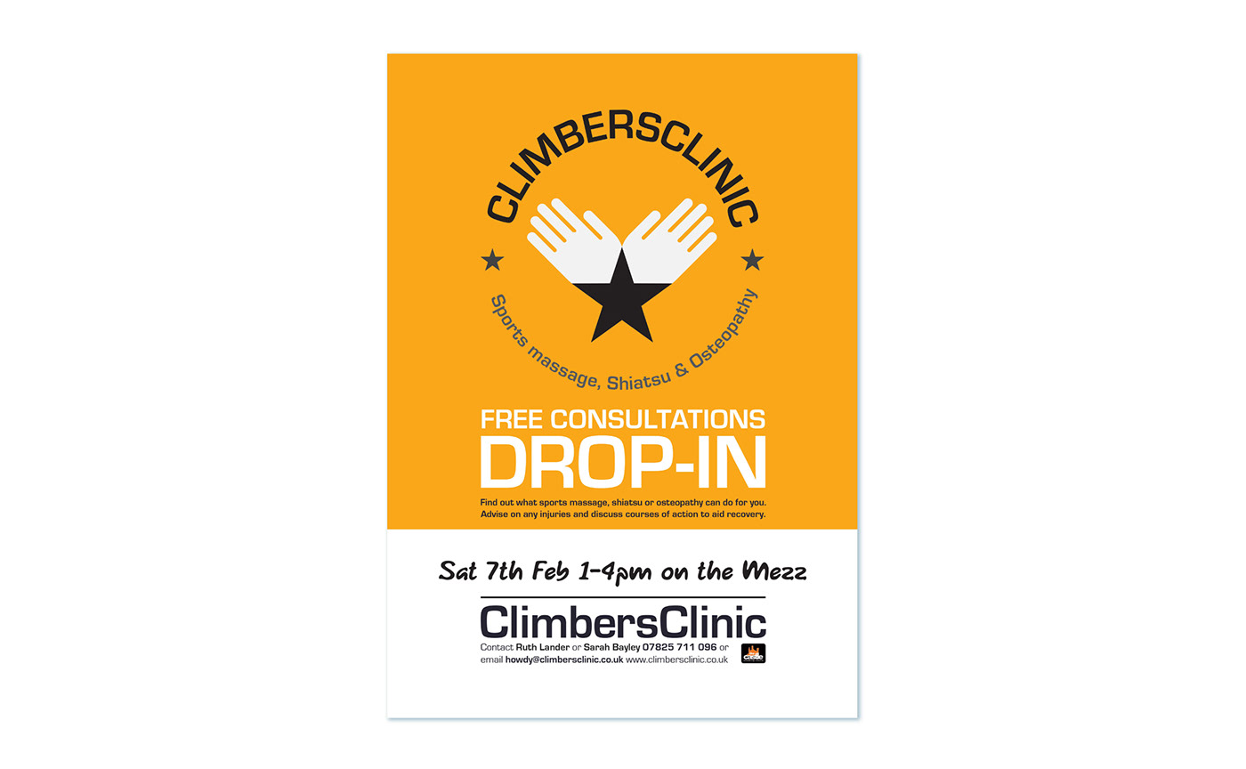
This poster is to advertise special drop in sessions, so has a space at the bottom where time and location can be added by hand as required.
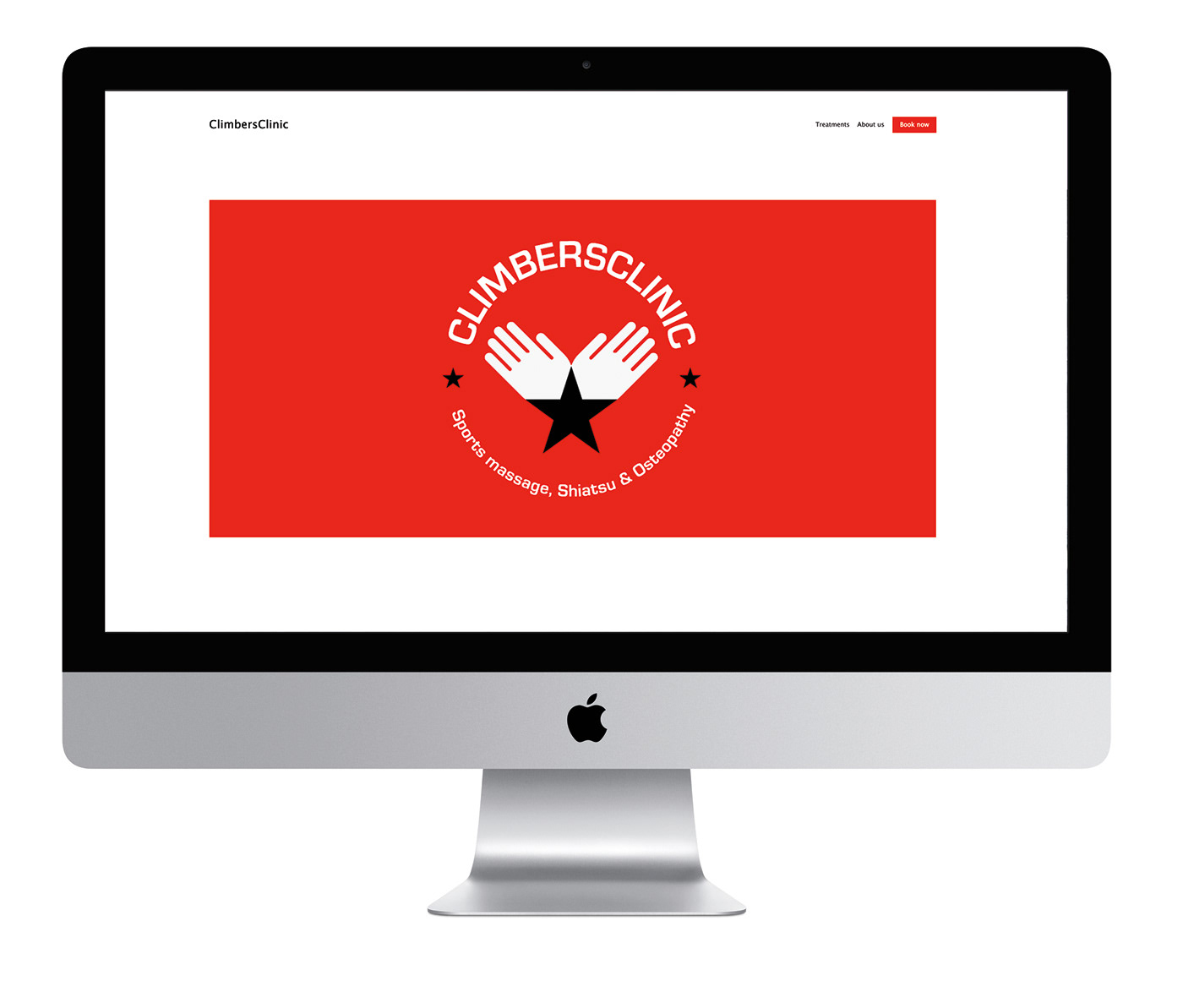


I also developed a simple, striking website design for them, to allow users to book appointments quickly and easily.


These are three flyer designs created to promote particular events and offers. Popeye was an amusing reference to their stereotypical clients, who are climbers with strong but injury-prone arms.


