A project completed for my packaging design class at Westminster College asking us to design and market a new brand of our choice. I chose to create a chocolate brand.
Brand Statement for the project:
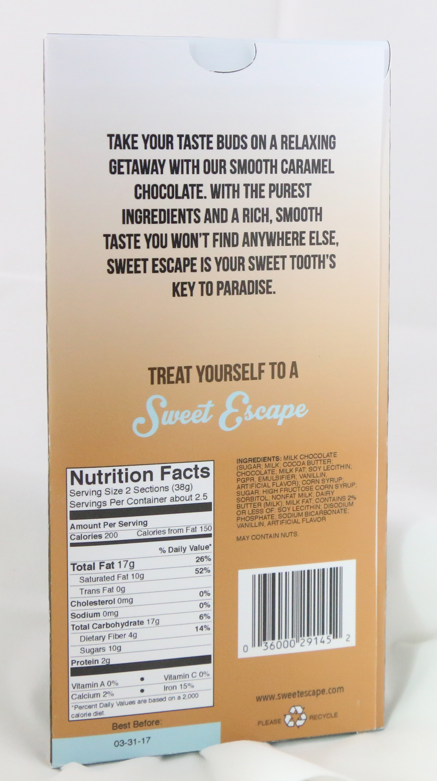
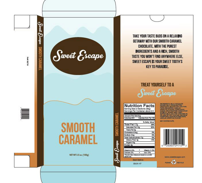
Chocolate is more than a treat; it’s a luxurious experience. That’s what we aim to provide at Sweet Escape. Take your taste buds on a relaxing getaway with our chocolate. With the purest ingredients and a rich, smooth taste you won’t find anywhere else, sweet escape is your sweet tooth’s key to paradise. Treat yourself to a sweet escape.
Additional product information:
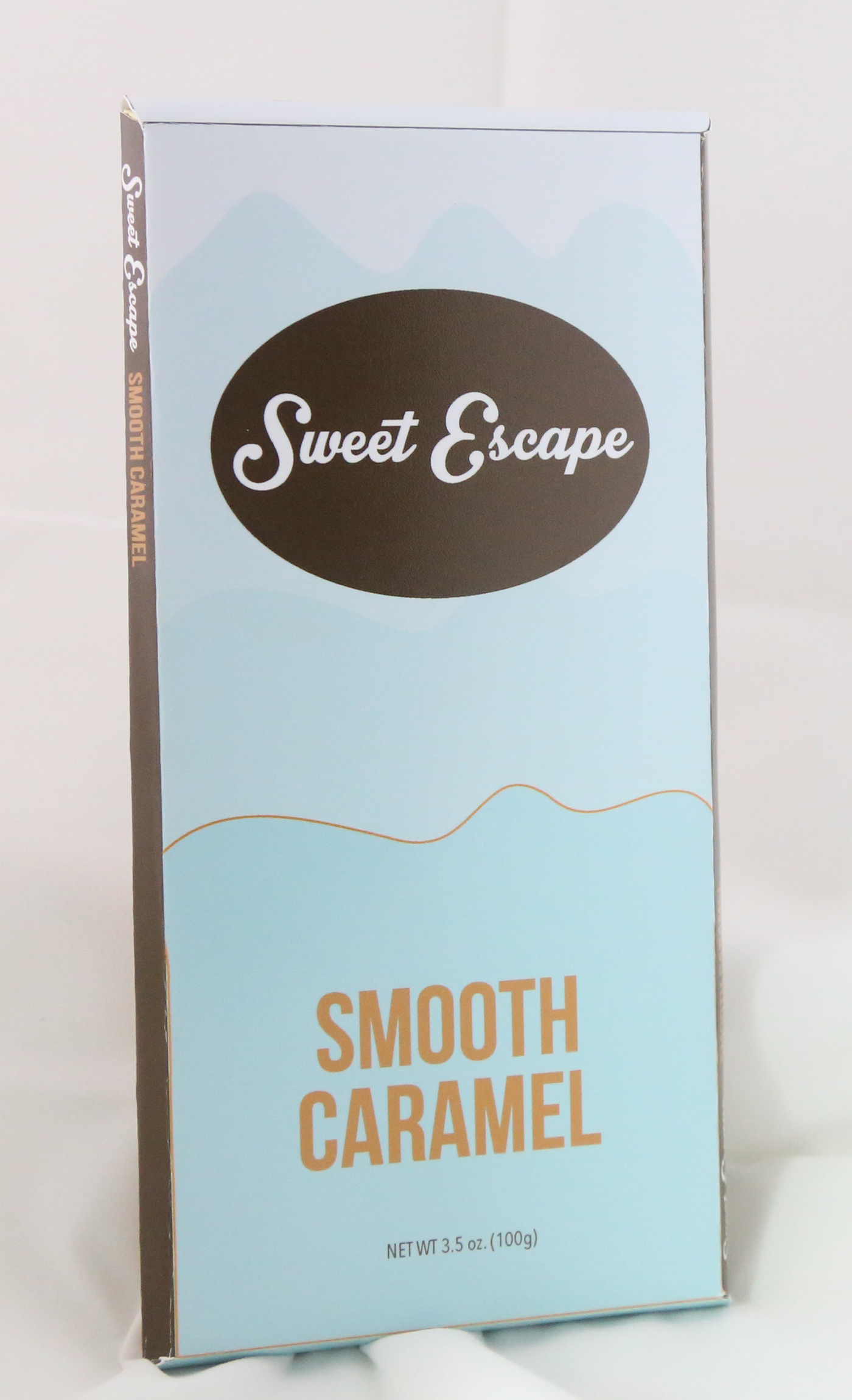
Sweet Escape uses light, friendly colors on their packaging to draw customers in and set themselves apart from other chocolate brands, while still incorporating a small amount of the warm brown color that helps evoke feelings of nature and reliability, and of course, chocolate. Other packaging for this line of chocolate bars would include a light yellow color and a light orange color, keeping with the flowing shapes and changing opacities, possibly incorporating circles and other soft shapes. The color of the flavor typeface attempts to represent the flavor of the chocolate bar to help consumers quickly locate the flavor they want.