"Pickled" series
2010
2010
School project in package design. Pickled deli was my choice of designing the package series. I've made a research first in local supermarkets. All pickled or canned vegetables were using the illustrations or photography of product, but design was excesively colourful in general and full of unimportant and misleading crap.
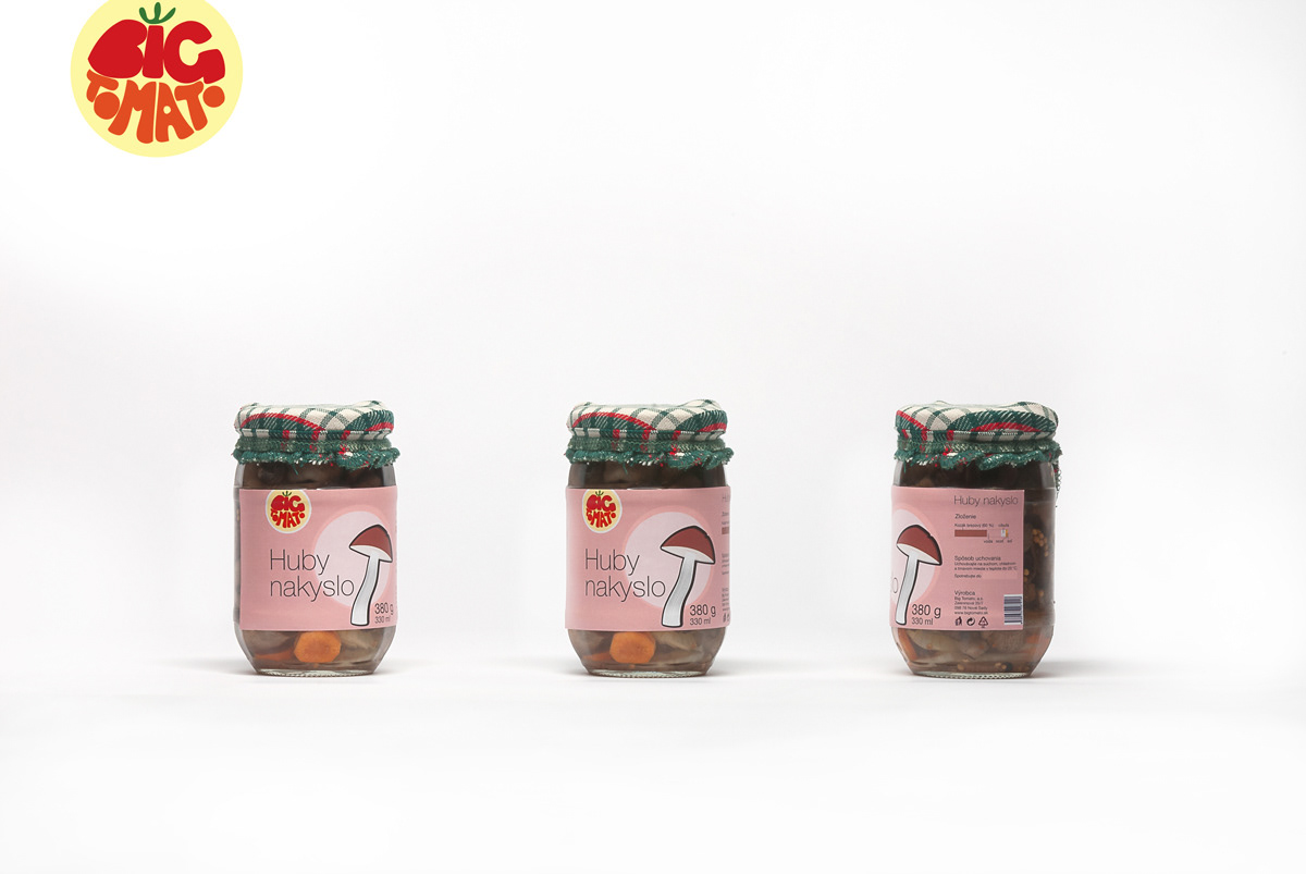
I decided to work to design a clean package, distinguishable from the existing ones. I created the pictograms of vegetables with the same amount of stylization concerning the potential customer, who should be able to identify easily brand identity and its products.
In addition, logotype was the extra work, I didn't put it as much attention as I would, if it was the project for a real customer. Anyway, I just wanted a red dot, which will be allerting the potential customer, so I made a quick sketch of imaginary Big Tomato brand.
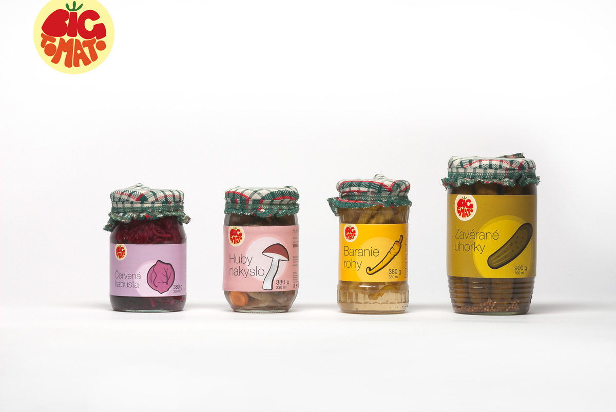

I could not resist to take this 80's-eastern-block-commercial-type photography, when all products are in one row, like soldiers.
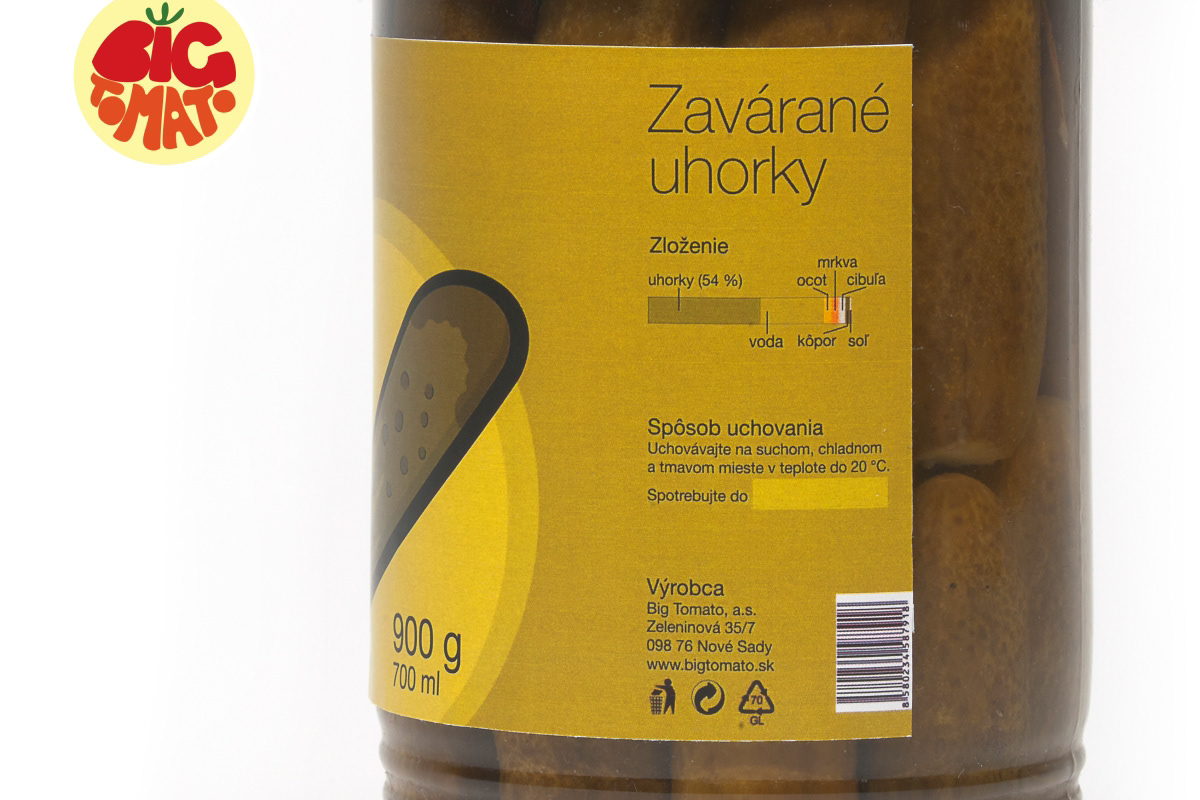
Close-up of technical information.
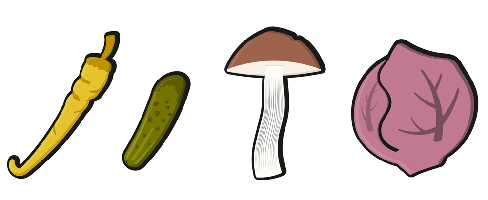
Pictograms
Special thanks goes to Barbora Hudzíková, who made me the top cloth.

