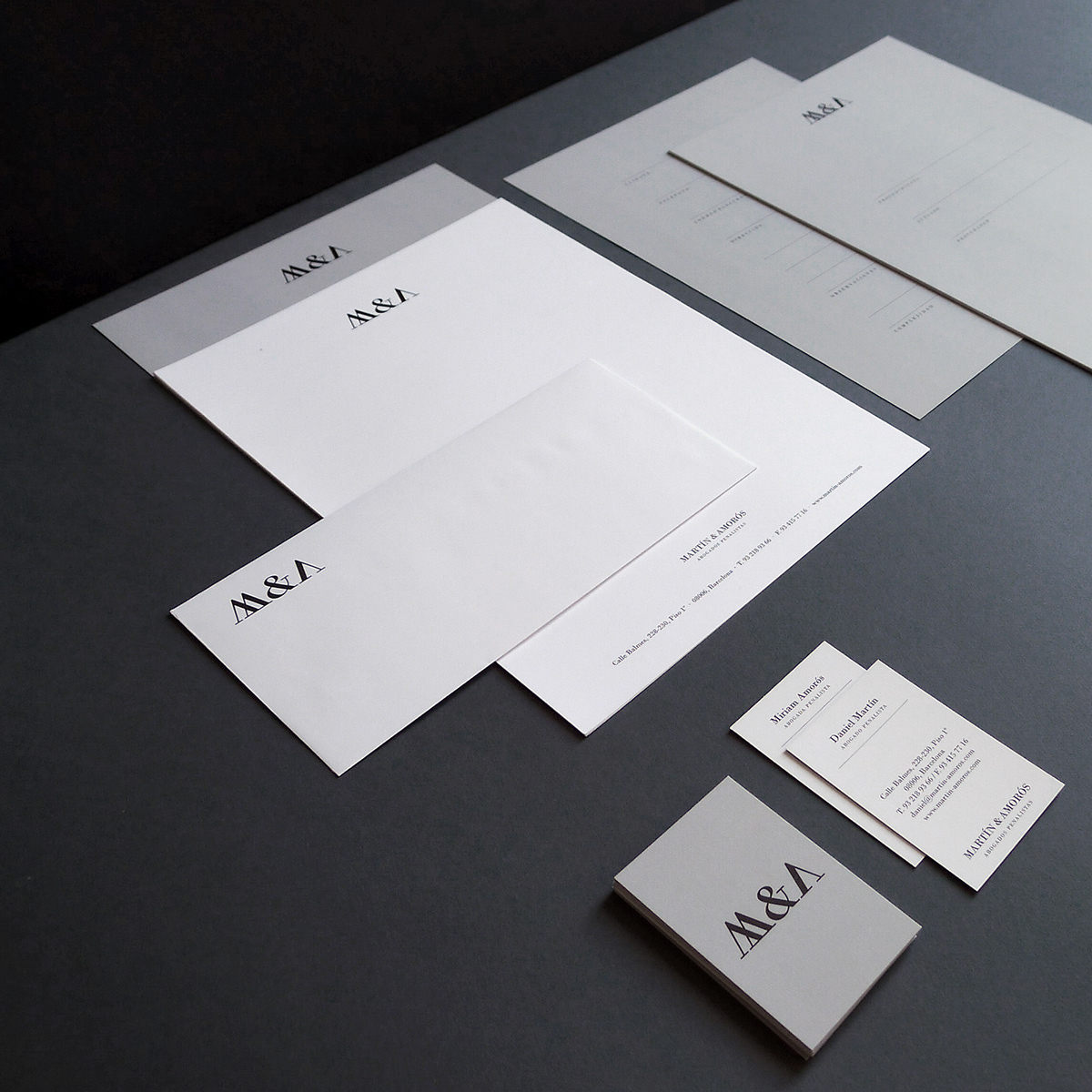
M&A commissioned us to help solidify the identity of their law firm, fruit of their recent professional partnership. This included the logotype design, stationery, business cards, and a look & feel for their website.
Martín & Amorós is a law firm that offers legal services based on excellence, commitment and obtaining results. It was founded by two young lawyers with years of experience in criminal law, an ethical and coherent vision are the pillars that provide added value to this partnership. They aimed to create a distinctive image to create recognition within a very competitive and prestige-driven target.
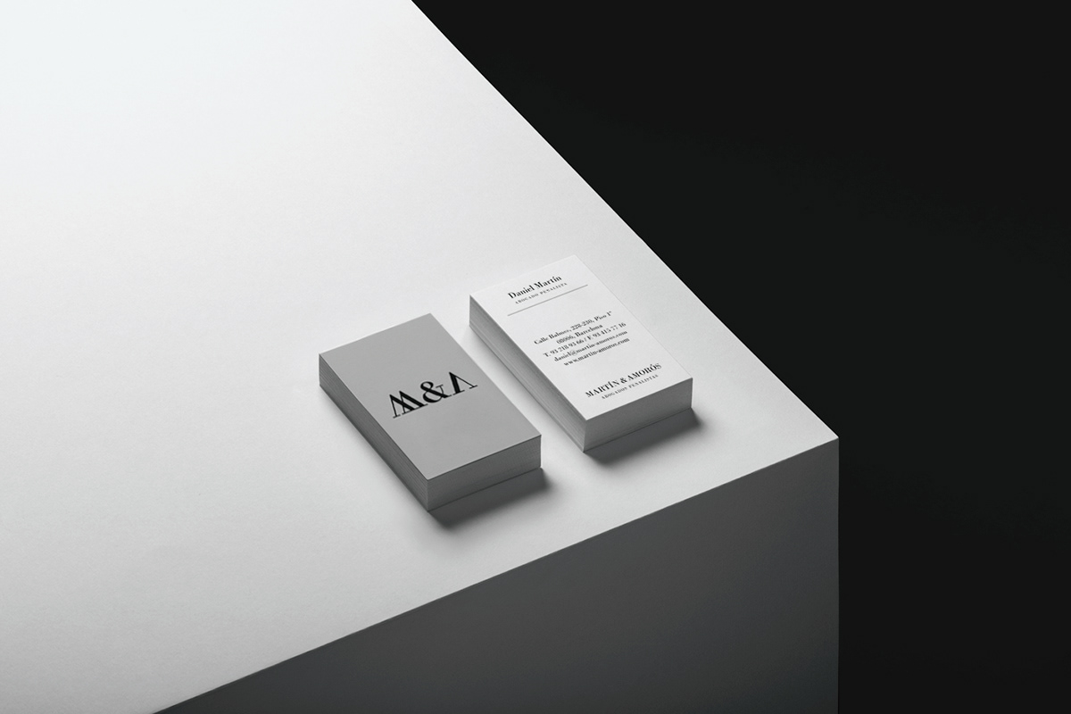
The logo’s classical high contrast typography enhances their expertise features, feels well-founded and functions as a compact shorthand for the name. It’s distinctiveness, however, comes from a spirited twist that clearly plays with the legacy and authority associated with erudition but rendered in a contemporary way.
We took inspiration in the numeral system that originated in ancient Rome and enumerate the hundred of law volumes spines at any lawyer’s shelves. Playing with the number V, we created an M and an A. This addresses initial perceptions, with proximity, frequency and quality of service ultimately giving real value to the logo.

The desire to appeal to the more affluent market is satisfied through the expense and abundance of material detail and print finish. These include uncoated fine papers and weighty boards. There is a variety but consistency, with a distinction in the combination of grey/black/white, hues that are reassuring in their corporate familiarity.