


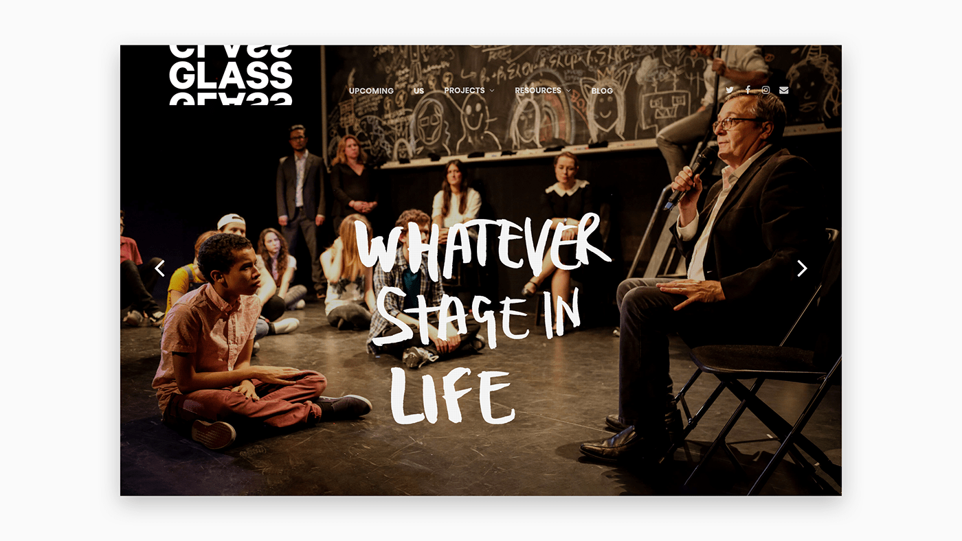
Glass are a dynamic, internationally renowned theatre company, but instead of working with trained actors they work with members of the public, using improvisation and their own experiences to build a performance. As a result, each Glass performance is completely unique, demonstrating the scope of human emotion.
When they asked us to rebrand I felt they should own their name more and it immediately offered lots of visual cues to expand upon: light; angle; transparency; reflection, etc.
But I wanted to focus first on the overall concept. After research, I wrote down a list of words and phrases that they encapsulate. And there was one that stood out.Essentially what they are doing is ‘Reflecting Experience’.
But I wanted to focus first on the overall concept. After research, I wrote down a list of words and phrases that they encapsulate. And there was one that stood out.Essentially what they are doing is ‘Reflecting Experience’.
This informed the logo – a modern creative marque featuring a bold, repeating logotype that hinted at the limitless potential of real life as source material for authentic storytelling, and ensuring stand-out in a crowded arts scene.
The human element is intuitively reflected by using handwriting, with it’s warmth and spontaneity, as well as it’s imperfections. I used brush and ink for a looser and textural feel, writing all the words and phrases I had earlier brainstormed. Combined with the the logo and tagline this establishes a flexible, bespoke range of assets and brand personality. This is supported by a comprehensive set of brand guidelines, covering everything from values and personality to visual specifications and implementation examples.


Produced while employed at Front Page.


