


Authenticity, longevity, and sustainable use of resources are expected from good design today. For over 80 years, Artek, a Finnish furniture company, has been sourcing materials and manufacturing products responsibly, creating timeless designs that are made to last, using natural and renewable materials. Easy to maintain, repair, and repurpose, Artek products can be kept forever, making the company today more relevant than ever.
Kokoro & Moi designed the visual identity for the campaign that brings out the themes of conscious consumption and tells the story of the company and its responsible practices.
Kokoro & Moi designed the visual identity for the campaign that brings out the themes of conscious consumption and tells the story of the company and its responsible practices.
Our work, rolling out during 2020, extends from the design of the visual communication materials to spatial implementations, installations, and exhibitions, as well as the design of the print and online advertising of the campaign.
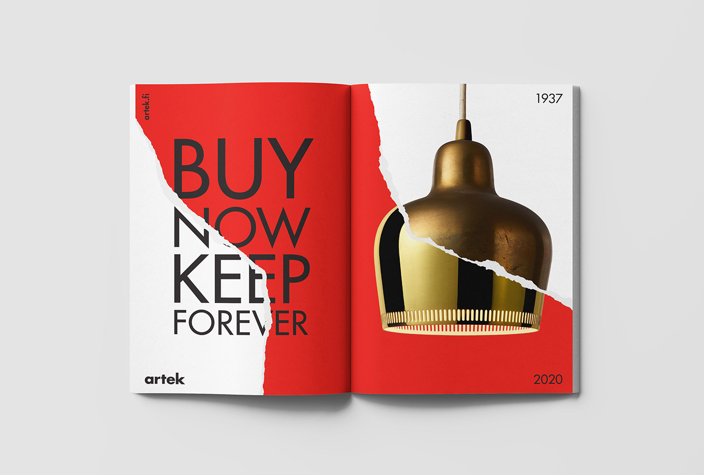
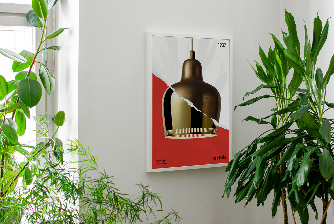
Visual identity for the campaign found its inspiration from the timeless design of Artek's products. In the applications, the surfaces are "torn" into two parts, with the upper layer showing the new version of the product, and the lower layer showing the old version, combined the way the two images form a single product image. The layers representing the different eras of the same product convey the message of timelessness and longevity of Artek's designs, the products you can buy today, and keep forever.
The color palette consists of three Bauhaus-inspired tones of red, blue, and yellow. Artek's brand typography Futura was used for the texts and slogans, which were provided by the client. Photographer Christian Jakowleff took the product photos for the campaign.
The color palette consists of three Bauhaus-inspired tones of red, blue, and yellow. Artek's brand typography Futura was used for the texts and slogans, which were provided by the client. Photographer Christian Jakowleff took the product photos for the campaign.


