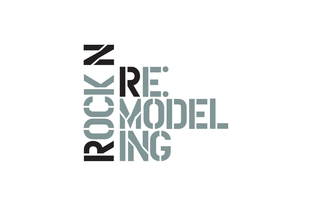
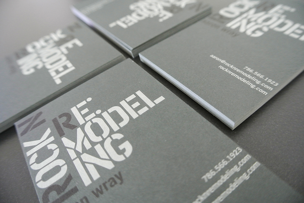
Rock N Remodeling
Brand Identity
Brand Identity
Aaron Wray of Wray Enterprises wanted to re-brand his construction and remodeling company in anticipation of moving from New Jersey to Miami Florida. The logo needed to reflect Aaron’s two passions; music and construction/remodeling. The resulting logo represents the functional side of the construction business, using right angles for the stencil typography and a PMS black to highlight the brand initials adding a deconstructed look and depth. The colors where chosen to reflect a darker rock n roll attitude. The stationery was printed on French Paper Construction Steel Blue with medium green grey and black inks.