


The logo was design with the family in mind. The tent used to represent camping is framed within
a simplified vector family holding hands. With the tent shows the fire of their bond.
a simplified vector family holding hands. With the tent shows the fire of their bond.

This is the postcard that was used to mail to guest for the exhibition. The design is meant to represent
the glow of the fire at night while camping. The high contrast is carried through to the typogrpahy.
the glow of the fire at night while camping. The high contrast is carried through to the typogrpahy.

Families will receive this envelope upon joining BONDFIRE.

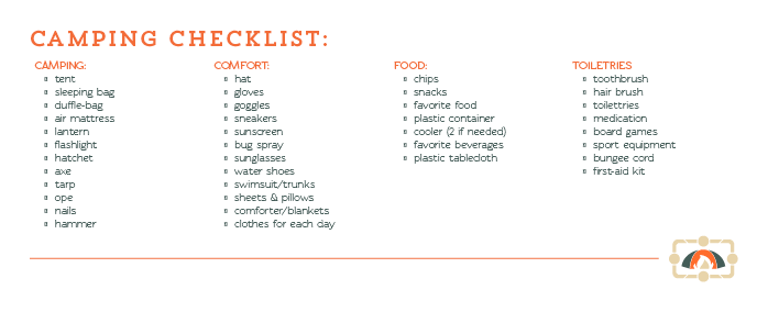
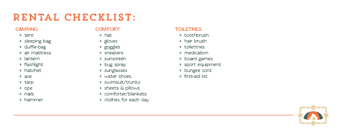
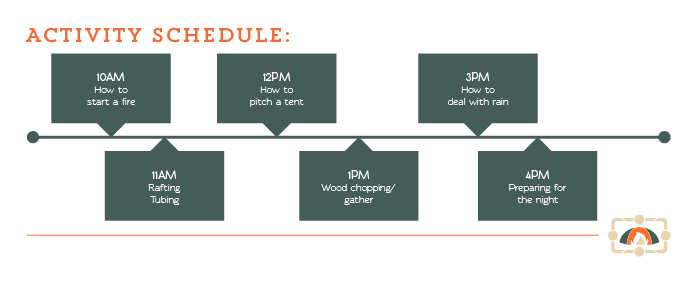


These are inserts that go into the envelope. The inserts contain a welcome,
campground map, packing checklist, rental checklist, activity schedule, and bus schedule.
campground map, packing checklist, rental checklist, activity schedule, and bus schedule.


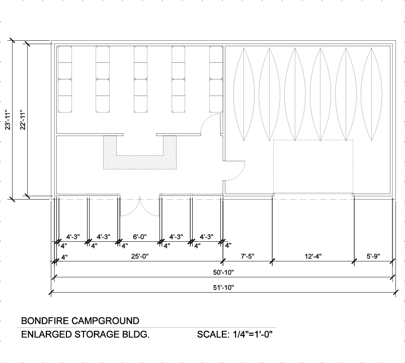

Architectural drawings were made for the campground itself as well as its buildings.

This shot was photo directed by myself and a great photo team.

In an exclusive on campus gallery this is exhibition space that was created to showcase
all the design and physical assets of the campground as well as its pricing.
all the design and physical assets of the campground as well as its pricing.

Scale models were created of the entire campground, a single, campsite, and the rental storage building.

A close up shot of the campsite scale model.

Logs were used to display the membership envelope, postcard, and business card.
Space were carved out of the log to place all materials into the logs.
Space were carved out of the log to place all materials into the logs.

Here are the three logs with all the branded material. A model bus to show how campers will be transported. Branded family mugs are placed within the log beneath the bus. To left are family branded hats. On the right are the printed materials.

Family branded t-shirts are hung on a clothes line like campers would hang clothes while camping.

My wife and I sporting the family t-shirts with the exhibition space.


