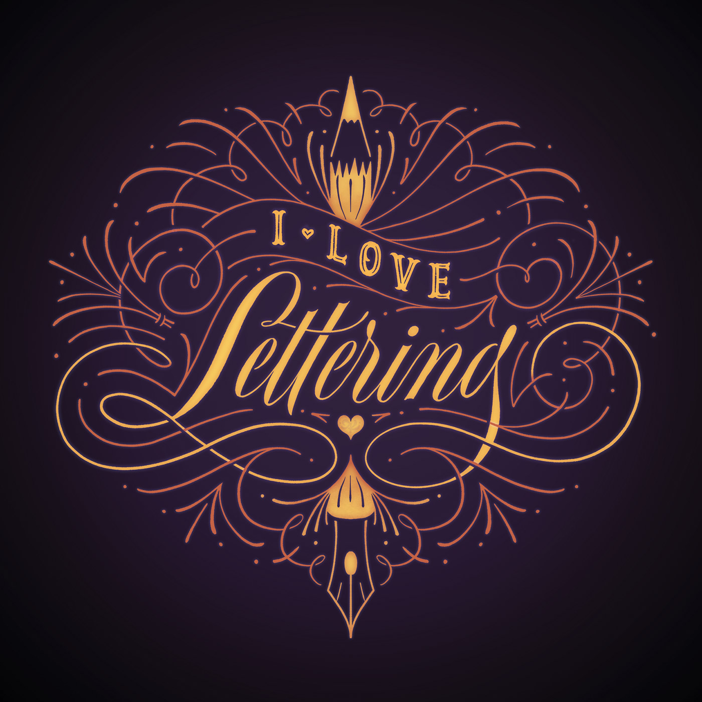
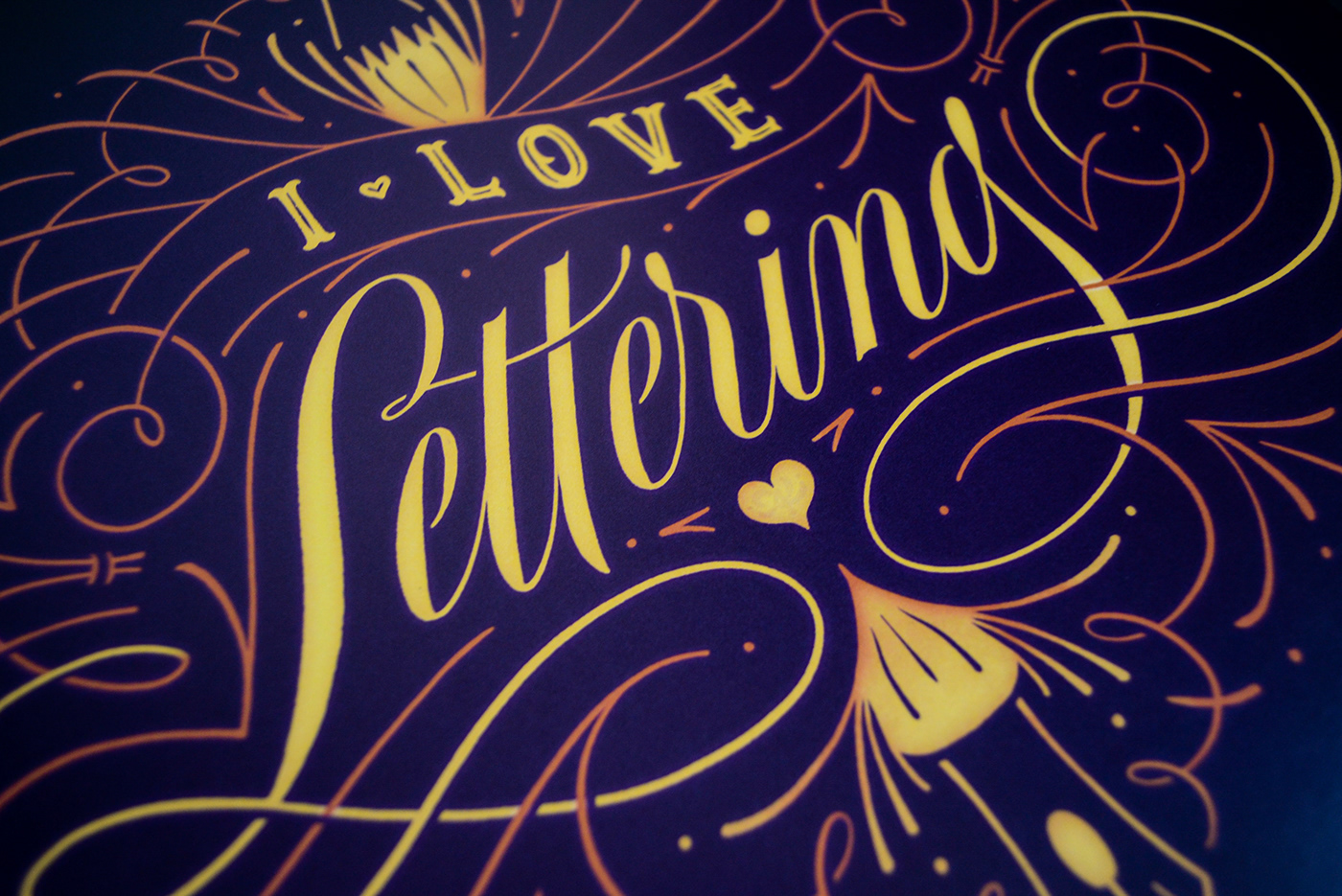
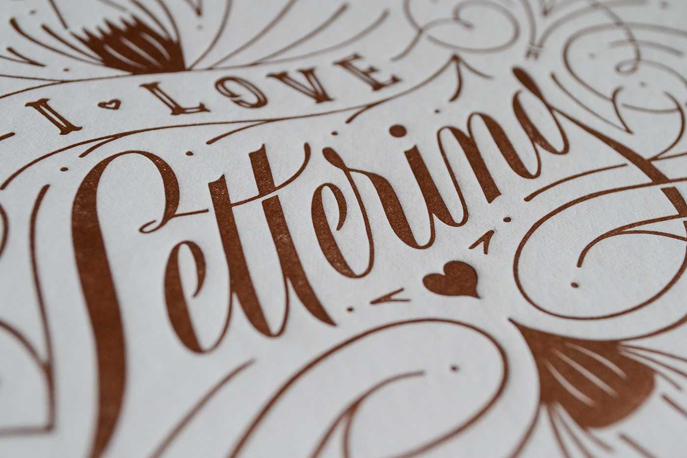
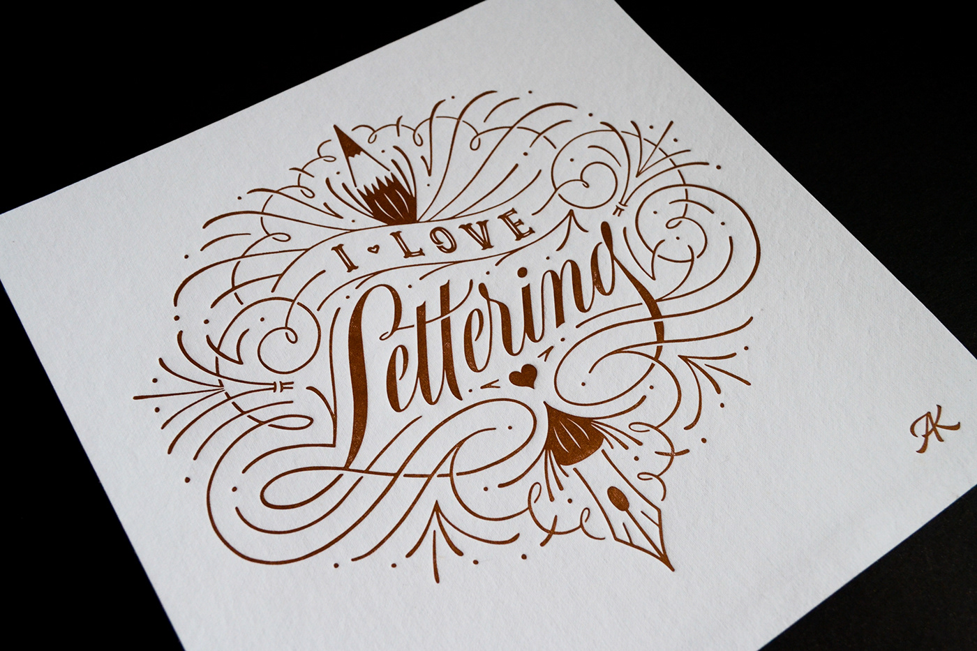
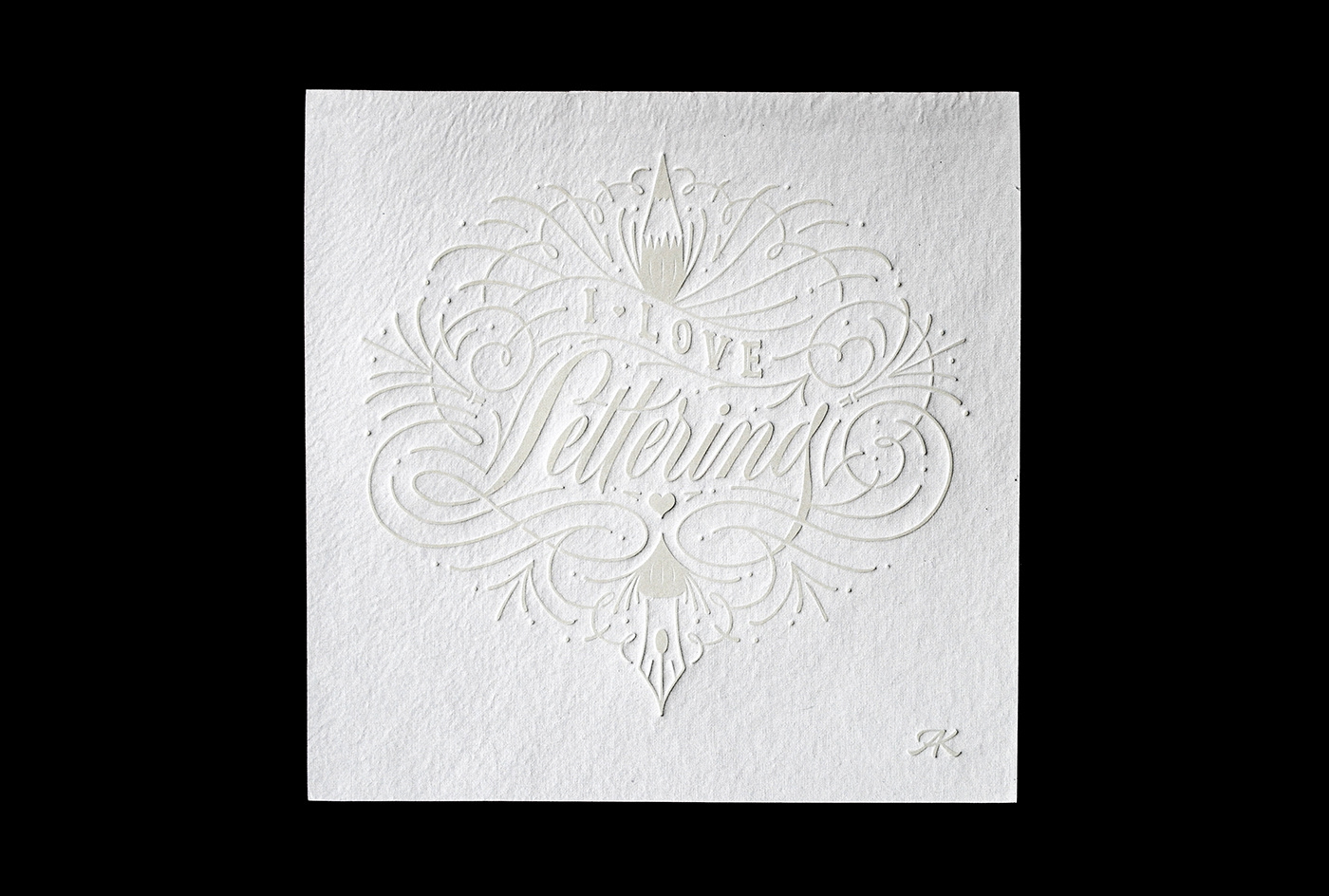
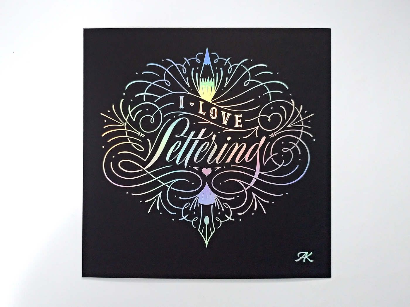
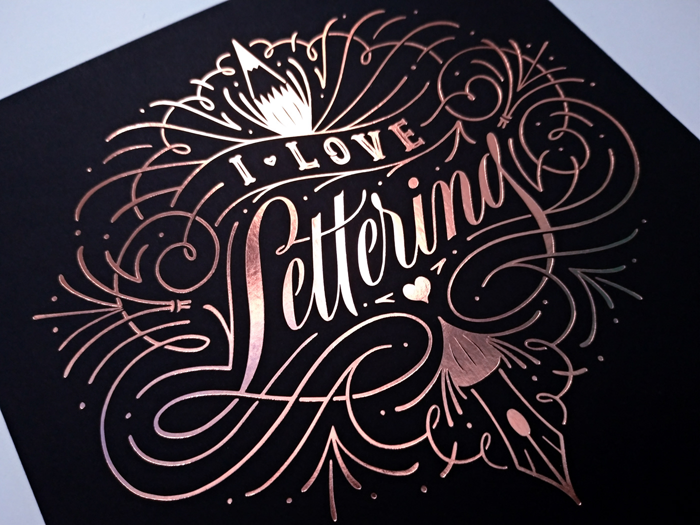
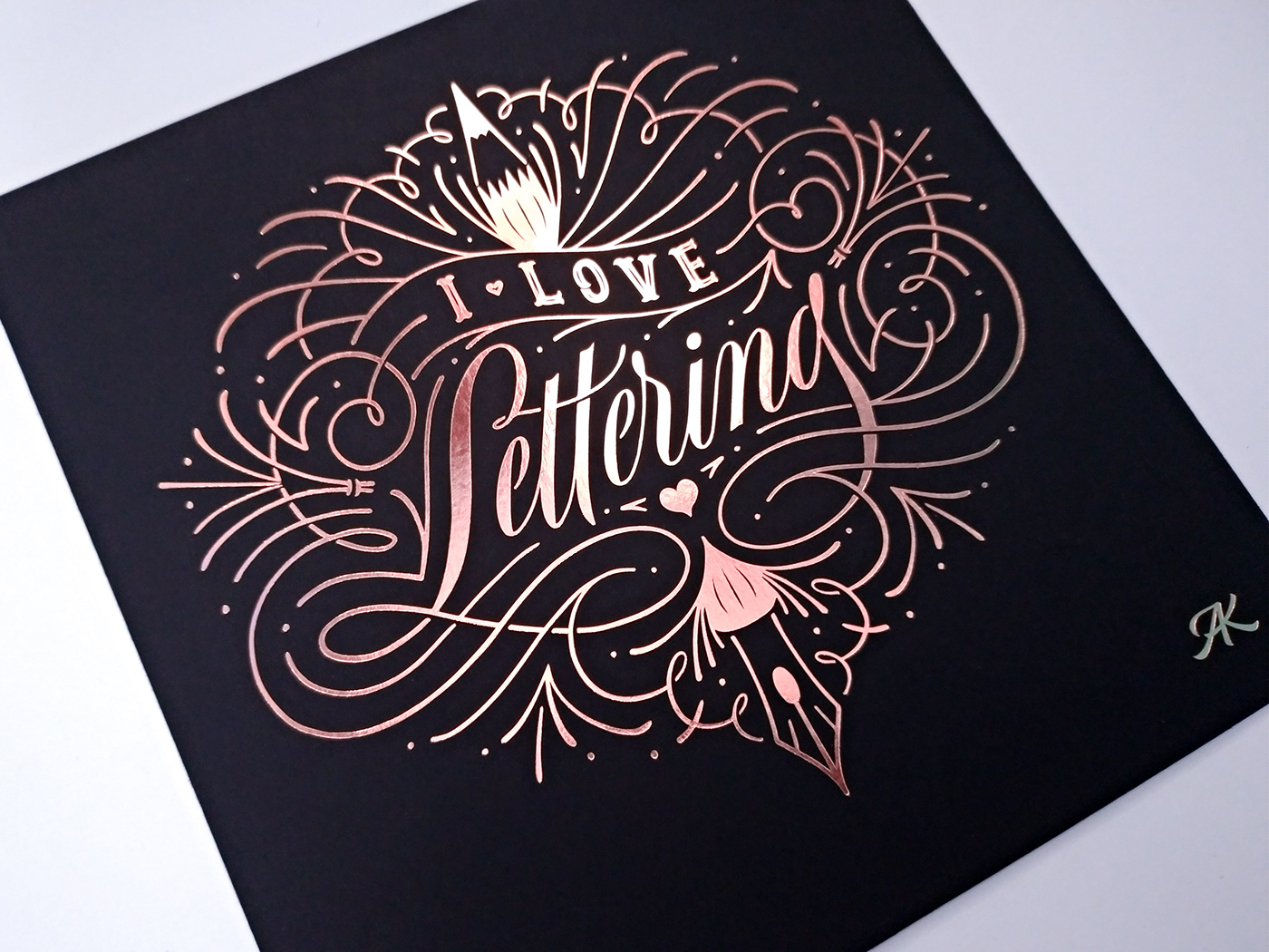
I Love Lettering
Artwork made originally as an entry for a scholarship to attend Letter West Retreat 2019, a 4-day lettering retreat in Moab, UT.
The prompt was to letter a piece with the words “I love lettering” and post it on Instagram.
Since the artwork was awarded the schlarship (!!), it was later made into a fine print edition in letterpress, hotstamping and digital printing, in order to raise funds for the trip to the retreat.
—
Arte criada para participar do concurso de bolsa para o LetterWest Retreat 2019, um retiro de lettering de 4 dias em Moab, Utah (EUA).
A proposta era criar um lettering com as palavras “I love lettering” e postar no Instagram.
A proposta era criar um lettering com as palavras “I love lettering” e postar no Instagram.
Como a arte foi selecionada para ganhar a bolsa (!!), ela foi posteriormente transformada em uma edição limitada de gravuras em letterpress e hotstamping e também em print digital, como forma de levantar fundos para a viagem até o retiro.

A little backstory
Burnout had been taking the best of me after a heavy workload sprint in May/June plus taking care of a family member in July, so I hadn’t been well or stable. It was August 2019 when LetterWest announced the scholarship contest, and I was still trying to recover from the burnout and find my way back into being a functional person.
I remember having saved the contest for later, thinking it could be cool to apply, but not really feeling well enough for it. Fast track to a day before the deadline, and I decide on a whim to make something for it—because for the first time in a while, I felt this drive to create something, and was rested enough to tackle it.
Making this piece was truly healing in itself, since it had been long since I’d last felt so excited about doing something or focused on a piece for hours straight (8h!) and actually finished it fully. I had been missing making things with my hand and hadn’t even fully realized it.
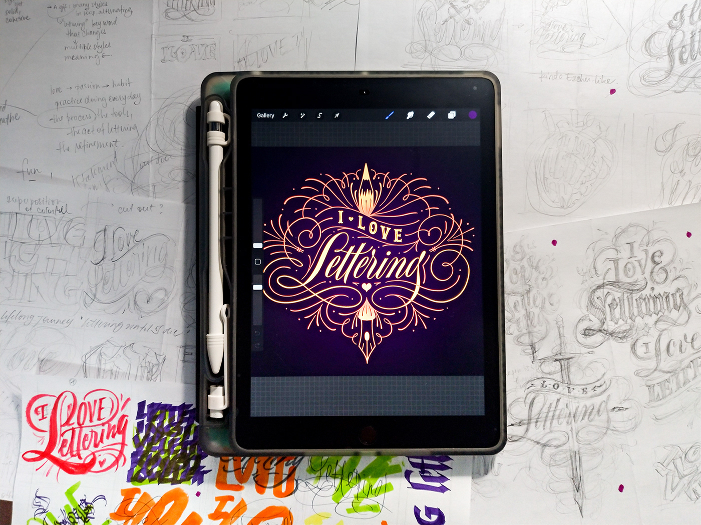
The Process
My lettering process always begins either with a written list of ideas or thumbnail sketches. This time, I already had the content I had to letter, so it was now a matter of figuring out what to highlight and what story I wanted to tell with this.
The image below shows the infnity of ideas I explored through thumbnail sketches. While written words are a great way of starting the concepting process, I often resort to drawings in the ideation process to visualize ideas more clearly.
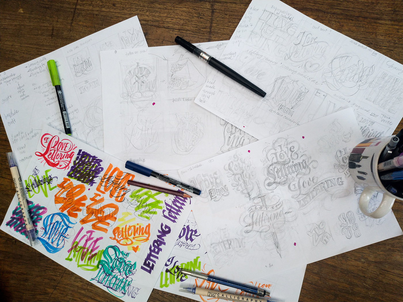
I knew I wanted to express my love for letterforms, and with the theme being so meta, anything could be possible shape-wise. Of course I had to get out from my system first the most obvious ideas—those involving literal or abstract hearts or compositions that I had seen before and had been influenced by somehow.
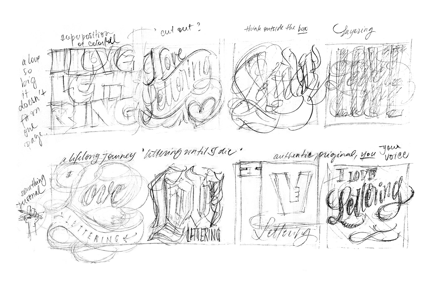
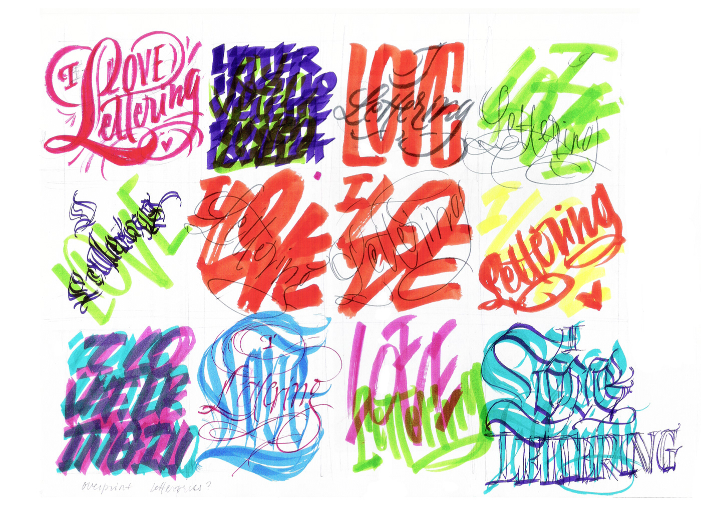
After a heavy brainstorm session of rough pencil sketches, I decided to take a step back and try some crazy calligraphic shapes and compositions for a change. While the results might seem ugly or weird, it’s something I often do during this process to break my go-to composition solutions and to help spur new ideas and shapes.
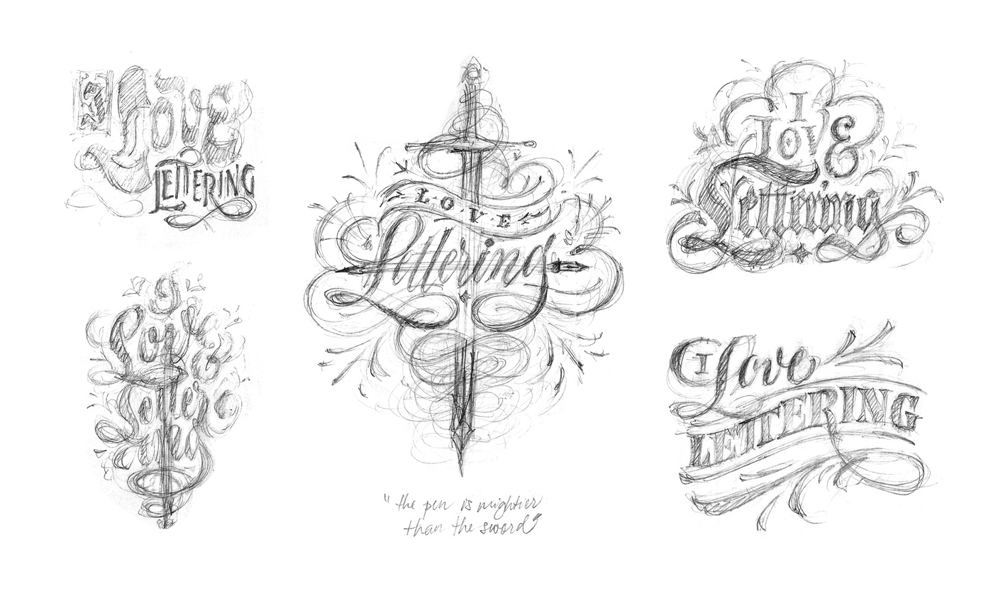
Going back to pencil and feeling warmed up, I sketched a couple more compositions that just seemed to flow. During the process, I ended up mixing elements from other “discarded” compositions I thought were interesting/useful, so I can say for sure that no work during the ideation phase is ever wasted.
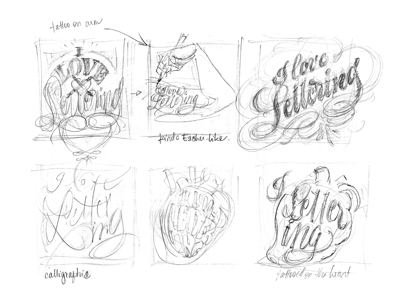
I ultimately ended up settling on this one sketch derived from a quote I like: “The pen is mightier than the sword”. Concept-wise, I figured the best thing to do was to embrace my personal take on what it is to love letters, and to follow the one that I felt was just calling me towards it.
This sketch embodied my special passion for script letters, flourishes, and a composition that softly leads the eye. Plus, it even had a bonus of an illustrative element—something I’ve been trying to incorporate more into my lettering work. It was novel, it was challenging, and honestly, it just seemed like real fun to keep exploring.
With the sketch selected, I took a picture of it and started the refining process on Procreate. The ipad with the pencil had been a fairly recent investment, and other than a bit of playing around to get acquainted, I hadn’t really used this new tool to its full extent in an actual project.
So it was a happy surprise that the work flowed so well in it. Not having to do the refinement on tracing paper/scan physical layers was definitely of big help time-wise, and Procreate came especially handy in the construction of the symmetric flourishes and ornaments of the composition.
Check out this (super sped up) gif of the process:

For me personally, there is so much decision-making involved in the process of making a lettering. It has to convey the concept, tell the story in a compelling way, have a strong and pleasing composition that supports it, and beautifully-rendered letterforms that embody these meanings. Often times it will start based on one idea, then it might change or evolve as the creative process unfolds.
This was absolutely the case of an initial concept that evolved and became just so much more (and better!) than I had originally envisioned.
Not unlike the flourishes stemming from the center of the artwork, this piece grew, expanded to mean so much more than it originally did. It’s blooming, alive, bursting with celebratory fireworks, and kinda heart-shaped (?). It is organic, kinda hand-made, and it holds the pencil & nib—two tools that are mightier than the sword, and represent my journey in the letter arts: lettering & calligraphy.
I couldn’t be happier with how this piece turned out, and was surprised myself with the end result. It’s always rewarding when a personal piece you make also makes you grow as an artist—I learned so much with it, and made things (like those flourishes!) that I never thought I had in me. Adding more color and illustrative elements in my work, even if just a little, was also a big step for me.
It had been a while since I had allowed myself to experiment new things lettering-wise, and even though this piece might look “simple” to the eye, it took so much work to get there—and I had no idea it would turn out this way in the end. The wild ride of the process is truly one of my favorite things about lettering ❤️
Living this whole process was a gift, and I am so grateful that I took the plunge and immersed myself into it. Needless to say, I was beyond thrilled to know it all paid off even more when they announced I got the scholarship!
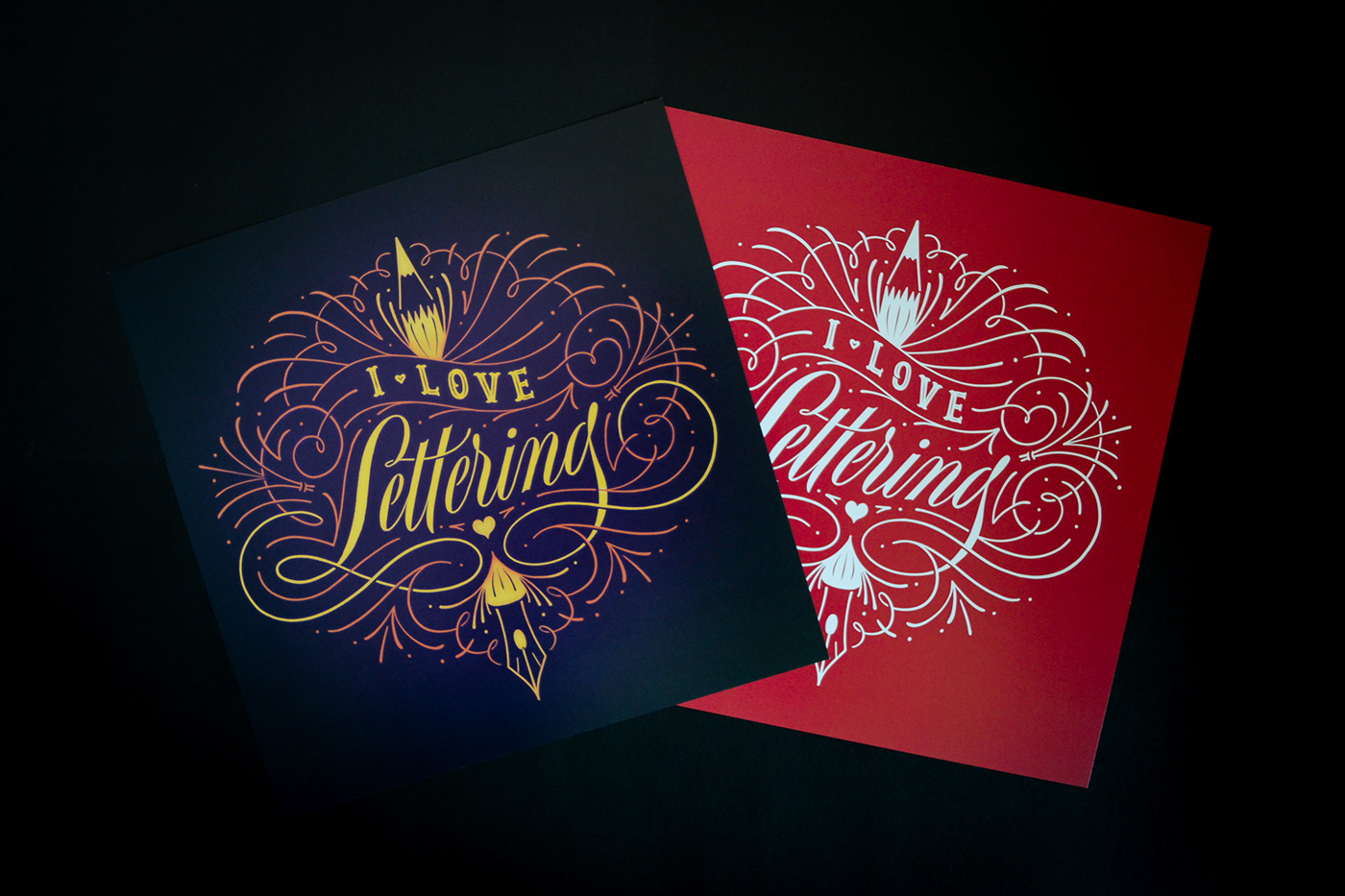
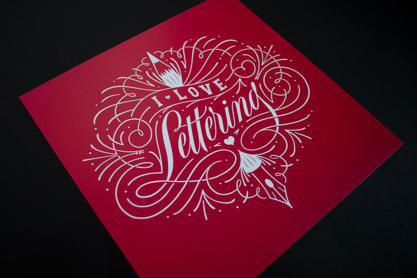
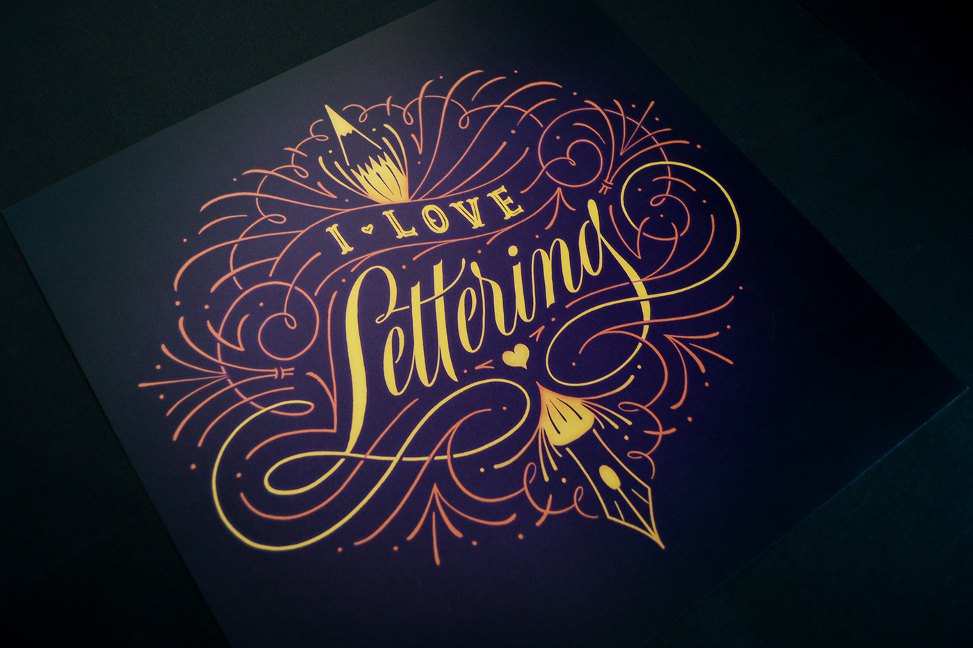
Prints
Digital Prints
30x30 cm digital print on 300gsm matte paper, on colors: purple (original) or reddish pink.
—
Ficha Técnica
Formato: 30 x 30cm
Impressão digital
Cores: Roxo ou Rosa avermelhado
Carimbo de autenticidade no verso.

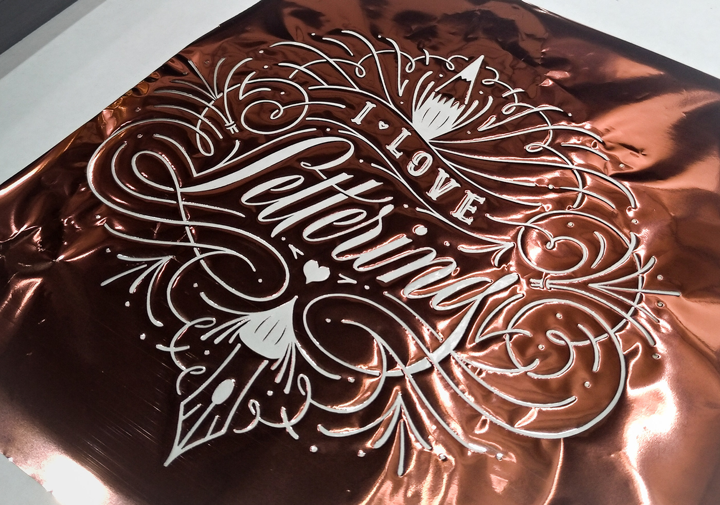
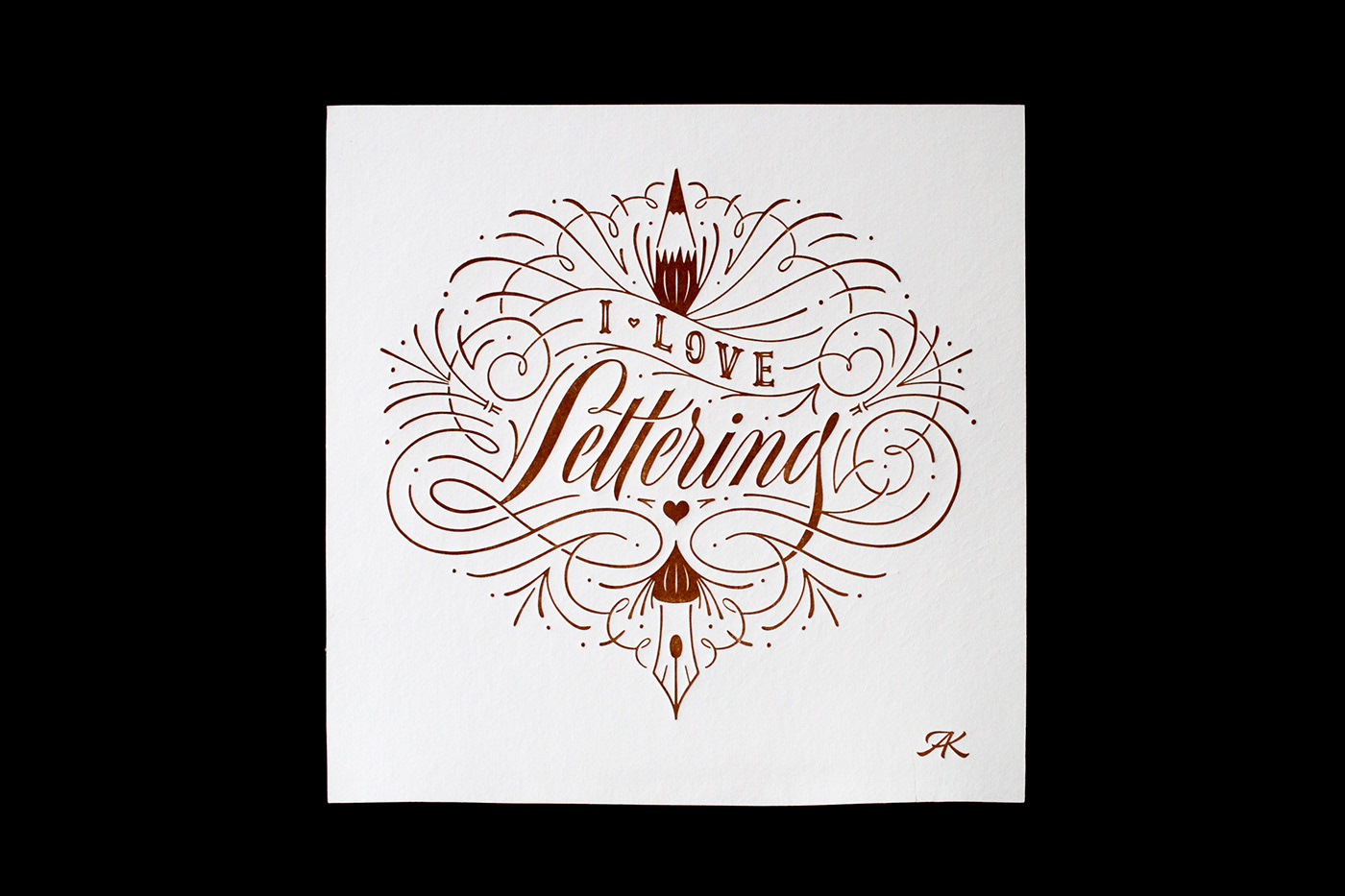
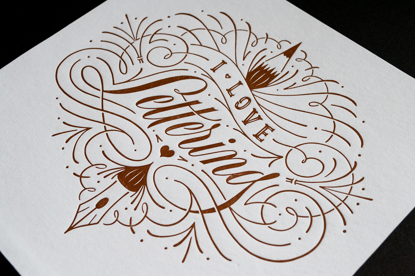
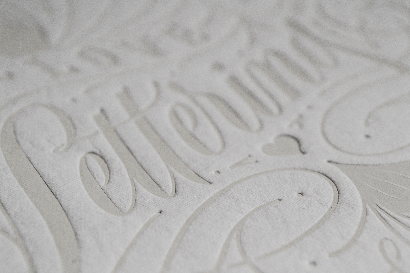
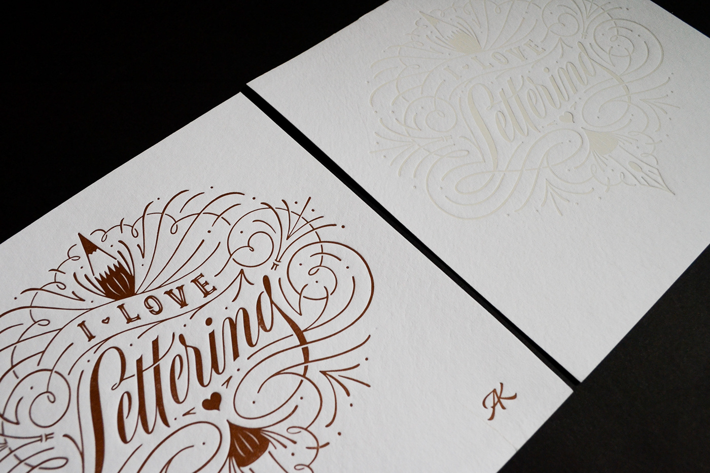
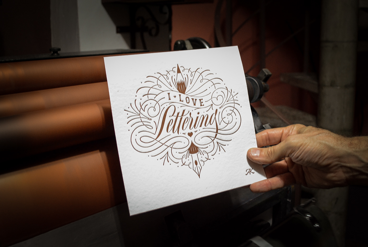
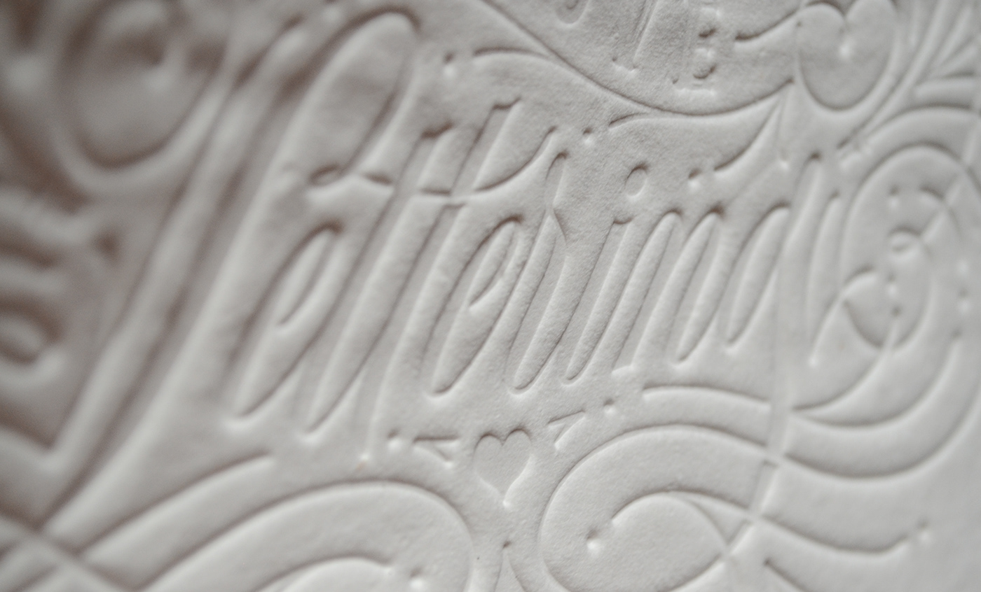
Letterpress Prints
Limited edition letterpress print in two color options, cream and copper.
Signed and numbered print, with authenticity certificate.
—
Edição limitada em Letterpress.
Cores: Cobre e Creme
Ficha técnica:
Gravura 20 x 20 cm
Impressão em baixo relevo feita pela Letterpress Brasil sobre papel São Paulo 350g da Moinho Brasil.
Gravura 20 x 20 cm
Impressão em baixo relevo feita pela Letterpress Brasil sobre papel São Paulo 350g da Moinho Brasil.
Gravura assinada, numerada e com certificado de autenticidade.
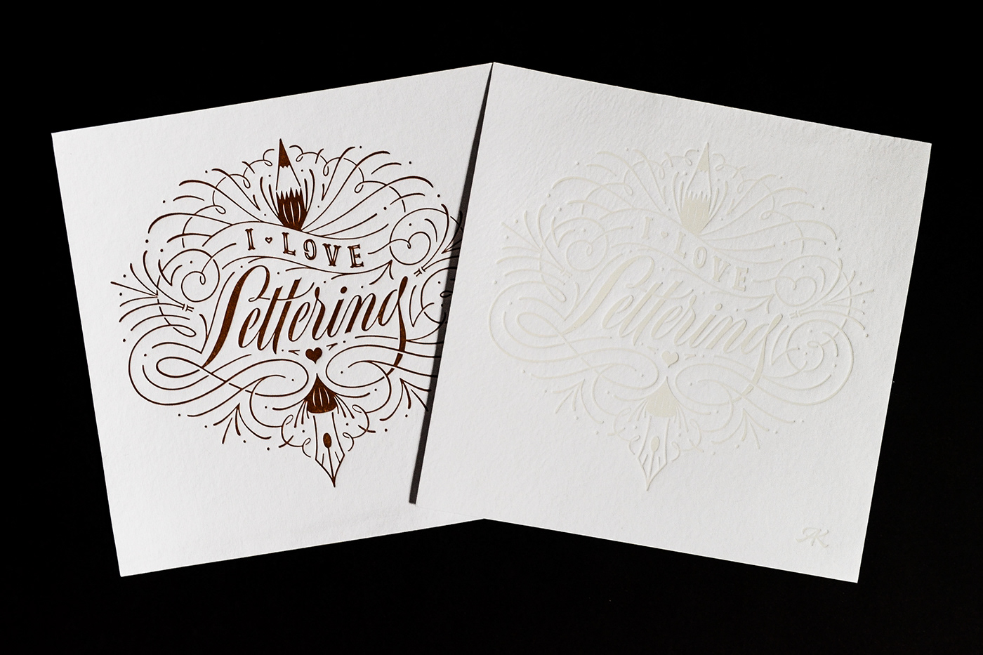

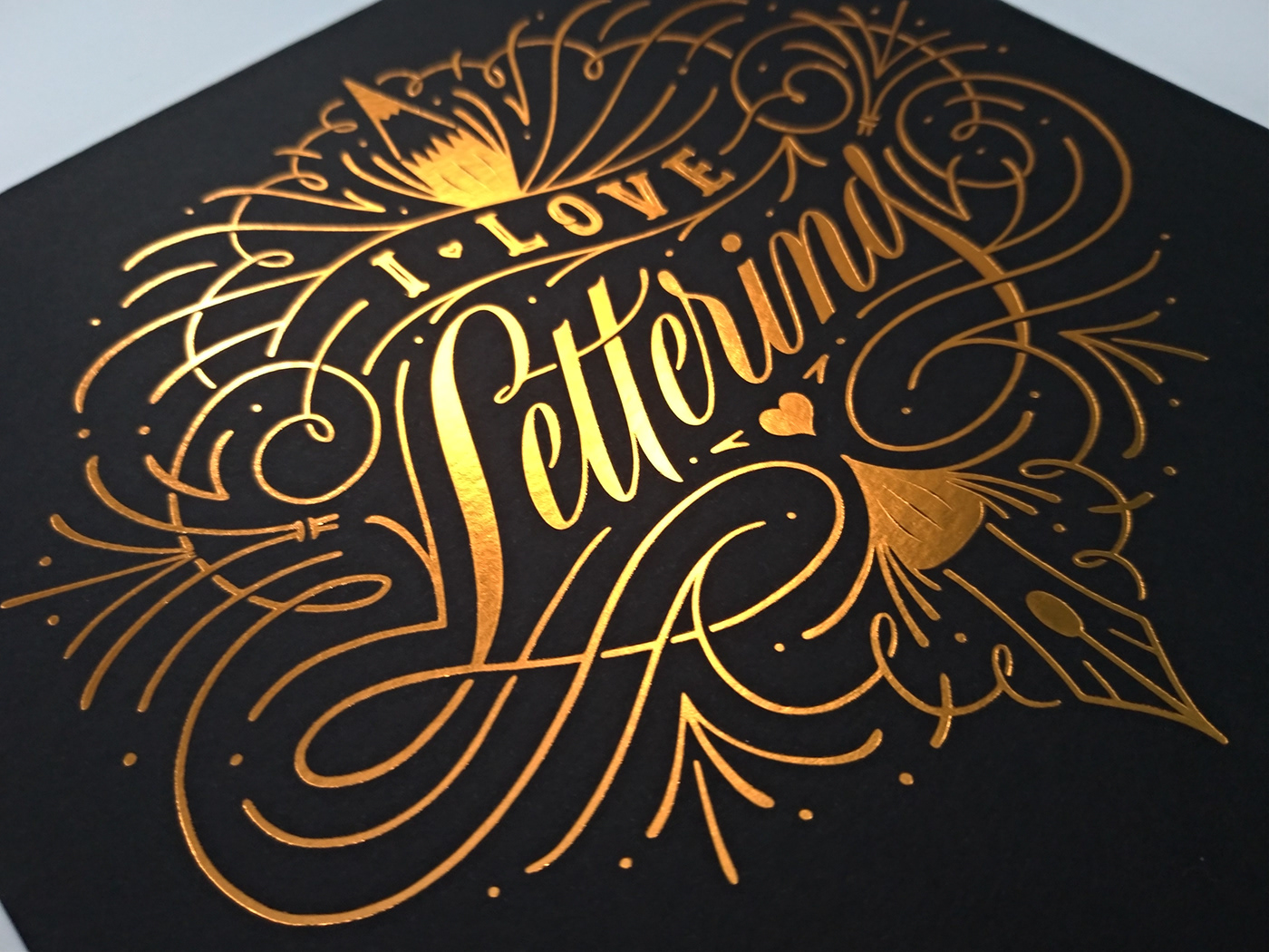
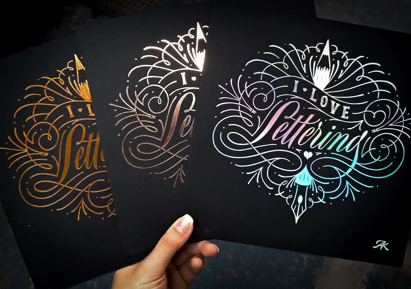
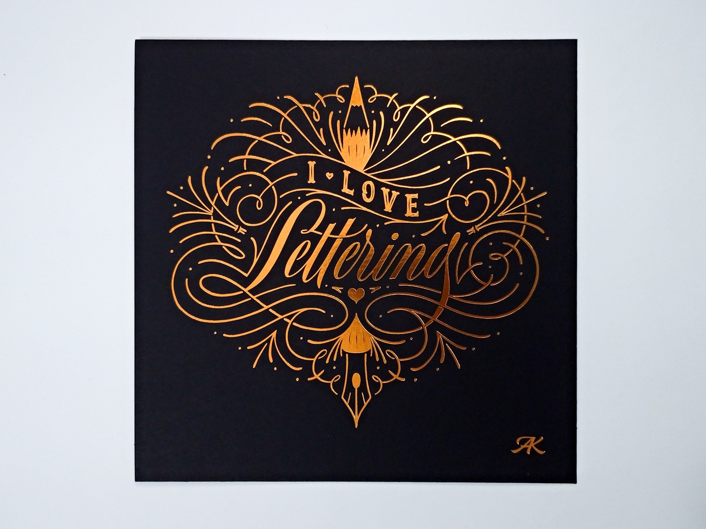
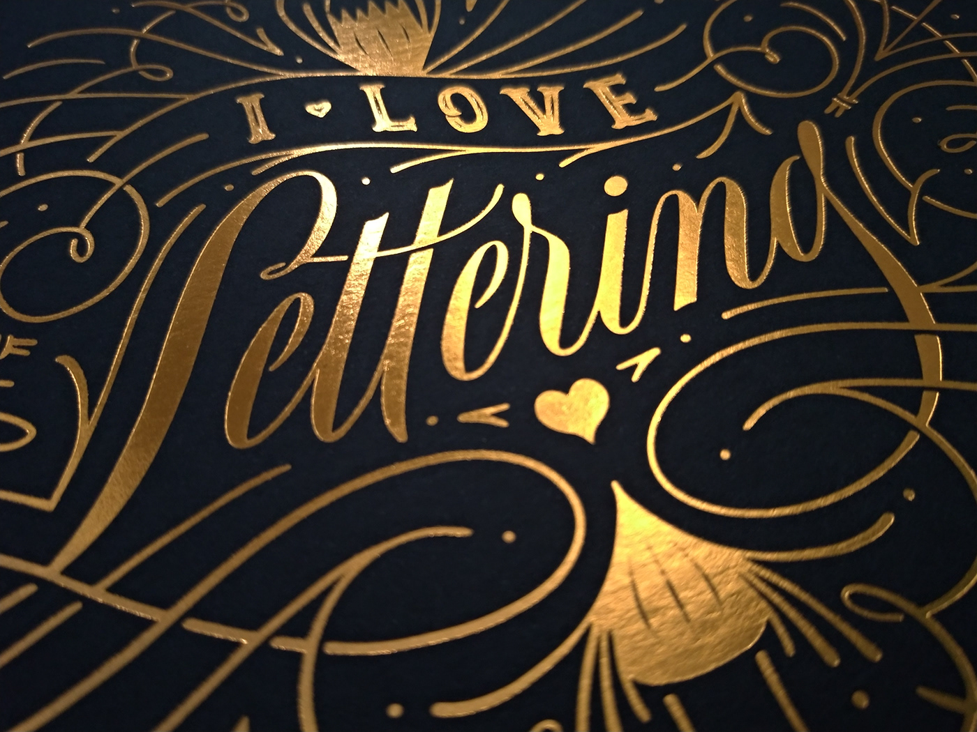
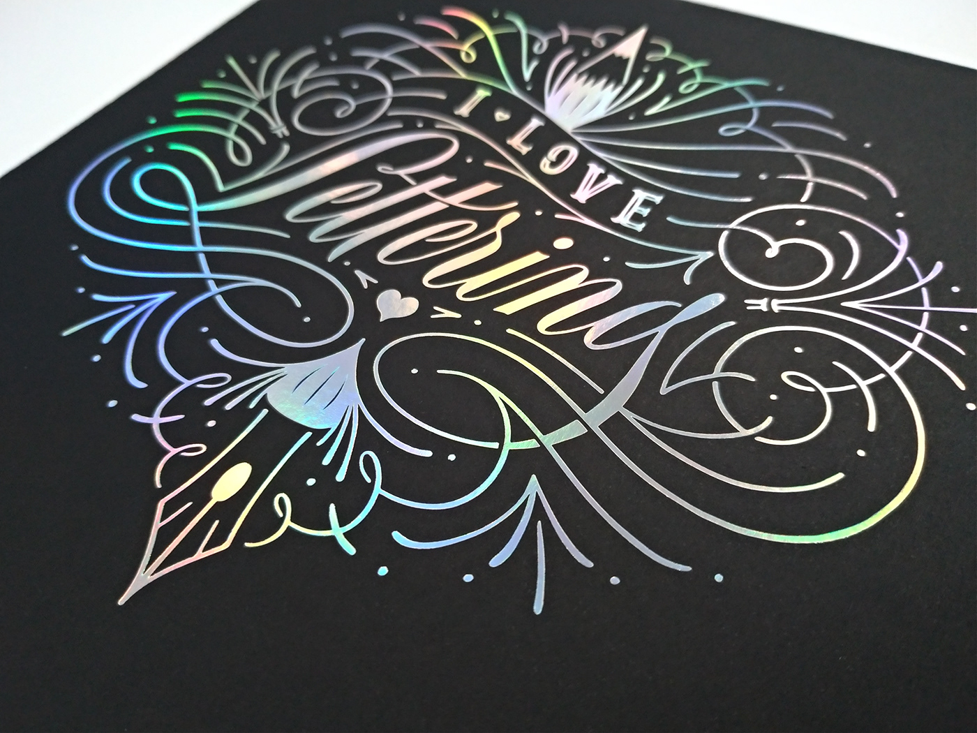
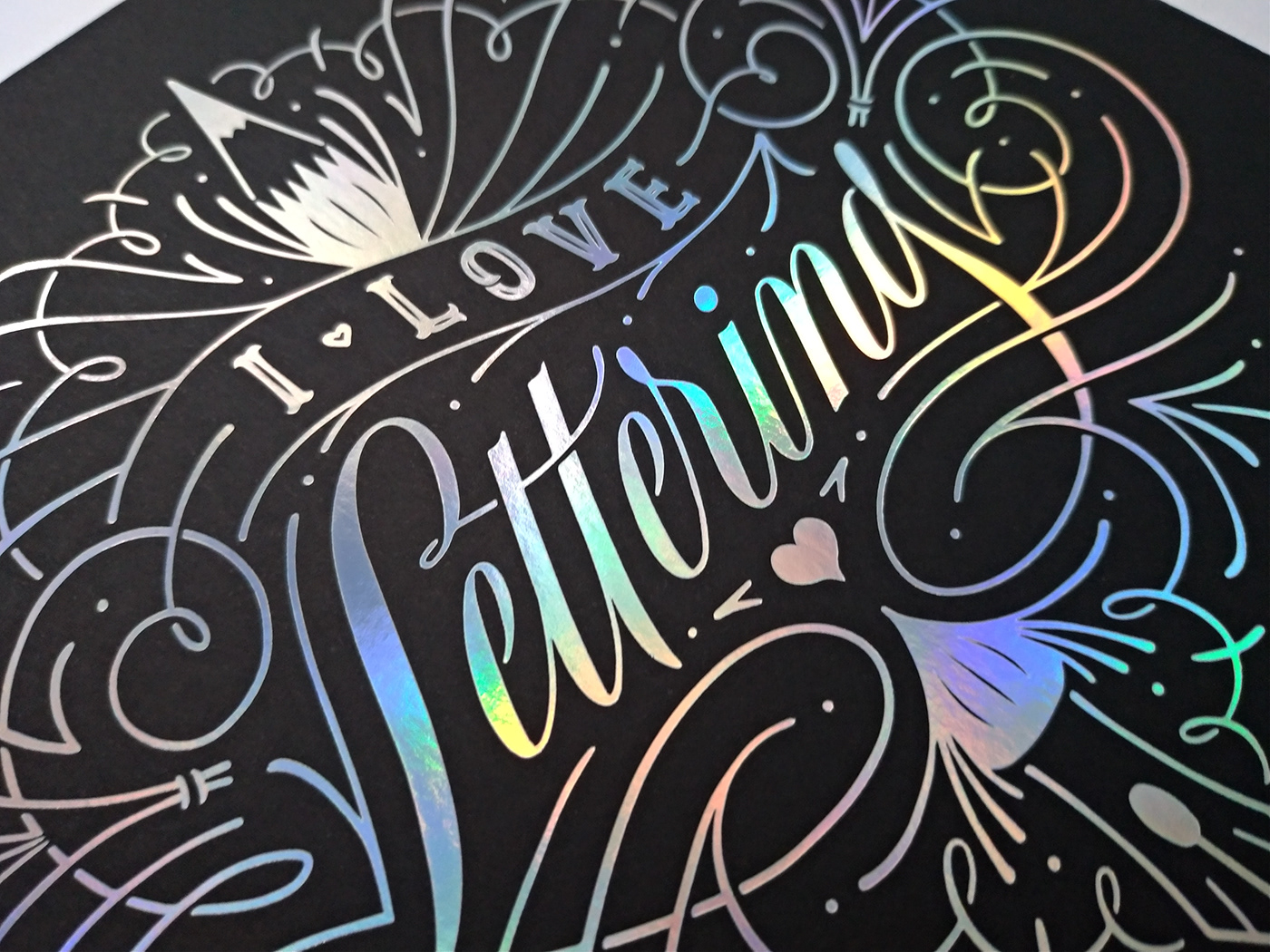
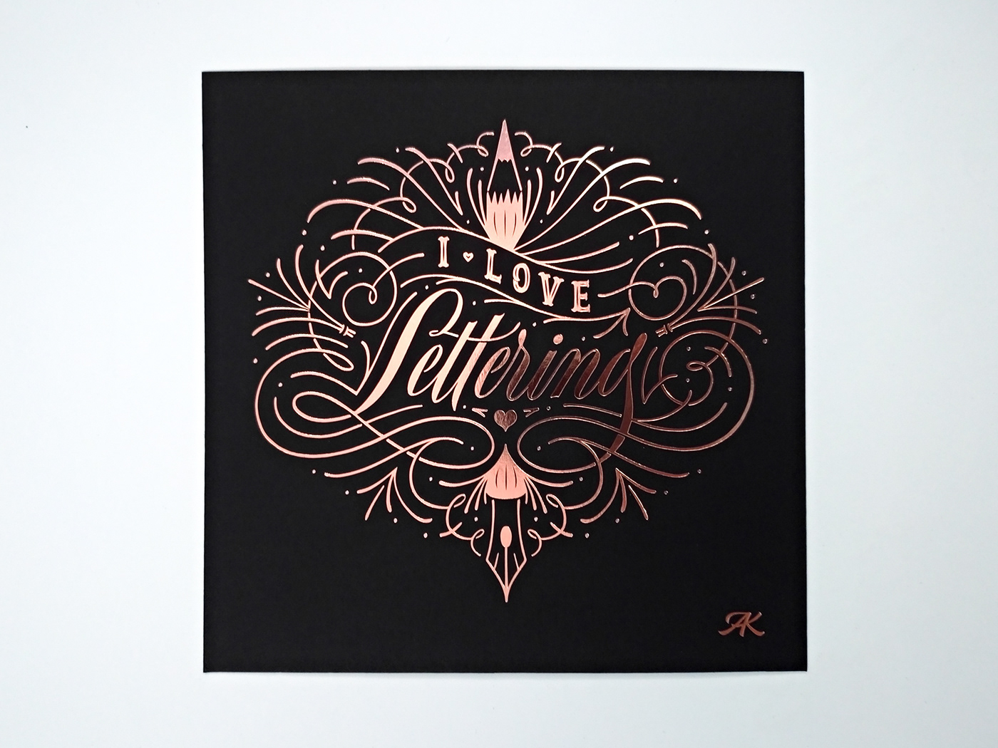
Hotstamping Prints
Limited edition hotstamping print, with a variation of foil colors to pick from:
bronze, rose gold and iridescent/holographic.
Signed and numbered, with an authenticity certificate.
—
Ficha técnica:
Gravura 20 x 20 cm
Impressão em Hotstamping feita pela Lemegg sobre papel Keaykolour 400g/m2 da Arjowiggins.
Gravura 20 x 20 cm
Impressão em Hotstamping feita pela Lemegg sobre papel Keaykolour 400g/m2 da Arjowiggins.
Gravura assinada, numerada e com certificado de autenticidade.
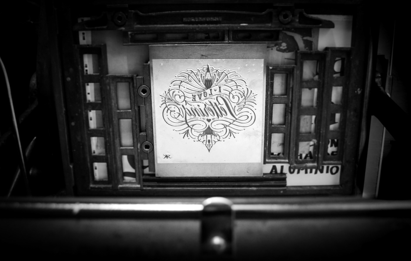
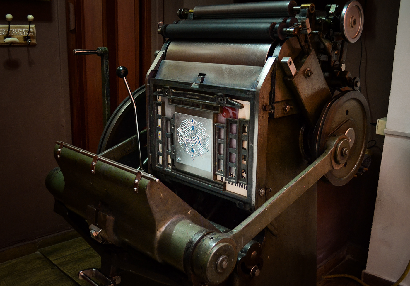
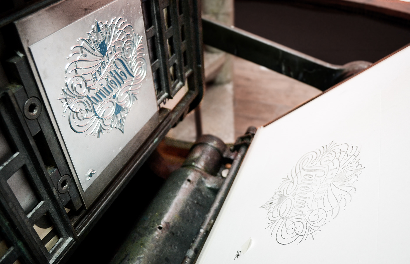
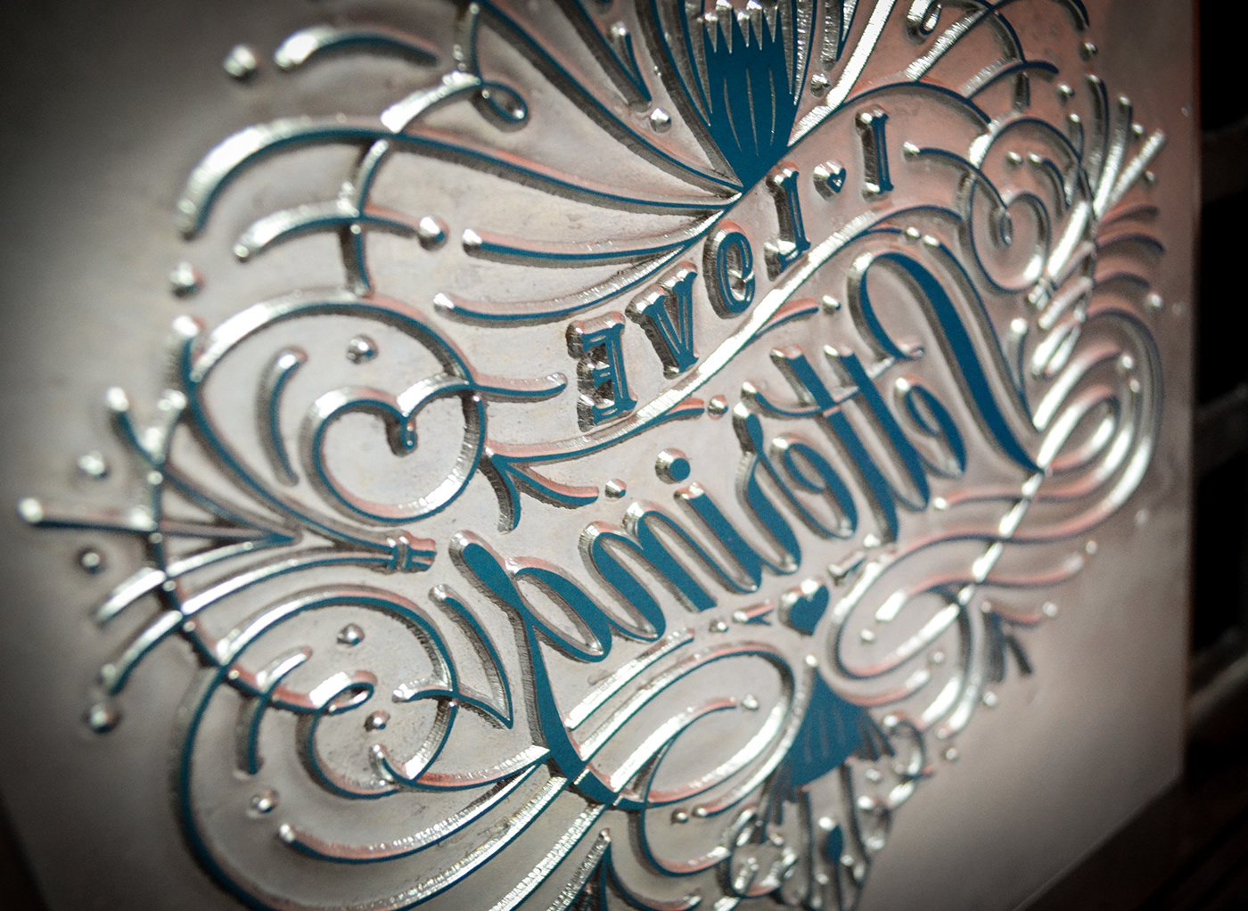
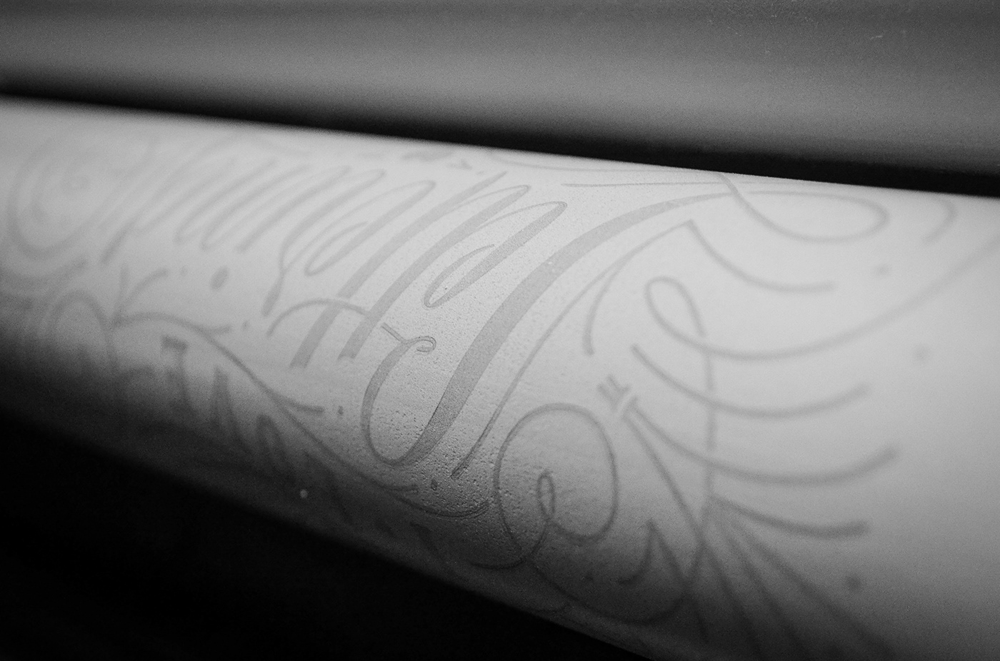
The Letterpress Printing Process
The process of getting this artwork to print and pre-sale online was a wild one, so I thought I’d plug in here too bits of the printing process (which is a feast to the eyes really).
To be honest I thought I didn’t have it in me to run all of this production stuff, but turns out that somehow I made it happen! (with a little, actually no, a BIG help from my friends—which I am eternally grateful for). Special thanks to the Letterpress Brasil team, Marcos Mello, Patricia Passos and Luy Albino!
Photographs are by yours truly and the space is Letterpress Brasil’s printing studio.


Final words
Special thanks to Becca Clason who runs LetterWest like a boss and was super generous in offering the scholarship for the 2019 retreat. None of this artwork and process would have existed if it wasn’t for this starting point!
Thank you also to everyone at LetterWest that supported me and helped out by buying these prints!
—
Agradecimento mais que especial aos parceiros que ajudaram esse projeto a se tornar realidade:
Marcos Mello, Patrícia Passos e Luy Albino, da Letterpress Brasil.
Eliane Mizumoto, da Moinho Brasil.
Vilma e Ronaldo Dimitrow, da Pintar! Materiais Artísticos.
Marcos Mello, Patrícia Passos e Luy Albino, da Letterpress Brasil.
Eliane Mizumoto, da Moinho Brasil.
Vilma e Ronaldo Dimitrow, da Pintar! Materiais Artísticos.
Paulo e Ching, da Lemegg.
E um agradecimento também a todo mundo que não só comprou as gravuras e prints mas também me encorajou, apoiou e compartilhou a lojinha. A ajuda de vocês foi essencial e eu sou eternamente grata ❤️