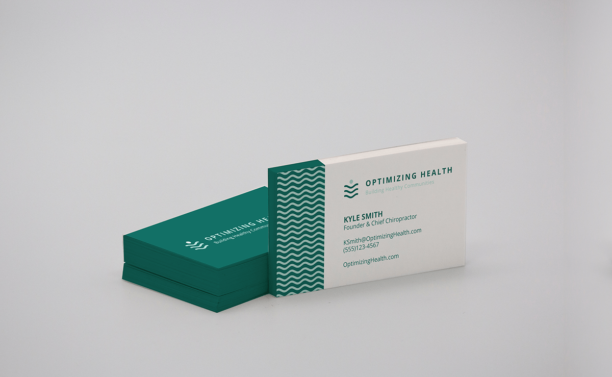
Challenge: Create a logo for a chiropractic business that targets companies of various industries encouraging them to incorporate health-focused initiatives into their culture in order to save on health insurance costs.
Solution: I decided to focus on clean, professional design inspired by health and tech startup branding - including sans serif type and modern, bold, color-blocked motifs. My goal was to avoid overused imagery that often comes with healthcare branding, but still utilize some clever symbolism. The image mark represents community (head and arms or spinal column) and optimization (with the abstract spine also representing a ladder). The green-blue color palette fits the industry well as it connotes trust, health, strength, growth, and balance.