
In this concept, I tried to make the interface of the Rive Editor more convenient for designers and people familiar with the creation of vector graphics (for example, front-end developers). This concept is not a guide to use, but merely the personal opinion of the author, coming from the many years of using vector editors, as part of professional experience as a DTP & graphic designer.
To begin with, I want to note that I have no particular complaints about the editor of animations or Nima part (in addition to what is already indicated in the Rive roadmap). This does not mean that there is nothing to fix, but I think it's better to focus on the priority flaws.
TL:DR — if you prefer visual content over text, then below you will find a video highlighting the main points.
. . .
It seems that the authors of the original UI were inspired by Figma (mainly IMHO) and Sketch, but in our case it is more correct to talk about the UX approach of such programs as the Affinity Designer, Illustrator and so on. Because Figma/Sketch is used primarily for designing the UI and UX of mobile apps and web, so when you need to create something more serious, than buttons or frames, then the problems begin.
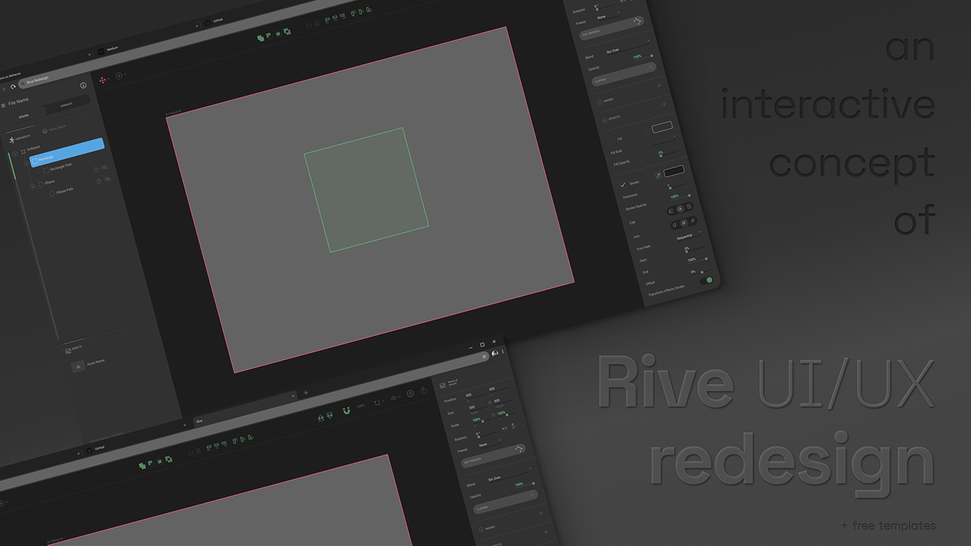
As you can see, the UI has remained almost the same, I just moved some elements and added new ones (the changes are green on prototype):
1) I mainly used the free space at the top to place tools that are independent of a particular object, since this is a common practice for all popular graphic editors (the right panel was just very loaded),
2) I personally really lacked Boolean operations, without them it is impossible to create complicated forms with transparency or blending quickly,
3) I also moved the alignment tools upwards in the center, there is still a lot of free space for tools that may be added in the future,
4) buttons moving objects in the layer hierarchy (move one level up/down) would be cool to combine with a key combination, for example, with Shift (move to the top/bottom),
5) snapping refers for instance to rulers, grid, etc.,
6) the menu showing the axes is not used so often, and it seemed to be more logical to split it and send it to the right,
5) two essential options in the hide/show menu,
6) a lot of sliders appeared on the right side menu (this is not quite as it should look right, but you get the idea),
7) setting 100% opacity as 1.0 is typical for coders, but for bearded, pampered hipsters - this is too nerdy,
8) an eyedropper, at least - since there are no color assets,
9) the stroke, by default should scale with the object (on the contrary, if you forget to put this value there - you have to change everything manually),
10) as for the popup menus of the tools, I divided them so that there would be no sub-menus. You didn't see this in Adobe SW often, did you? I believe there is a reason for that,
11) 3 new items in the context menu, with a right-click on the object: rasterization, export to the SVG and stroke expanding,
12) I've added the function of reflection vertically and horizontally - yes, this can be done through negative scaling, but in most cases, designers will never discover that,
13) now the key combinations in the menu are shown as for computers with macOS, but on Windows, there are simply no such keys, so please adapt,
14) it would be great to combine the Hierarchy and Drawing order into one panel - Layers, or at least some scroll bar,
15 and further) Some things just did not fit into the prototype, for example, tooltips for tools - guess how long my colleagues (purebred graphic designers) thought about the Freeze menu? A simple popup tooltip, with one sentence, will significantly simplify understanding. Also, the selection of all objects according to same properties (fill, stroke, etc.) is missing. Аs well, there is a definite lack of classic shortcuts, as an example of duplicating objects with Alt + drag, etc.
Short preview video of this prototype (in case XD is not working properly on your browser):
I consulted this with other designers in my area, so this is not only my point of view. These are not significant changes — but the devil is in the details. I hope you enjoyed the work and maybe it will inspire someone. Comments are welcome, thanks!


