The GetDocsNow Refresh Project
Case Study
For several years GetDocsNow has served over 1,500 documents to users per Month and served over 40+ Management Companies. Despite all these, the website has needed a fresh look and a more friendly User Experience for quite some time now. The Project, for now, will focus on the Marketing front of the Company, which is www.GetDocsNow.com, the primary domain index. The project encompasses improving the website's following aspects: A New Look, more compliance with web standards, better ranking online, a well-defined Branding and branding consistency and last but not least, usability on all devices—all aspects in which the current website falls behind. This Briefing will discuss the details of each project part, scope, and task.
Before we get to the bottom of it all, we need to visit some principles so we can decide how it should look, namely: Colours, Fonts, Logo Design, and the website framework.
Colours
A vital aspect of branding is colour. GetDocsNow has no official Branding Guidelines that should include a brand colour, but it has some elements that are considered Brand. Throughout the current website, the colour purple seems to be the colour of choice, so I assume it's purple. However, the stylesheet (CSS file) information does not specify a consistent value for the colour. Defined for one of the header elements the property "colour" has a word value ("Purple" - hexadecimal: #800080), but the rest are consistently using #870960.
I attempted to reuse this colour for the new colour concepts, but the term "reuse" is slightly loose. I used a base colour derived from the colour purple and retrieved the closest PANTONE colour match. The Pantone system is a Colour Matching system important in print production. We are going to use Colour Matching systems for any brand colour projects since web colours do not translate very well to Print.
Once the Colour is defined, the application of colour theory is made to produce a 'theme'. Colour theory (or colour rules) is vital to following the principles of design. The following illustrations when you scroll down are just a few examples of Colour theory combinations.


[From Left to right]
(1) The Analogous principle is combining the base colour with other colours of a certain degree adjacent to the left and to the right of the hue scale (Colour wheel). This concept is more appealing (in my opinion) in a small white space, but may be overwhelmingly unpleasing in a larger layout.
(1) The Analogous principle is combining the base colour with other colours of a certain degree adjacent to the left and to the right of the hue scale (Colour wheel). This concept is more appealing (in my opinion) in a small white space, but may be overwhelmingly unpleasing in a larger layout.
(2) Complementary colours are trendy in the design world but personally, I'm not a fan. In my opinion, a base colour is paired with a distasteful colour most of the time. As illustrated, the GDN purple's complementary colour is that plain Grass Green you see. Maybe I could do a split complementary, but it looks more horrendous. The black and grey had nothing to do with colour principles, I added them as supplementary colours. Now I understand why The Incredible Hulk from Marvel Comics wore purple trousers - they were looking for his complementary colour!
(3) Monochrome and shades are two different principles that may look the same. The difference is that monochrome is a step up or down of the base colour by tint percentage. "Shades" is adding a certain percentage of black (darkening) or white (lightening) to the colour. In this concept, the base colour combines a darker (222 C) and a lighter (681 C) shade, and the two new colours step down on a monochromatic scale.
(4) A Triadic colour principle is the combination of the base colour and two other colours equally distanced 1/3 fraction (33.33333% degrees) in the hue scale, or "colour wheel". It will probably work depending on where you assign the two colours to either the secondary or the highlight. How good they look together may depend on which element on the website you choose to place them on.
(5) While obeying colour principles is a common rule, the rule applies most of the time to learners and beginners. As experts, we know the rules, and then know how to break them — or simply just thinking outside the box to make something unique and eye-catching. This one right here is not an official colour theory. I threw in a black and a shade of grey. It's probably not very original (and lazy) as the current website is already using black, grey and purple—but it's effective.
The Colours applied to a web layout


Then, I tried to detach from the usual, old purple, and used other colours...


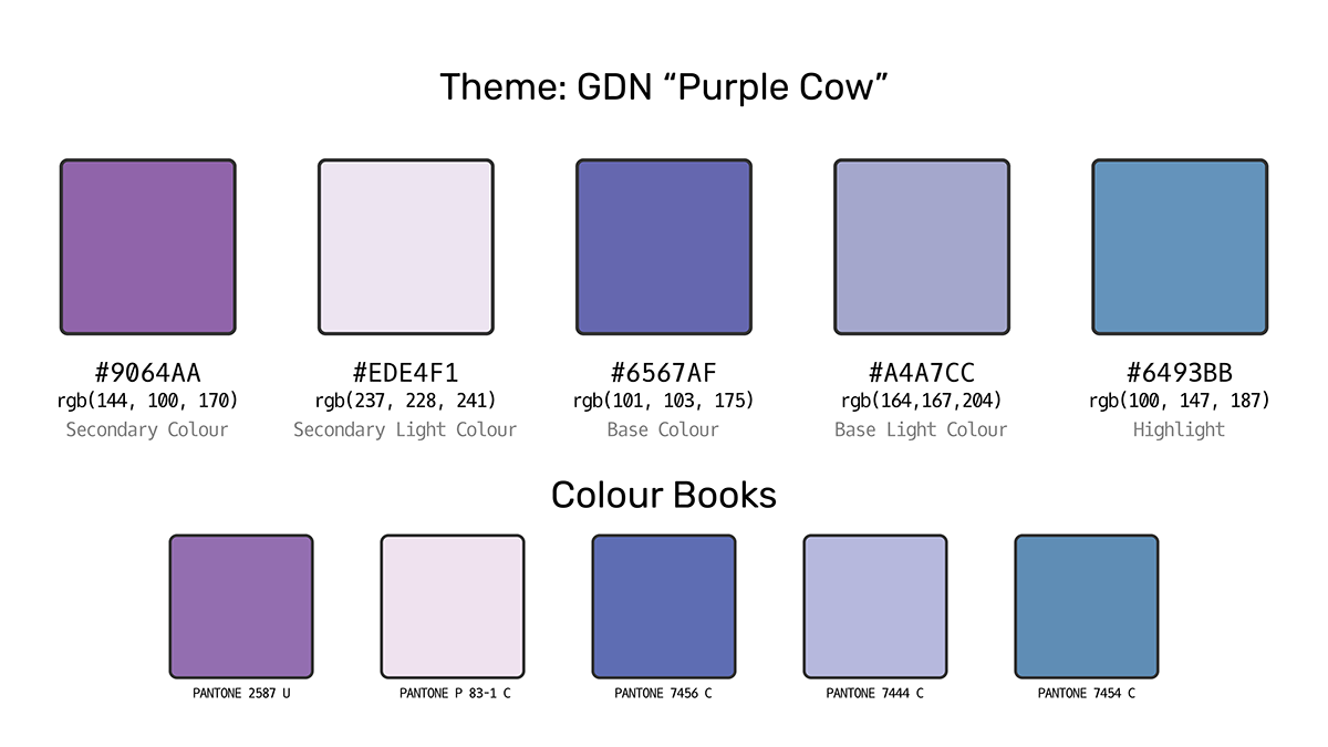
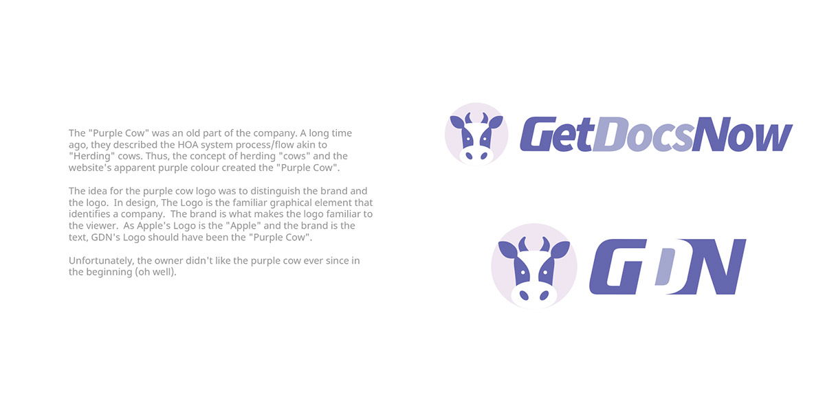
Ultimately, in 2020, I ended up never using any of the colour schemes defined above, but instead, I collected new colours for a new theme to compliment the "Purple Cow" Branding (Below).
Brand & Logo Concepts
A logo is an important part of brand identity. It reveals the company, it invites new customers to get to know you, distinguishes you from the competition, and encourages Brand Loyalty.
The old (Current, actually) Logo (below)


There are a few things I am critical of about the current logo. One of them is the lack of volume. The use of strong weight or significant contrast is a must for logos to be effective. The words "GetDocsNow.com" was straight-up written in a single line and using an unmodified Garamond font. Another is the ellipse around the word. Unlike in the short form of the logo ("GDN"), it's okay to overlap the swirl as it comes across the right, but on the full logo, it covers a significant amount of the "m" which is distracting.
Below, you will find the Logo Concepts that were meant to replace the old one above:
Design 1: Closure Principle

Design 2: Continuity Principle

Design 3: Proximity

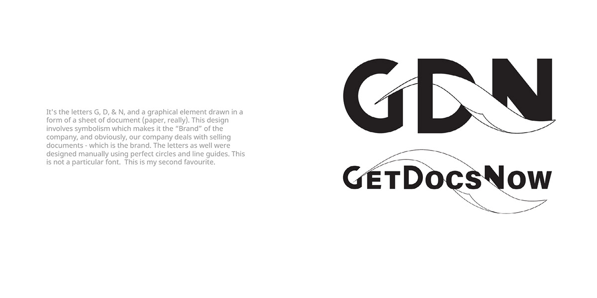
Design 4: Brand & Logo - 1 : "Symbolism"
Design 5: Logo Refresh - Not a "Redesign"

Design 6: (2020) Purple Cow
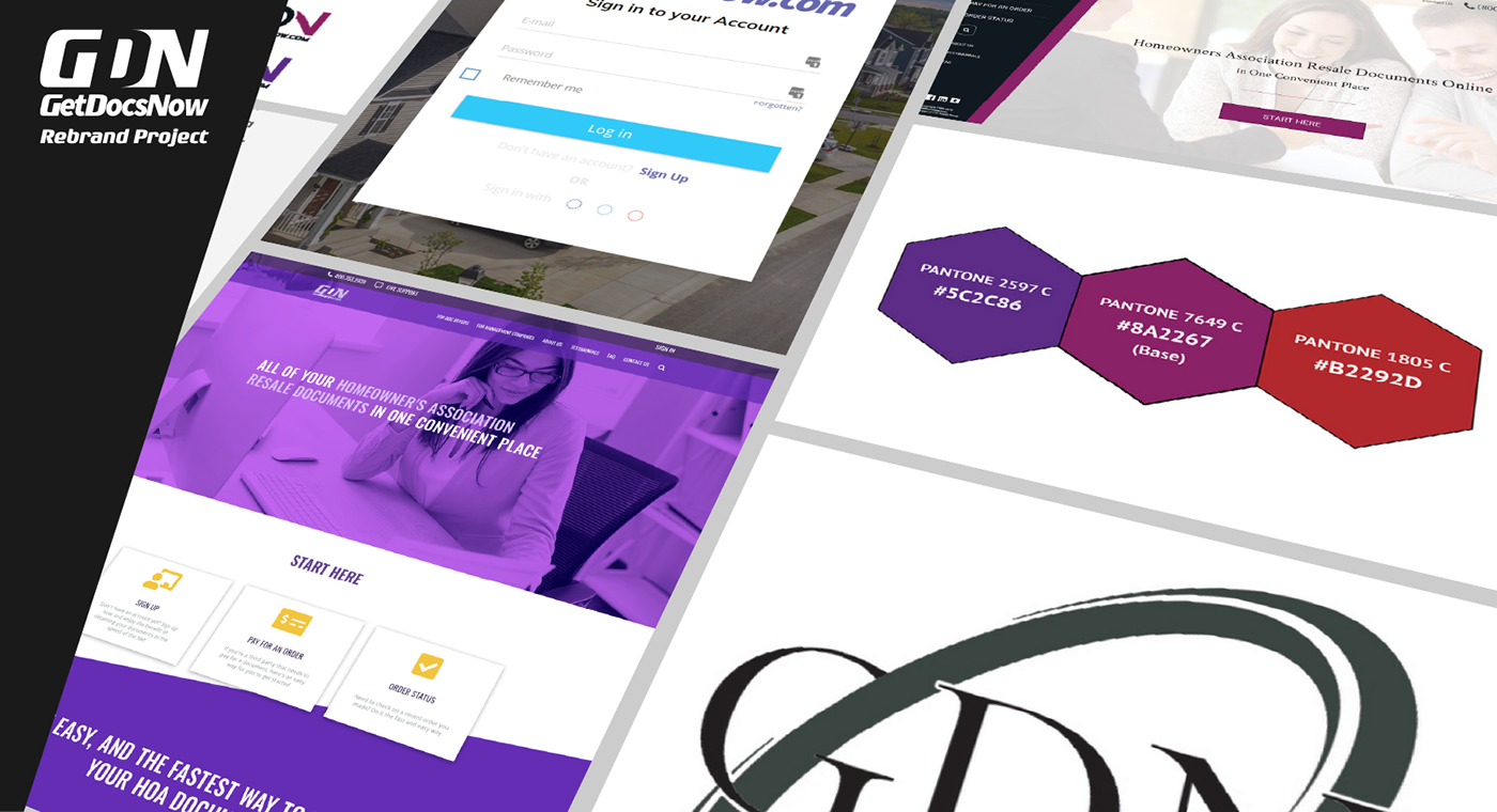
Website Concepts (Brand Implementation)
Marketing Front Design I, II, III


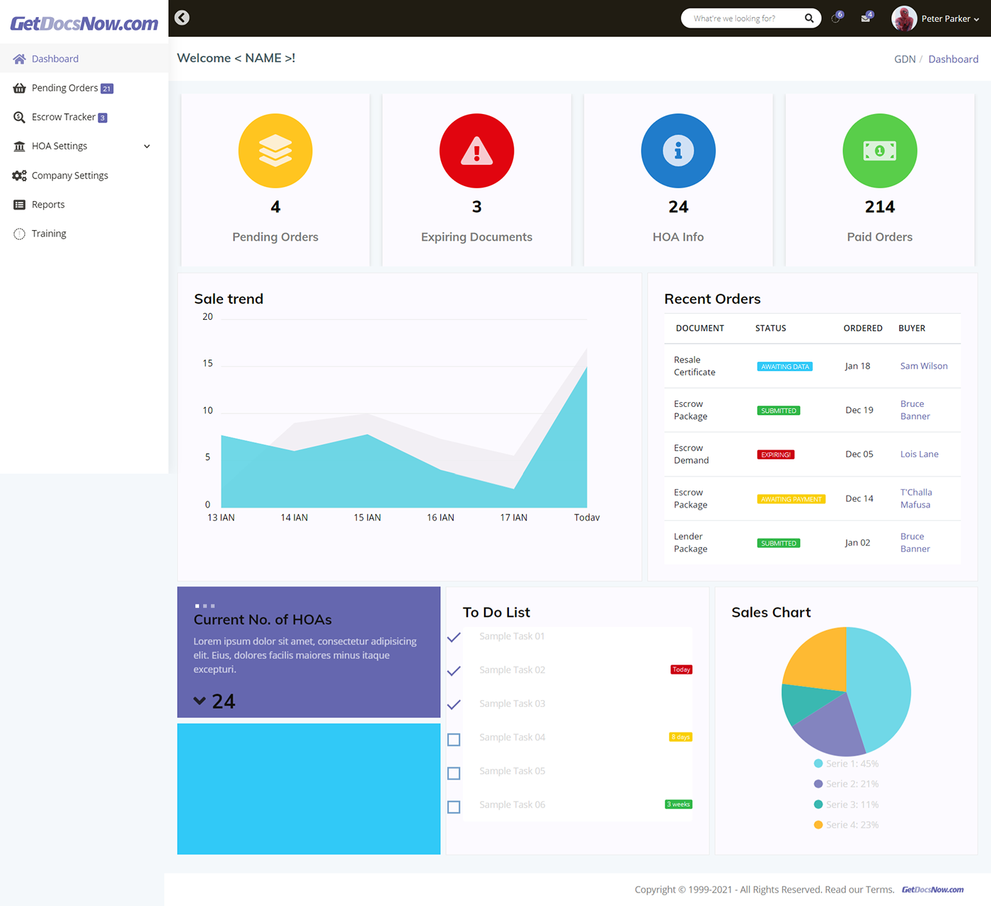
Members area Website Design Concept (2020)


The Members site concept is an HTML/CSS build created using Node.Js and Gulp.
View the project in GIT (Bitbucket)
View the project in GIT (Bitbucket)
This project also has an ongoing prototype in Adobe XD