Life is short. Stay awake for it.
We updated their brand identity from a northern lodge theme to a fresh variation
of the same elements, now rooted in natural textures and fluid graphics.
of the same elements, now rooted in natural textures and fluid graphics.
The logo and logotype create an expressive, energetic look, while
the color palette has evolved to tie more closely to Caribou Coffee’s core offering.
the color palette has evolved to tie more closely to Caribou Coffee’s core offering.
The shield element has also been updated to resemble the shape
of traditional national park signage.
of traditional national park signage.
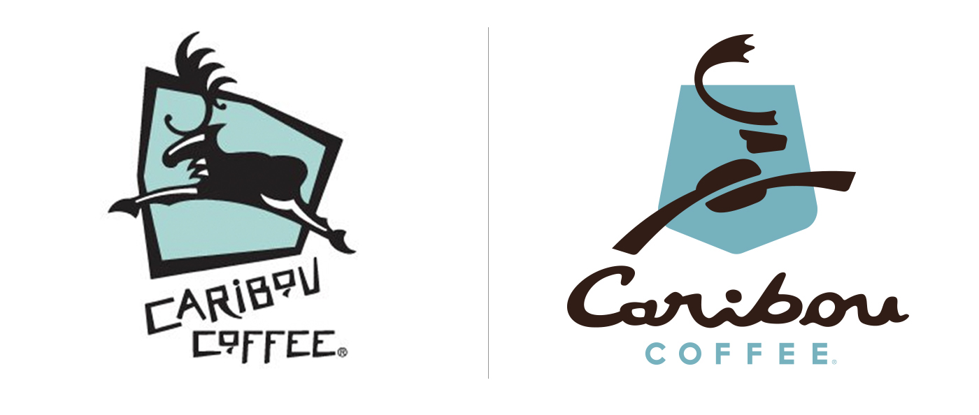
Before | After
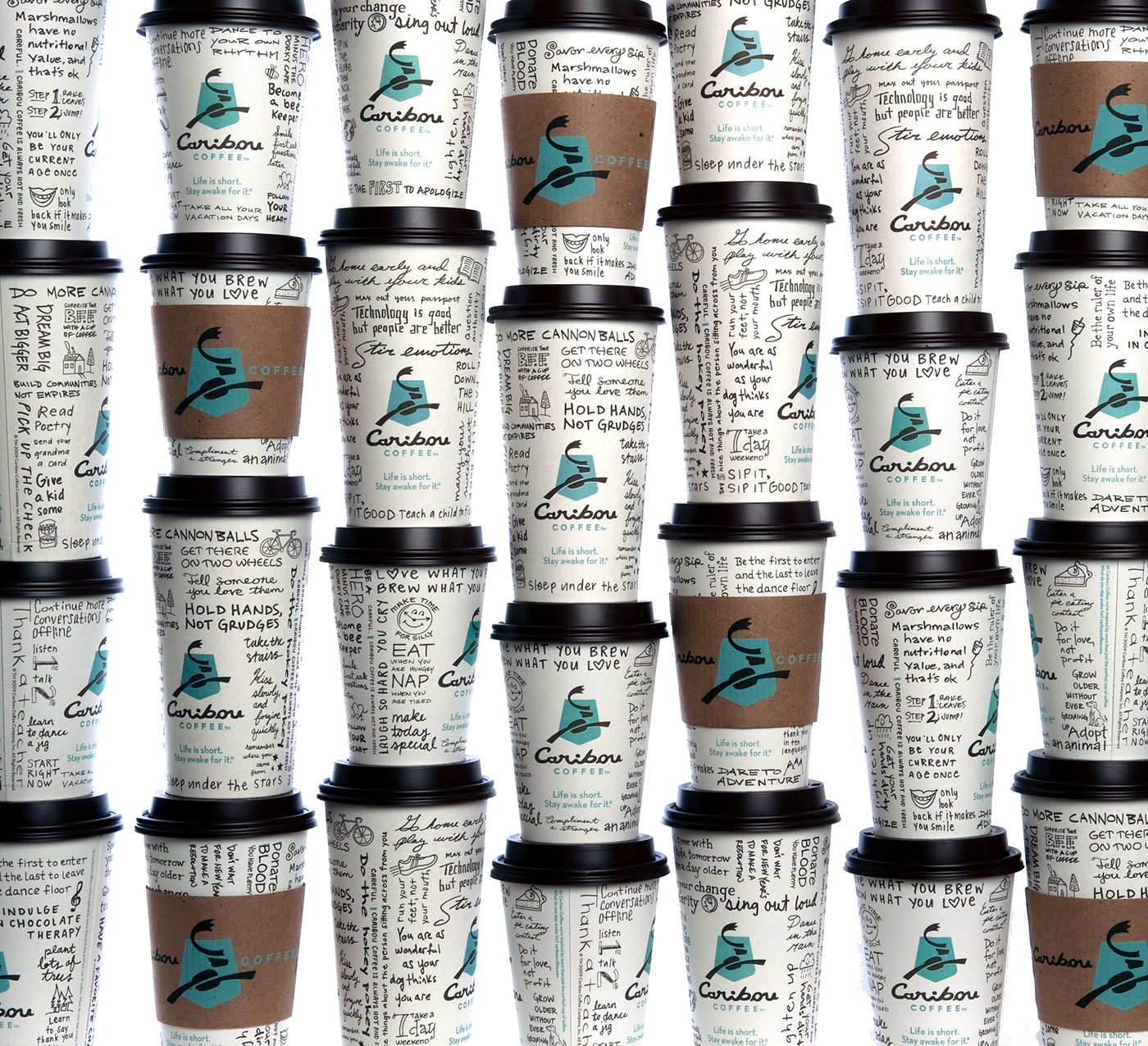
Rebranded cups and sleeves
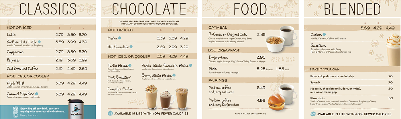
Menu Boards

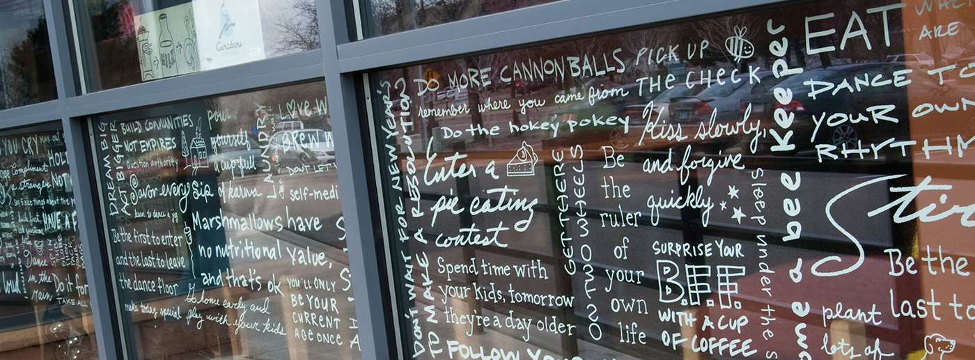
Environmental Graphics

Brand Book

Media Kit


