The Company
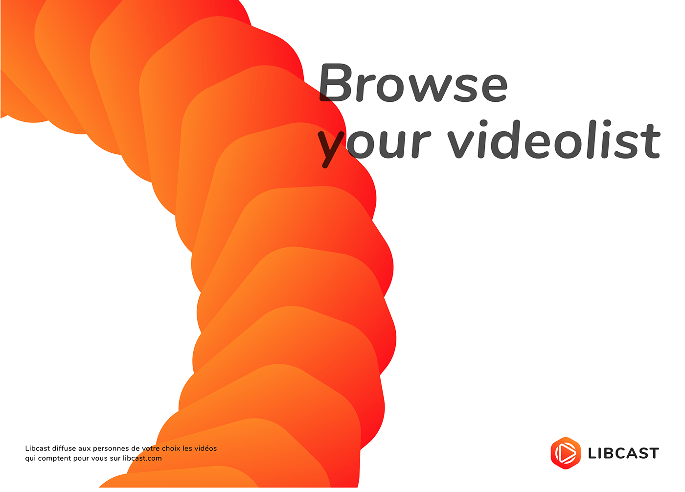
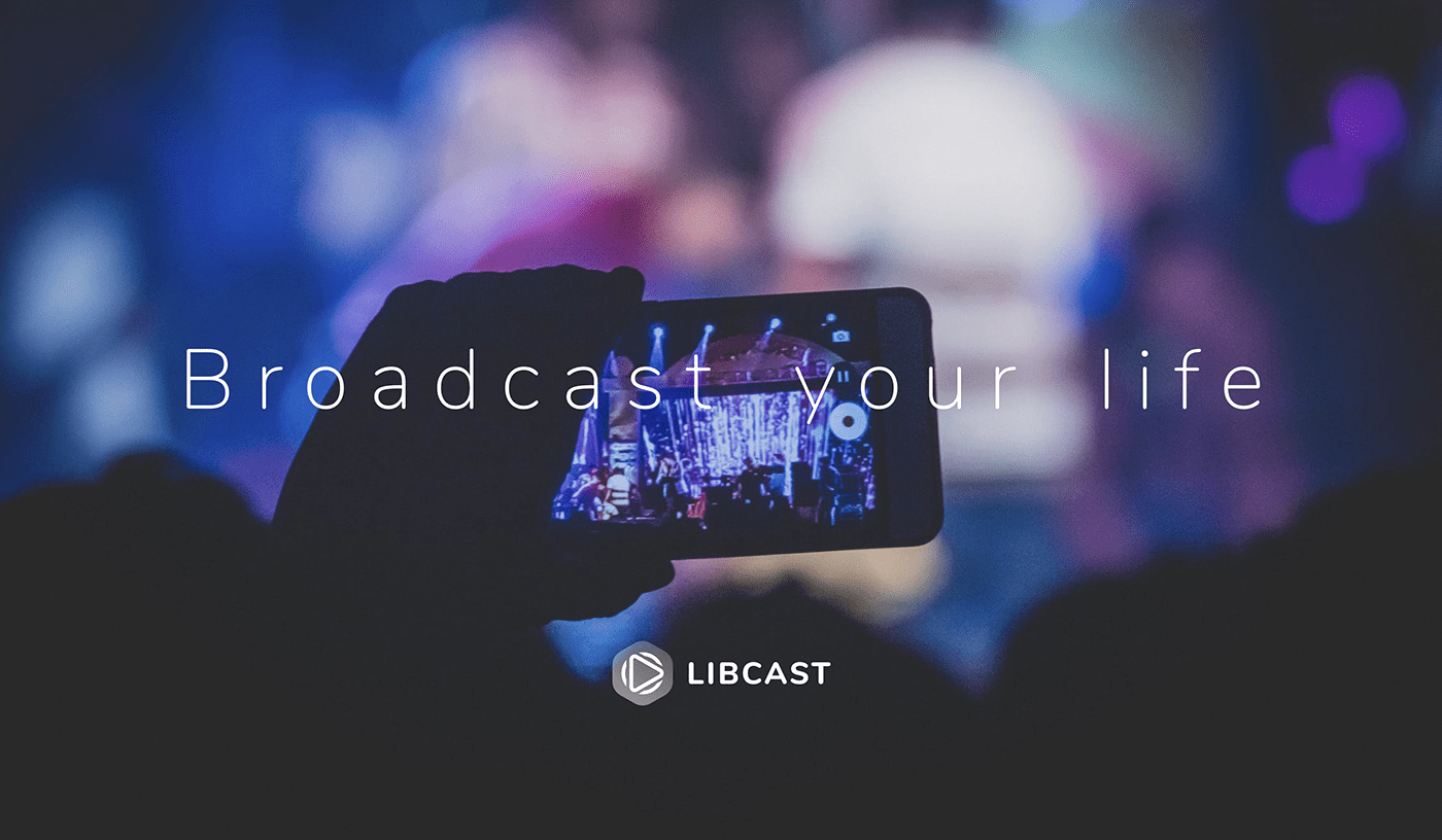
A digital service for videos contents
Libcast is a French company, created in 2006, that publishes a platform for hosting, managing and broadcasting videos over the Internet in SaaS. Its head office is located in Bordeaux.
This company offers a video hosting and broadcasting service for professionals, suitable for BtoB or BtoBtoC3. Users can store their videos, and publish them publicly or by restricting their access to a defined an audience, such as internal company employees or class students.
Libcast offers a white label HTML5 video player, customizable with color and a logo and without ads. The platform also offers additional features such as chaptering, subtitling, adding a document to a video and statistics.
Since June 2016, Libcast has been offering a live streaming service for professionals, easy to use and without advertising.

Rebranding
Caution in the creation of symbols: the danger of meanings
It becomes an urgent priority and the frenzy can take over because you want to return to having a good perception of yourself, as a company. Like when you look in the mirror and would like to change your appearance. After 12 years it was necessary to change the look to be modern, recognizable and competitive in the reference market.
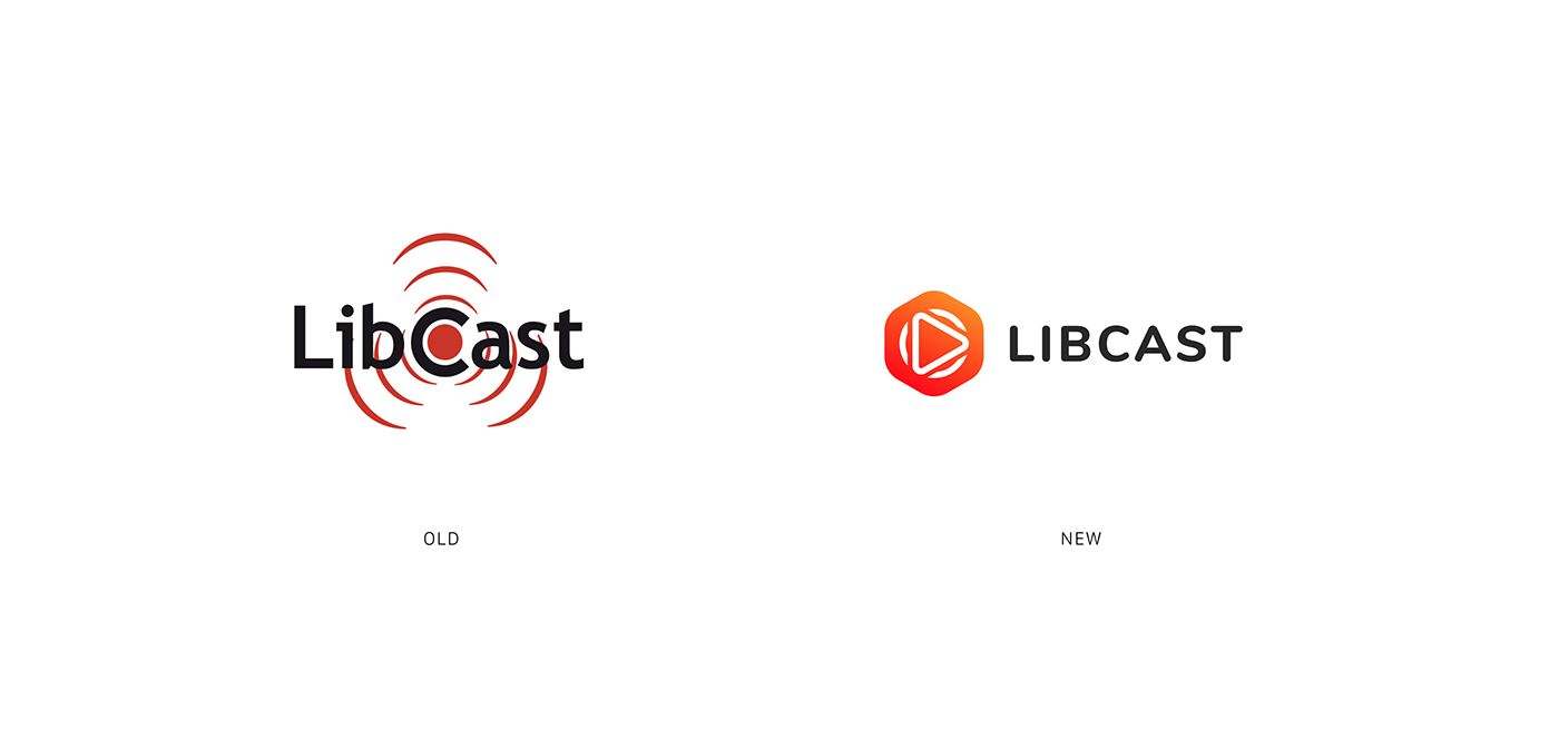
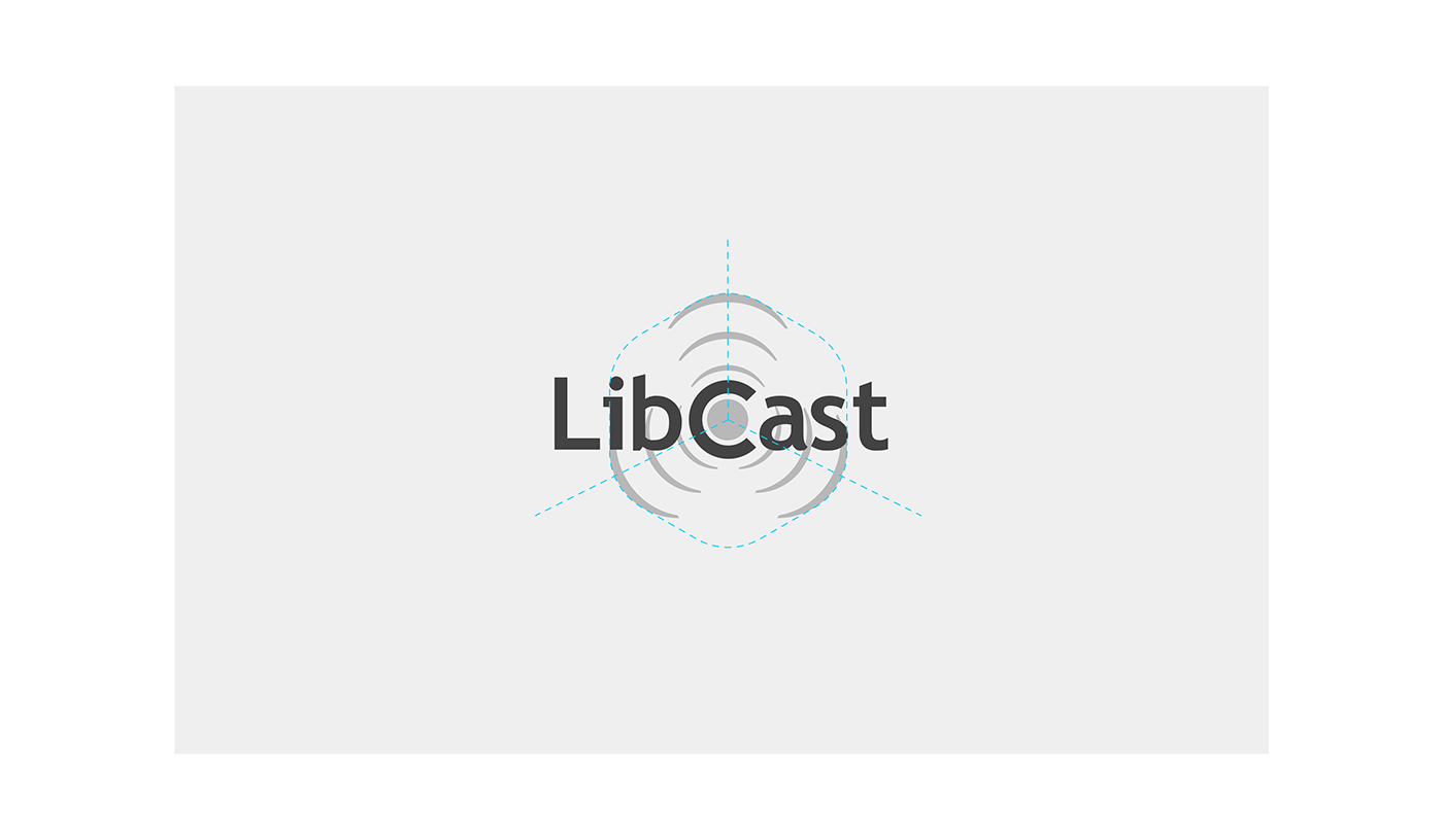
The Libcast logo was a representation of the "Spread" of the videos / live and in its heart, there was a red circle as "Rec" included in the central letter C of the logotype.
It seemed to me that the appeal of the logo was weak, as well as readability, these waves that propagate even in the letters create confusion and do not allow the logo to be dynamic, there was no recognizable sign that it could be used alone, without logotype. The dark red and black colors made the logo maybe old. But the biggest problem was that anyone who saw the logo without knowing the service could think something of "Toxic" or "Radioactive"...so dangerous!

The process
Caution in the creation of symbols: the danger of meanings
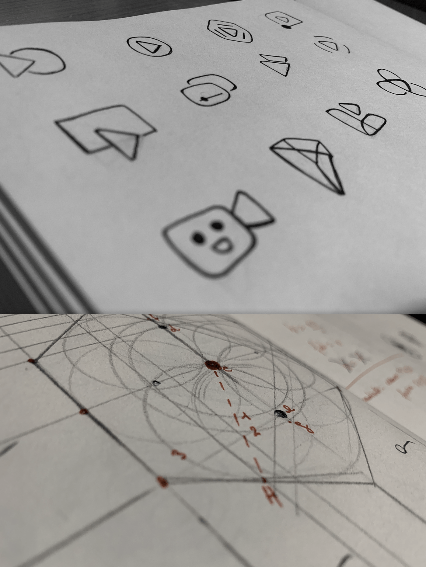
Designing a logo is one of the most tiring things for a designer who works alone, like me. It means organizing informations, studying them, deepening, creating and recreating...and all this in the shortest possible time!
The new Libcast logo is the result of a couple of months of work with the Marketing Department, which immediately proved to be competent and with culture to understand this change.
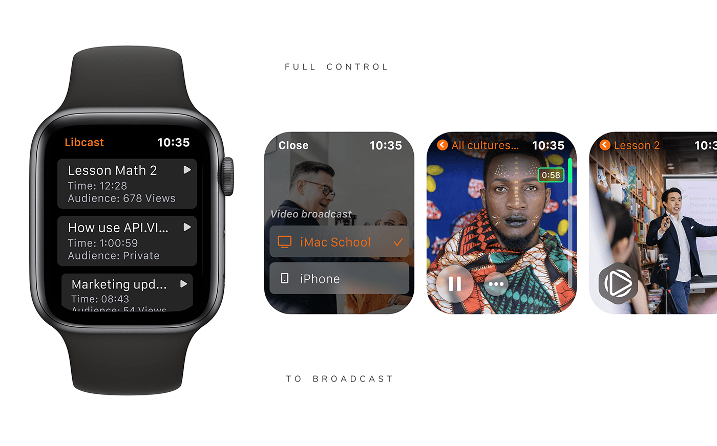
I immediately understood that combining the sense of "play a video" and "start a live" were fundamental concepts to represent Libcast and keep its values. The service offers personalization of player and sharing also on companies websites or social networks, it means that the Libcast logo would have perhaps disappeared. How could I integrate it in a "neutral" way into video contents also in the future in a hypothetical user interface? Yes, my job also means anticipating possible scenarios. My idea so was to create a graphic symbol that could become an integral part of the videos, a Play button, giving to the logo also a concrete function.
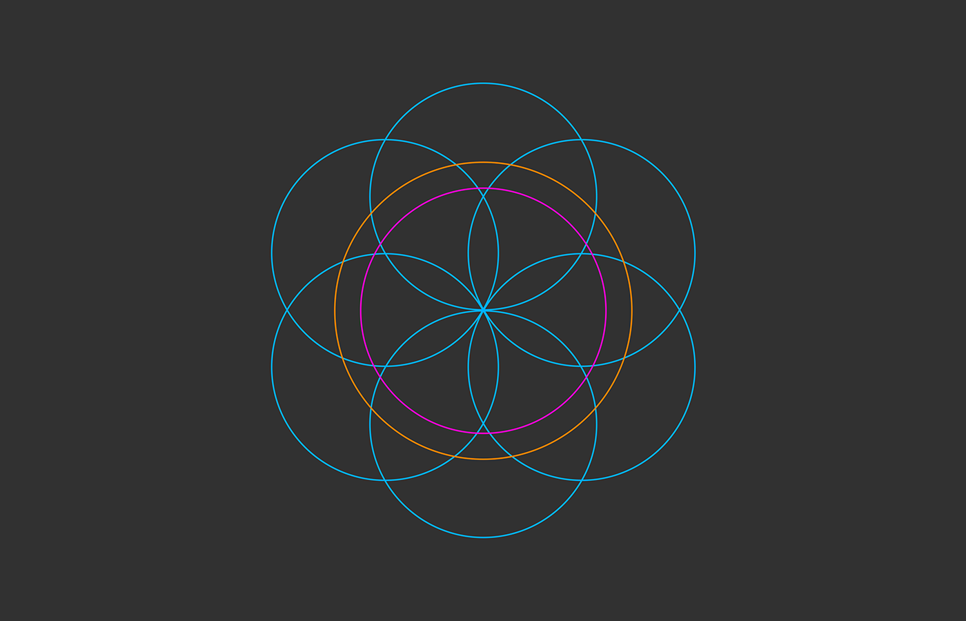
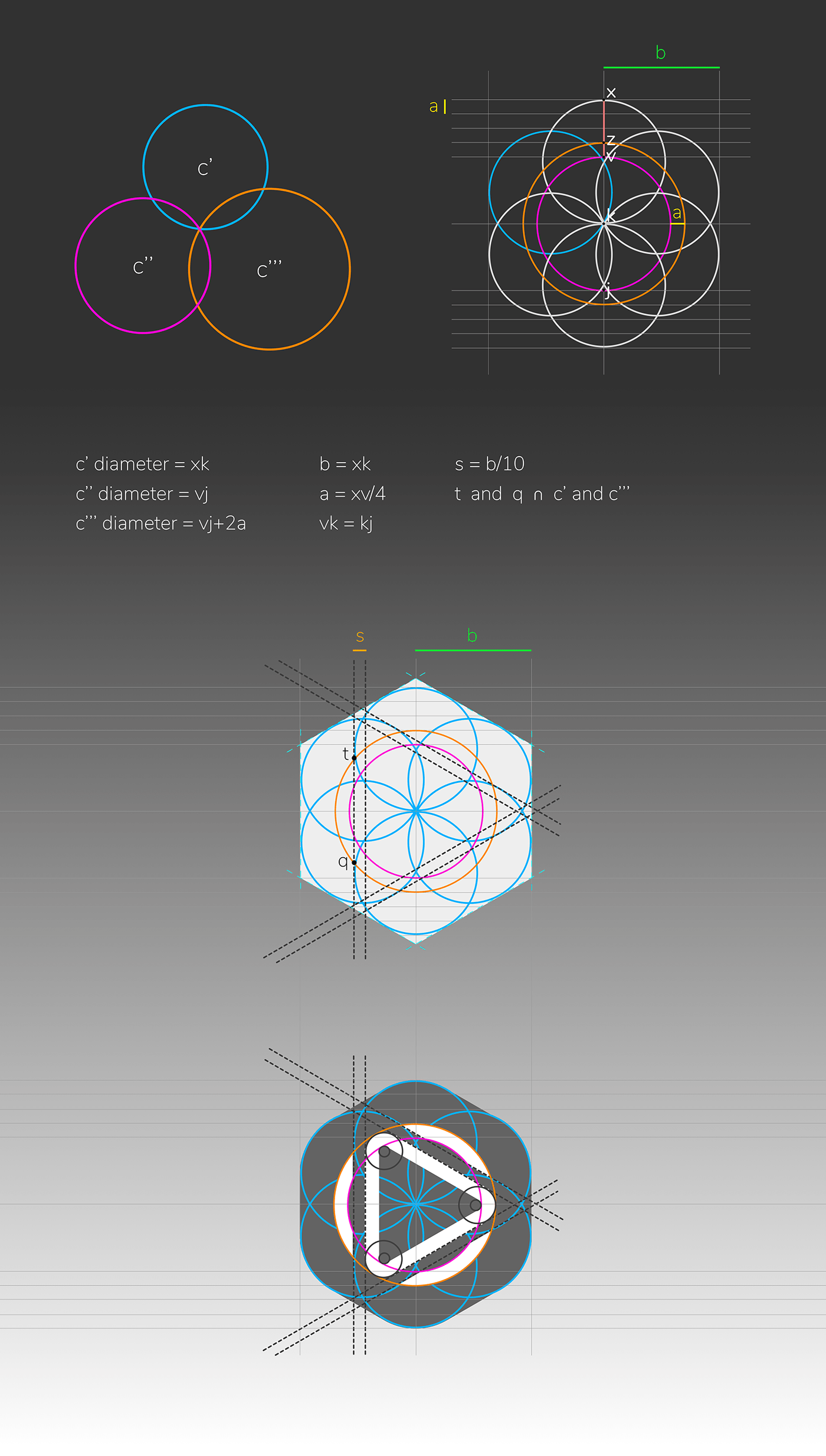
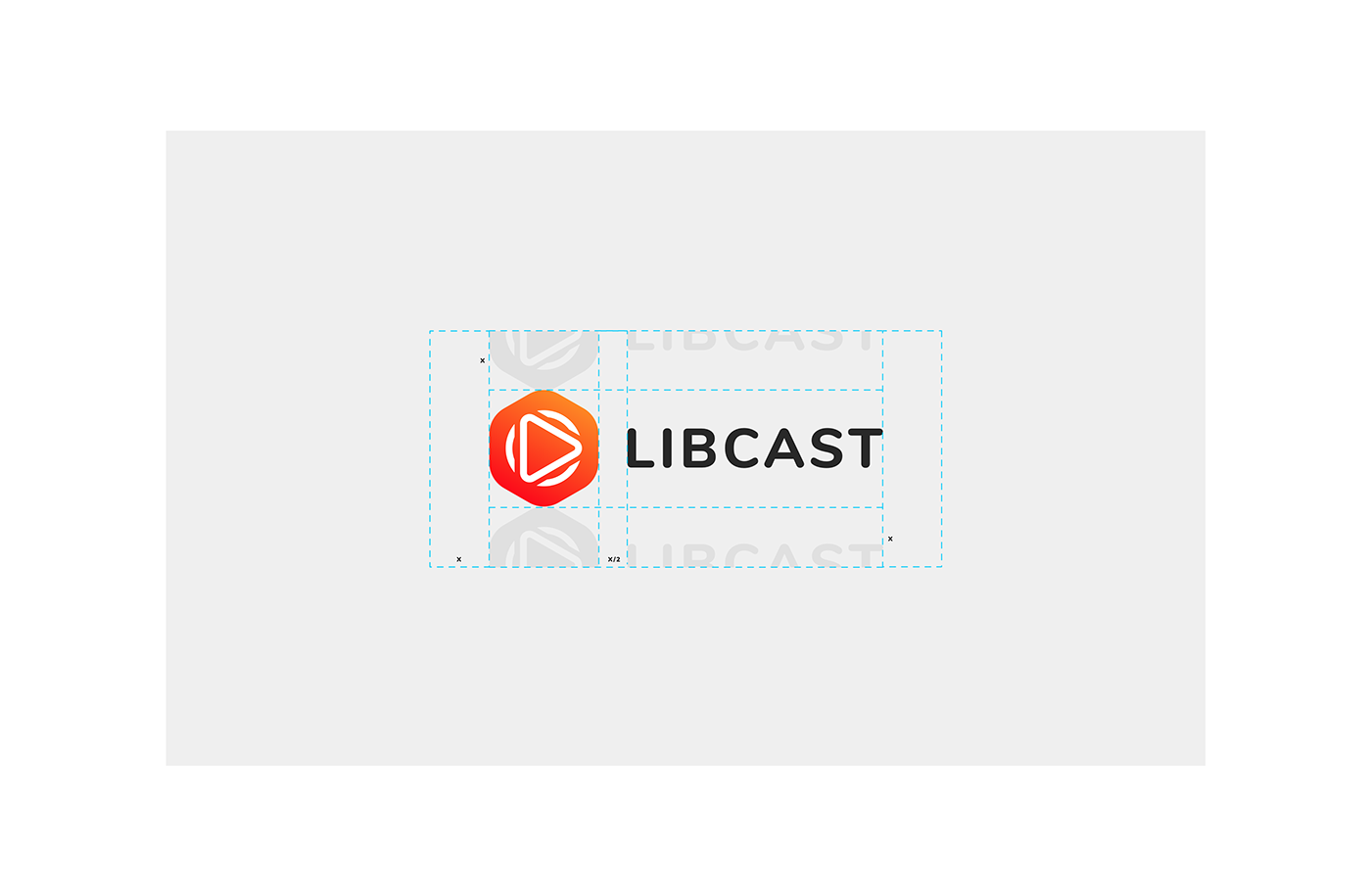
The new logo consists of a central triangle surrounded by three waves. It's a clear representation of a "Play button" as heart of video contents and live streaming. I also added a rounded hexagonal shape, which not only represents a flat-box, so a space as container where videos live, but above all it is the shape of Libcast's country origin: France! Yes, the Hexagone is a french symbol and I firmly believe that every company, even if it develops abroad, must always remember its roots.
The only thing I have kept of the old logo is the use of warm colors, in this case a red-orange gradient, combined with black.
"Nothing is created, is lost, everything changes."
How it evolves and transforms from old
"Nothing is created, is lost, everything changes."
How it evolves and transforms from old
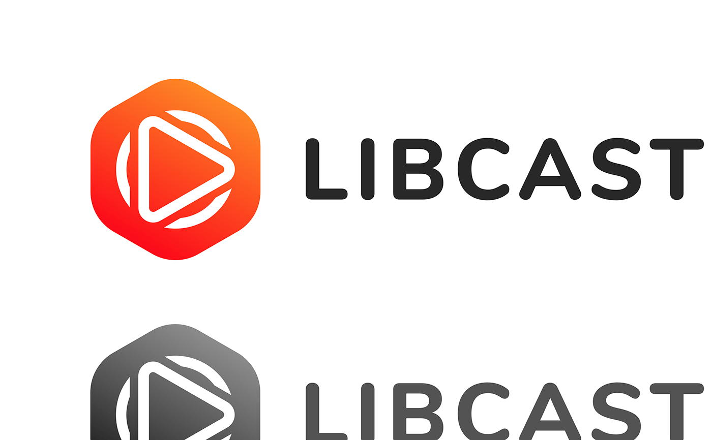
The waves of the old logo were perfectly inscribed in a hexagon and propagated from the center but they were too many and were confused with the textual part. I could use at most 3 of them, like the number of sides of the central triangle they would start from.
In short, it is a geometric logo that was born by itself ... I only put the pieces together, everything got stuck to perfection, so it's not my fault :)
In short, it is a geometric logo that was born by itself ... I only put the pieces together, everything got stuck to perfection, so it's not my fault :)
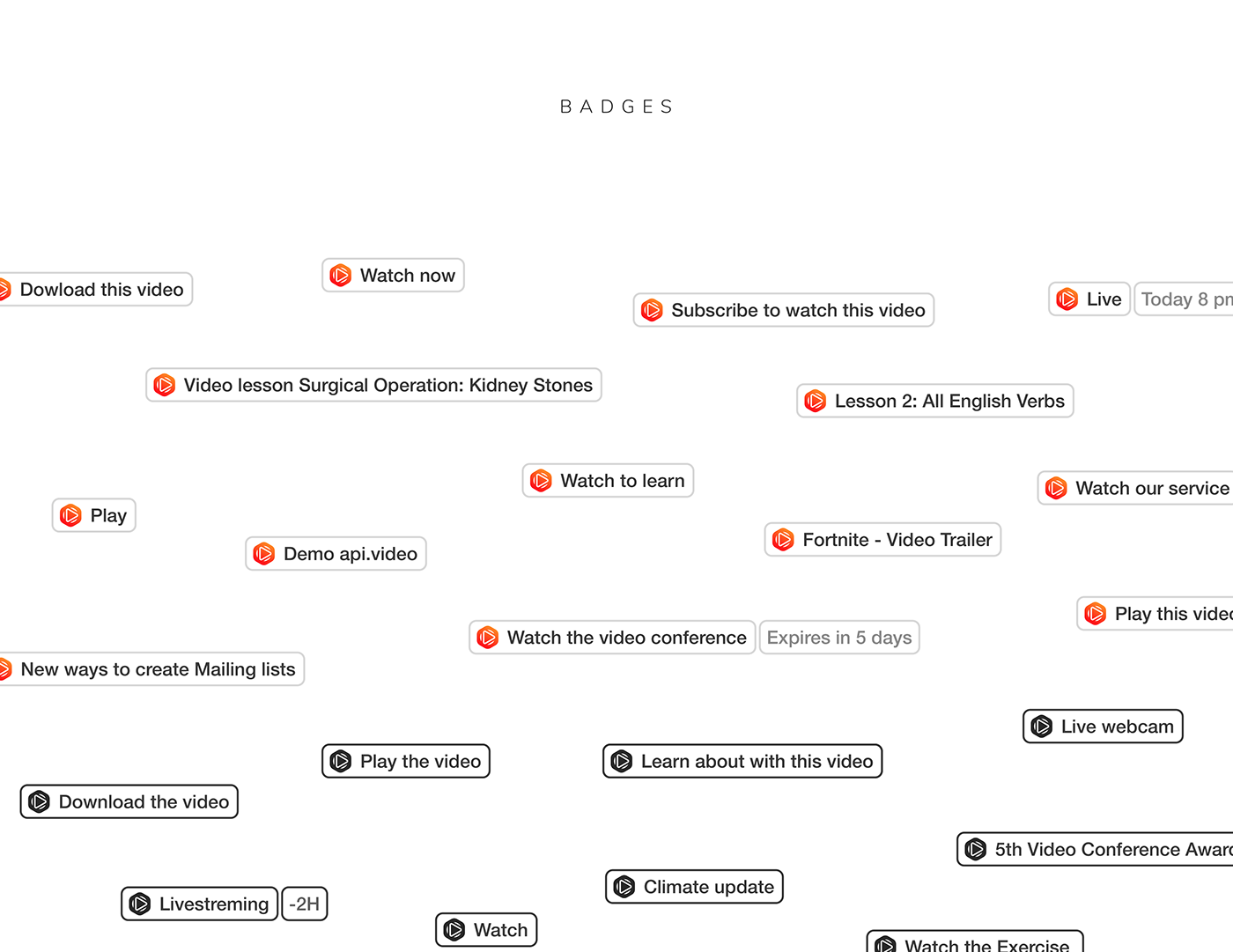
Video buttons for external
A new way to integrate video or live links on websites or email
Another idea was to be able to use the logo in a readable version even in very small sizes, such as for customizable buttons that had videos or live streaming as links, that Libcast customers could use on corporate websites or in newsletter. "Play to watch" is what the logo wants to communicate regardless of any text.
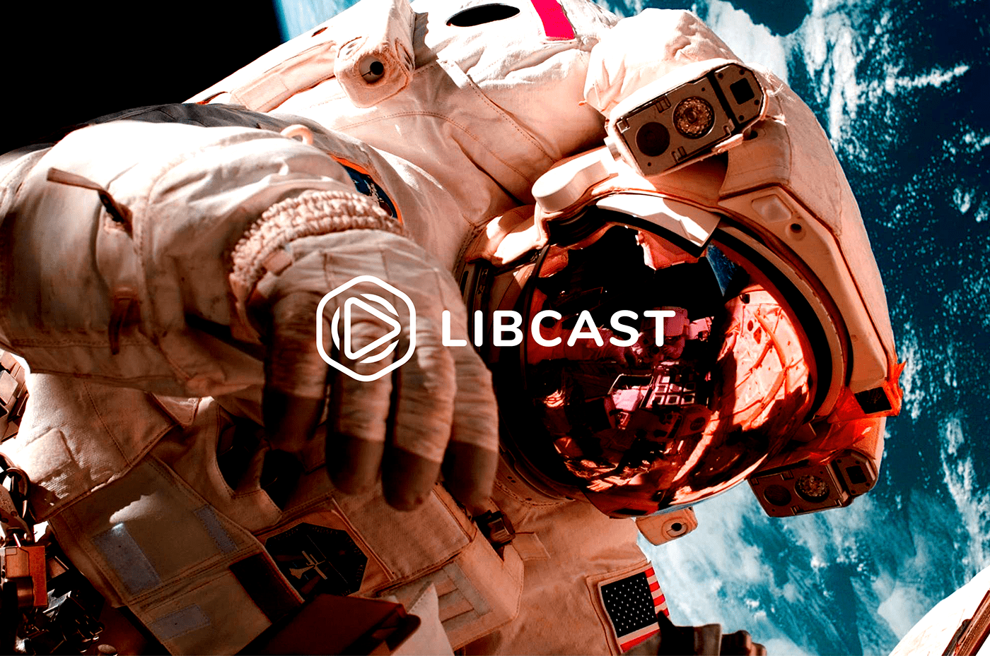
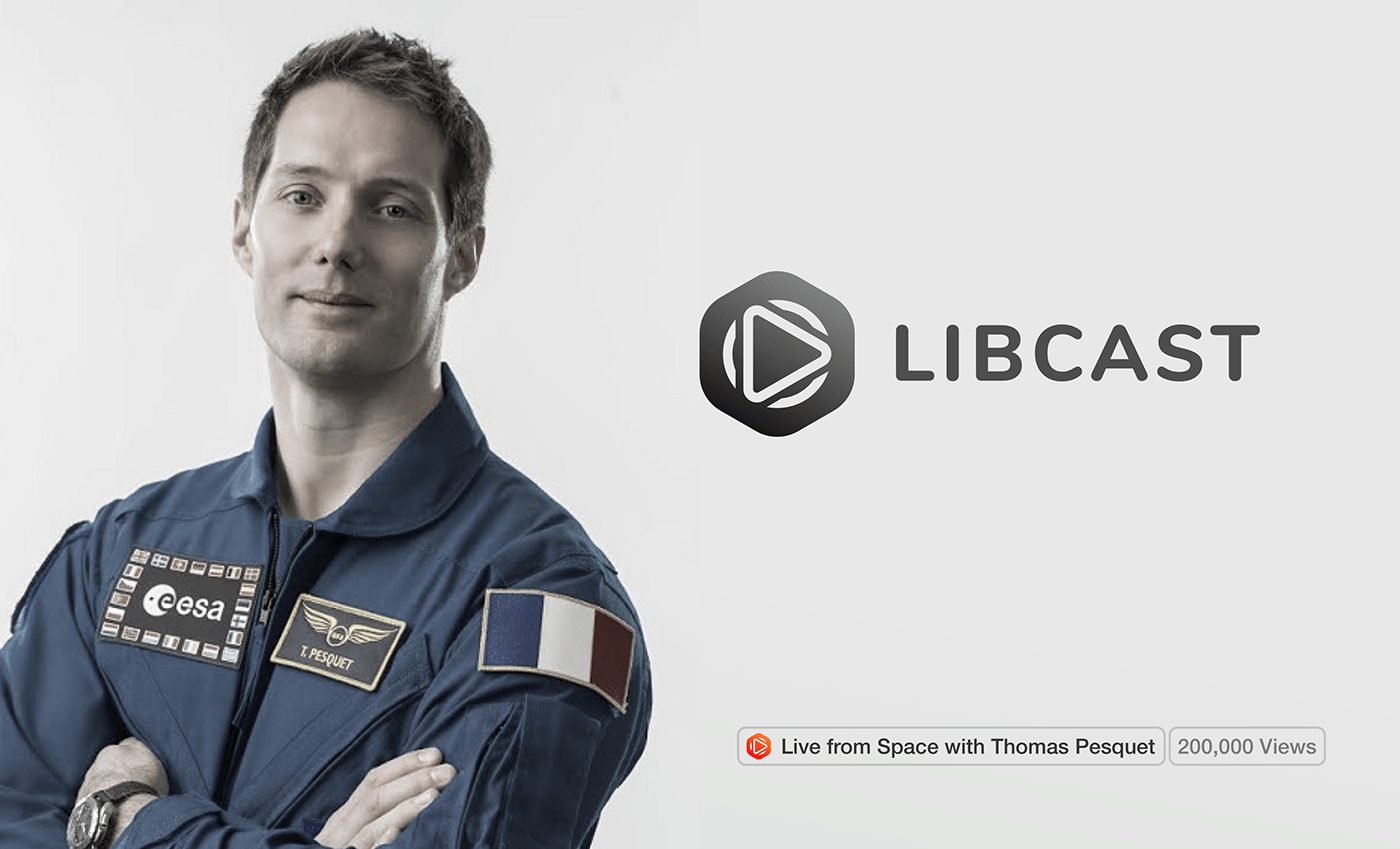
Live streaming from Space
Libcast broadcasts a Live with Thomas Pesquet from the ISS
Libcast is the technological partner of a cool project with Equalx. This company organizes exchanges between Thomas Pesquet and the privileged students who can ask him questions, Libcast retransmits the video stream (image and sound) sent from the International Space Station to thousands of screens around the world.
In other words, the image sent from the ISS (which, it should be remembered, rotates at a speed of more than 28,000 km / hour around the Earth), is received at the NASA Space Center in Houston, in Texas (USA). It is then sent back to a satellite, then received in France and broadcast in a Libcast player integrated into a web page.
Libcast allows all participating classes, 200.000 students, whether located in mainland France or overseas, to receive High Definition picture and sound in seconds.
Watch more about the event on france•tv