©Rassvet
‘Oktyabr’ in Moscow makes history as the first freestanding store
on the local skate scene
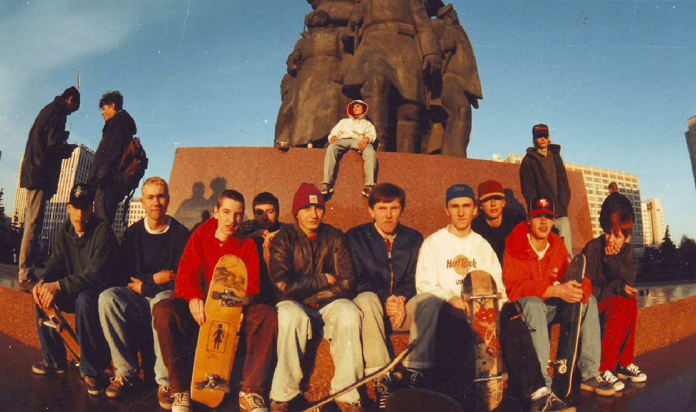
Russian skateboarding scene blew up in July 2018 as the new freestanding store ‘Oktyabr’ first opened its doors. Behind this long-awaited event stands the crew of two—Tolia Titaev and Gosha Rubchinsky, founders of the upstart brand Rassvet. The name of the shop echoes that of the Oktyabrskaya subway station, long known to be the meeting point of Moscow skaters, who would gather there under the monumental statue of Lenin to work on their riding skills and check out each other’s gear.
In fact this is the reason why the client embraced the idea to take the Moscow Metro station sign—the one that all muscovites are acquainted with very well without even realizing it—as the main reference for the identity. And we managed to design a minimalistic yet remarkable and purely typographic lettering. Not only does the logotype resonate on the history behind making it familiar to the local skateboard scene, but on a larger scale it preserves our cultural heritage by reviving the history and putting it in a modern context

Photo: instagram.com/oktyabrskateshop

Kaluzhskaya square near Oktyabrskaya subway station, 1995
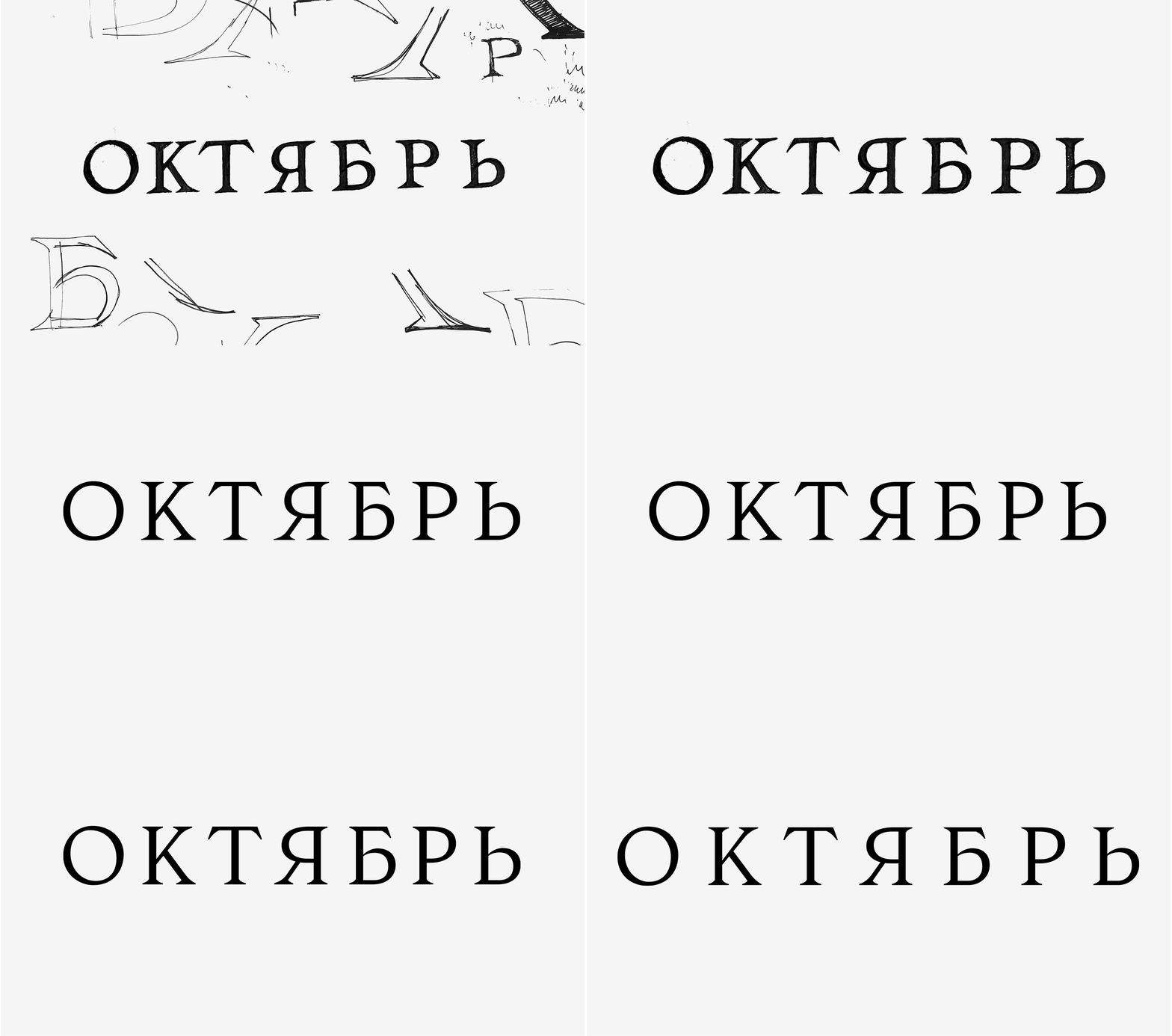
If you look closely at the original sign on the station you’ll notice that it’s actually three-dimensional. So as the first step in development we had to find the best way to get rid of the relief, understand how to treat the details and how not to lose the personality while doing so.

After we figured out overall proportions and weight we focused on defining the key features of the lettering and choosing what we wanted to keep and what we wanted to leave behind.

Straightening everything up
Something that you don’t immediately take notice of is the thin leg of the letter [Я]. Traditionally the leg of the [Я] in different typefaces is thick, but not in this particular case. Whether that was made by mistake or on purpose, we decided to keep this unconventional solution and turn it into a special feature of the logotype giving it a unique delicate touch

Considering repetition and consistency is very important in designing logotypes. The order of letters in a word contains a lot of power by itself. ‘Октябрь’, for instance, ends with four letters in a row that all have small ovals—Б Р Ь Я. The fact that they’re piled up in this way didn’t make it easy for us. But we went on and kept two different approaches that are present in the initial lettering instead of unifying them: so the ovals in [Б] and [Ь] curve into the stem while the ones in [Я] and [Р] meet the stem at 90°.

Intermediate version. All four arcs are rounded, curved into the stems — Final version. Combining two approaches: 90° junction and curved arcs
At this point when all the important decisions had been made we could work on fine tuning details, polishing the serifs and spacing between the letters. Willing to keep the spiky impression in the logo we made some of the junctions of the strokes slightly thinner. The serifs don’t attach smoothly to the stems. The curvature is sometimes a bit less polished and more robust. All this helped us to set a similar spiky three-dimensional character that we perceive while looking at the lettering on the station.

Left: ©Vogue, Dmitry Mironov |nRight: instagram.com/oktyabrskateshop
Designer: Nikita Sapozhkov
Supervised by Maria Doreuli and Liza Rasskazova
Client: KIXBOX
Art director: Arseniy Kazimirov
Year: 2018


