
Okay, let's practice actual problem-solving skills. As much as I love drawing bold colors and abstract posters, I really enjoy meaningful products solving real needs.
There is no better way to practice this skill than to solve some realI world problems. Wait, but where to find them? Well, I love gadgets and startups. Let's look around!
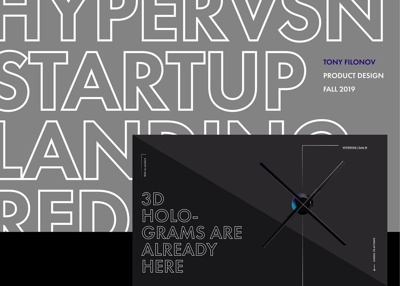
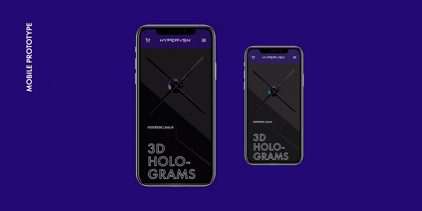
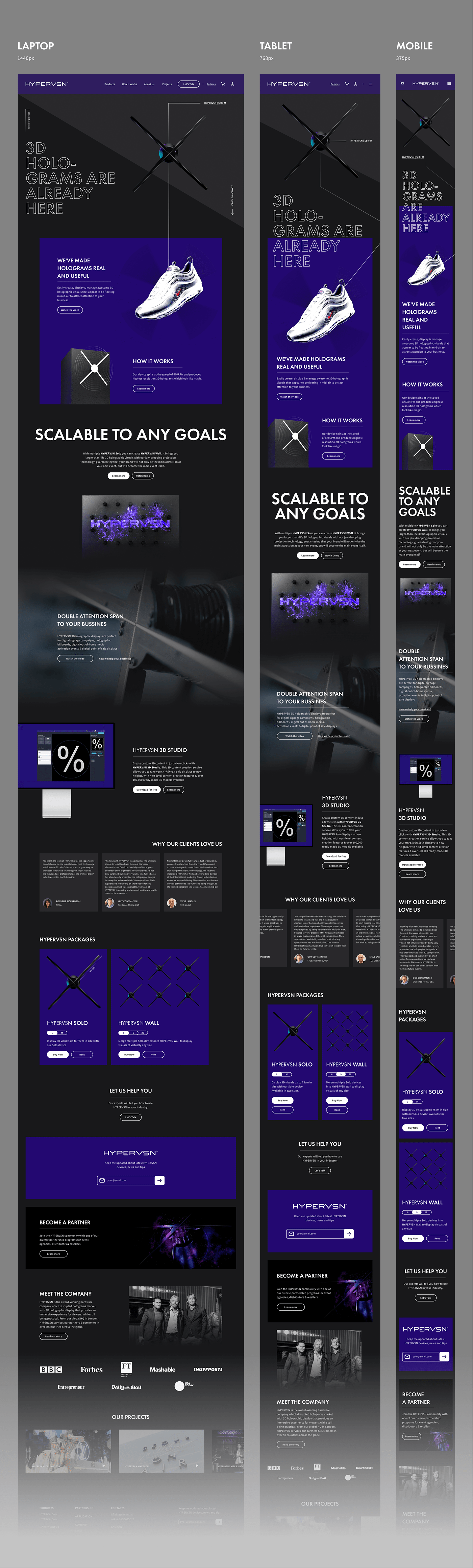
Yeap, found one. Even in my local city. Today I'm redesigning landing / home page for HYPERVSN.
WHY THEY NEED REDESIGN

OUTDATED
well, just look at trends, boy
BORING
faceless phrases, no story
just a standard template with generic
just a standard template with generic
delivery
DISPASSIONATE
inexplicit product showcase
dense layout, confusing indents
low-quality icons
dense layout, confusing indents
low-quality icons
CONFUSING
basic info spread on different webpages
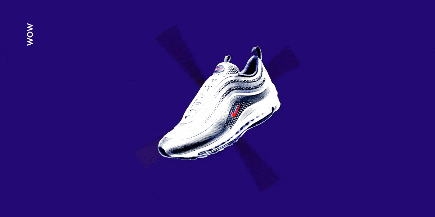
generic illustrations instead of actual photos
minor blocks take major space
generic illustrations instead of actual photos
minor blocks take major space
visual noise
dense layout
But that's exactly the case where you can do it cool. Let's fix it!
GOAL
Appropriately showcase bold startup to the general public.
PRIORITIZE
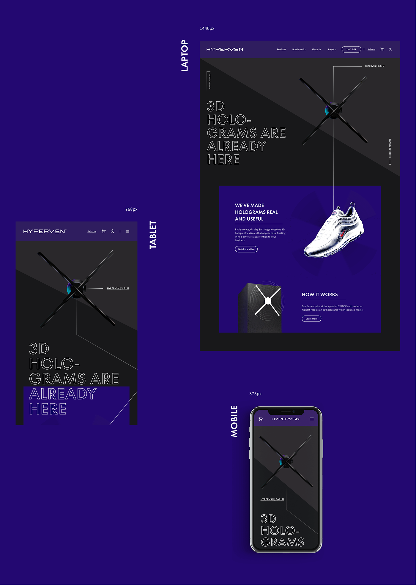
Let's start with solving the main UX problem – inexplicit product showcase.
The solution is simple – remove unnecessary features and put the fanciest product picture right on the cover and animate it to show the idea. Also, explain right away why the product is cool.
MERGE
Basic info about products and how it works is spread on different pages. Moreover, links to products look terrible.
Solution – merge blocks from multiple pages and create adequate-looking links.

JUST REFRESH
Well isn't everything just better when the style is refreshed regularly?
Especially if this style is my favorite minimalism. :)
THANKS FOR READING!
LET'S JUST HOPE THAT ALL COMPANIES WOULD BE FOUNDED BY DESIGNERS 🤪


