
Brand Identity and Stationery
Cleaf Farms
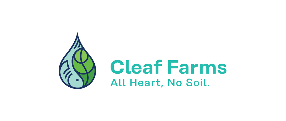
OBJECTIVE: To clearly brand an urban aquaponics startup in a way that was easy for prospective business partners—ranging from municipalities to chefs—to understand his products and process.
SOLUTION: Aquaponics is similar to hydroponics, but with the incorporation of fish as part of the water stream fertilization and filtration process. Our approach was to combine the important elements: water, plants, and especially fish, into a compact geometry that would speak without words.
We built the logo mark on an underlying geometry of circles incorporated into the droplet, taking care that everything felt balanced and consistent. When designing, it's crucial to have a logo that works as well in black and white as full color, so we included a version that is a white outline for special applications.


“
When one is venturing into a new business, it’s always great to find the right help to convey the right message to attract your potential customers. Its one thing to create the business and make the product, but it’s totally another when one has to attract people to try it. As a result, startups such as mine have a challenging time creating the right brand; a message that truly reverberates with our audience.
That’s why working with Fizz Creative was awesome! They worked with me throughout the design process and diligently kept me in the loop. They really took the time to take my thoughts and feelings into consideration when creating a lasting brand. As a result of our close collaboration, the final product turned out great and was everything I needed and more! The right help! The right message! Thank you!
–Kevin Calhoun, Cleaf Farms

