
Brand Identity and Custom Font
Redmond Waltz
OBJECTIVE: To rebrand a well-established company in the manufacturing and service sectors, where branding is often overlooked our outdated.
SOLUTION: Our approach was to honor their history while giving them a more durable and mechanical-inspired mark, derived from the stator core of an AC generator. We kept the RW monogram from the previous mark, but updated it to feel more contemporary and thoughtful. The unique nature of this project inspired us to design a custom font, which borrowed geometry from machinery to create a feel that is hard working but still shows precision.
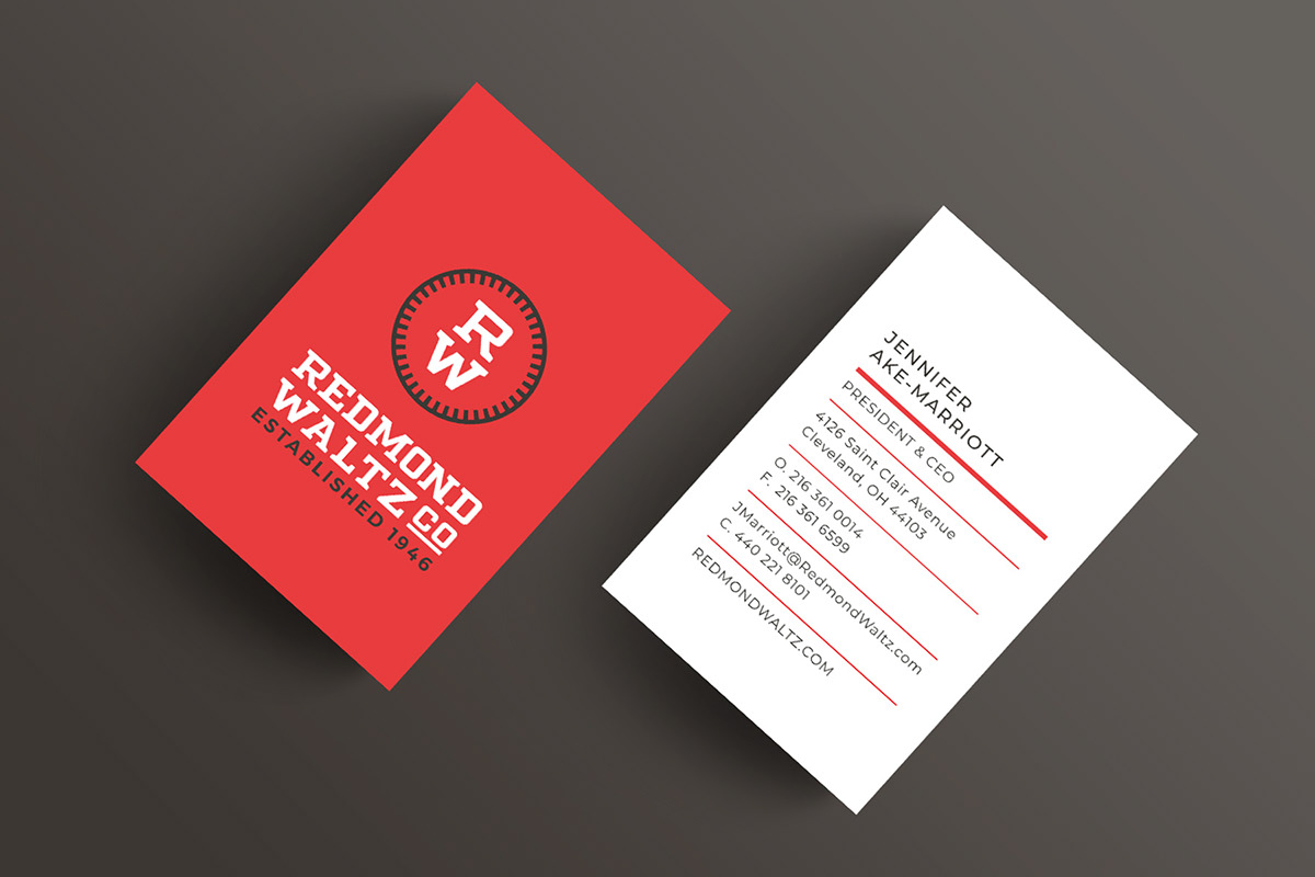


Our client’s unique specialization lead us to design a custom font for the logo, which felt durable yet precise, like a trusty old wrench. Working with the client, we were inspired by some of their vintage shop tools, and the lettering found on pieces of cast iron machinery. We applied this type design to the logo before building out the whole typeface.


