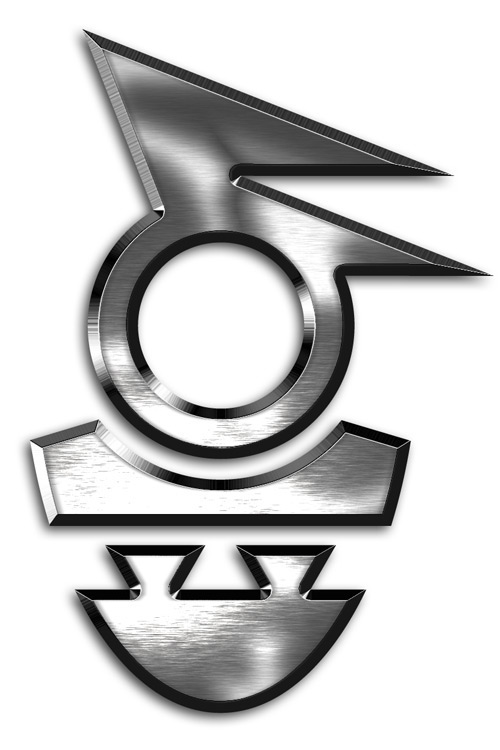
The briefing for the logotype: "Windson. Imagine a Norseman; son of strong winds, also, a son of the sea. Badass with style and an edge, literally or not. Powerful, mean & nice, steely, but not too polished."
The Wndsn legend is elaborately packaged, visually legible if you want to, with every detail meaningful, yet powerful on its own, as an impressive shape. The result is essentially a combination of the symbols for Wind and Son. The metal effect is part of the deal, but there is nothing more pure than the papercutting style. I make every detail count, or eliminate it altogether. Talk about hyperinfusion of meaning -- in other words, you cannot over-interpret this logo.
Backstory & making-of at: http://showcase.alexanderbecker.net/notes/logo-windson.php