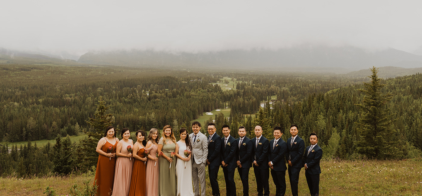
K+L Wedding
A wedding between two people set in the mountains. The K+L mark stemmed from the simplicity of two rings. Combined with the couple's initials, creates a solid, bonding mark. An alternative version was used for night time wedding festivities. The couple's colors starts with the primary palette of navy and copper. But then it's extended into 4 other tones, to give the wedding a diverse, theme. Outdoorsy, mountains, natural, simple, soft.
The main visuals that expanded across the wedding collateral are the illustrations. The four scenes kept with the mountain theme and also included the four parts of the wedding - location, ceremony, reception, after-party. Printed accordion fold invitations were printed and sent out to guests. Simple card-stock folded and placed in textured brown envelopes. RSVP and wedding landing pages were created with all the wedding information.
Client: Kaonou + Linh
Studio: Liph
Capabilities: Art Direction, Branding, Digital + Print
Studio: Liph
Capabilities: Art Direction, Branding, Digital + Print


