The Client
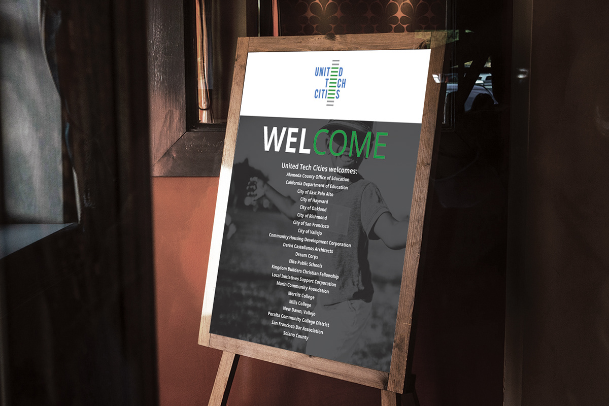
United Tech Cities is an organization comprised of a group of companies whose goal is to create a community-to-tech pipeline for people of color.
The Objective
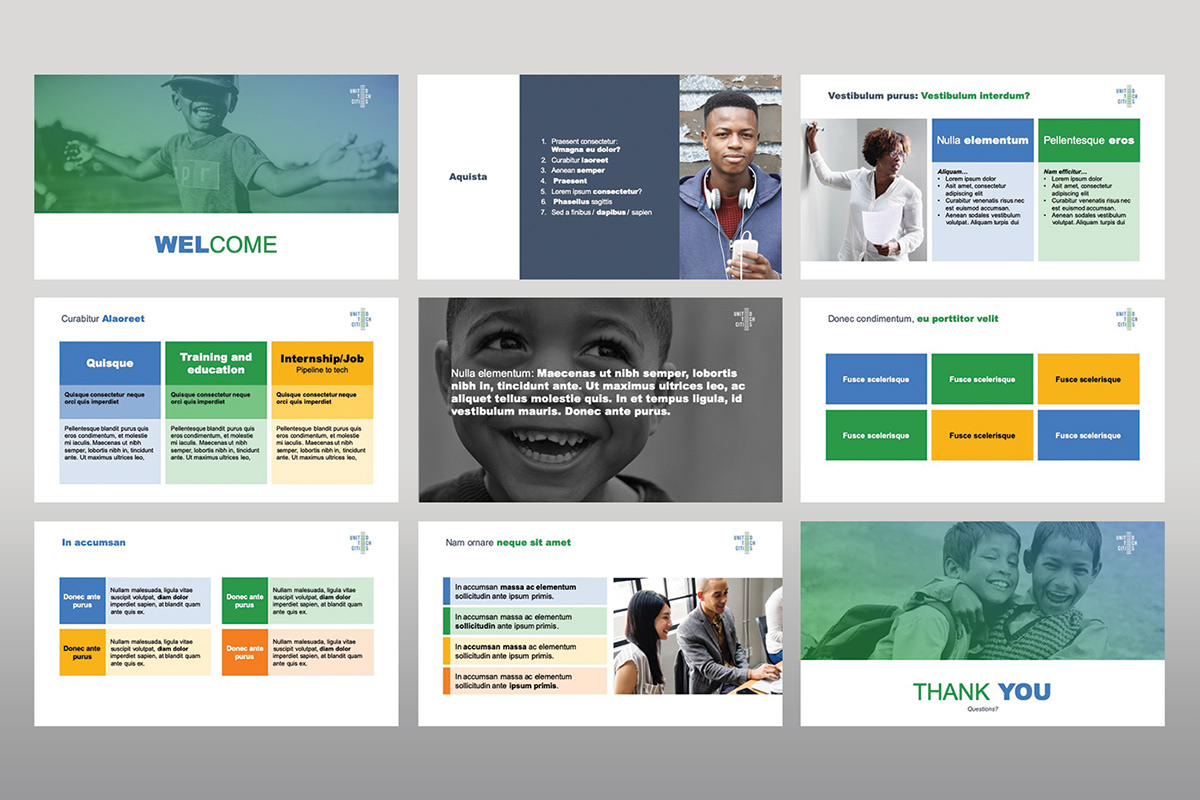
Create a vibrant, attractive and friendly brand identity.
The Solution
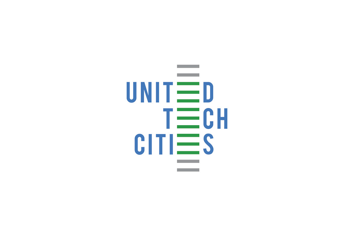
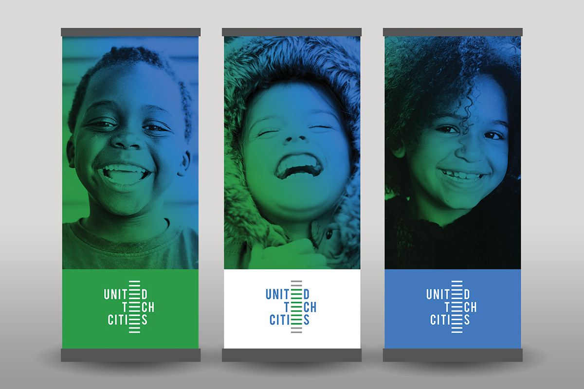
The logo is comprised of a bold, "tech-y" font and vertically stacked horizontal lines. The horizontal lines replace the "E's" in the logotype and is also representative of a ladder. The colors of the logo are cool and calm yet elementary. The images of children used are overlaid with a gradient of the brand's colors to emphasize the positive effect the organization hopes to make on these children.