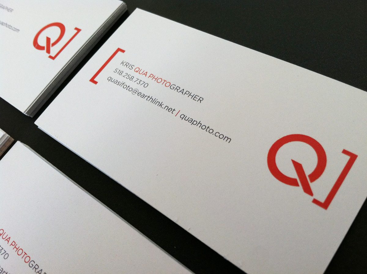
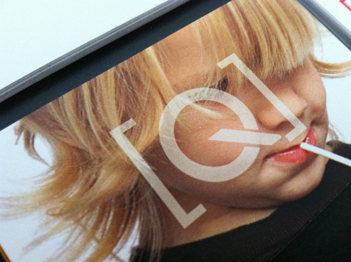
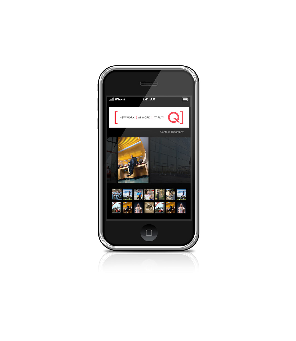
Qua Photo
Logo Identity
Logo Identity
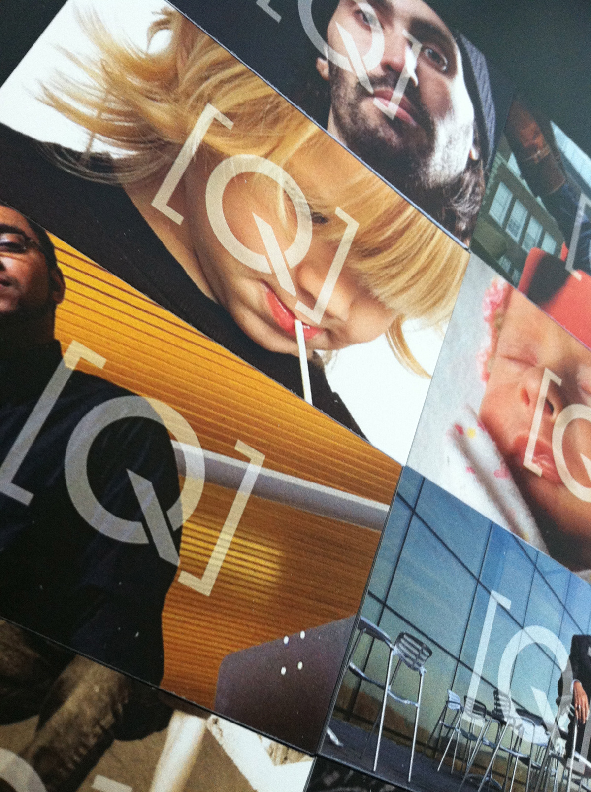
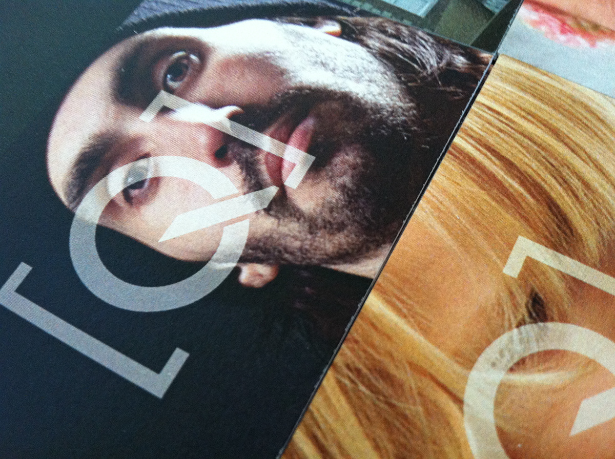
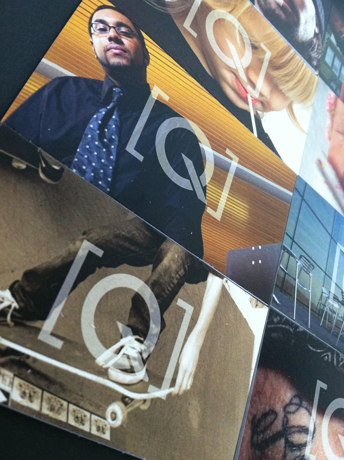
Photographer Kris Qua was looking to update his branding with a new identity and website. Kris provides a unique mix of traditional photographic solutions with focus on Healthcare, Education and Portraits. In addition his personal work is rich with images of passion for the skateboard culture he loves and unique art based experimental photography and portraits. The logo uses the “Q” and brackets to create the abstract image of a camera, the colors are a bold red and medium gray. The cards where developed to highlight Kris’s photography with a different image on each card, 8 in total.