We were faced with the task of creating a single concept and style solution for two interrelated Austrian brands — a wellness studio and an online natural cosmetics retailer.
Both brand logos were executed in a naive, youthful style, which failed to draw their target audience. We helped formulate and further clarify their company values of internal balance, harmony of the body and soul, use of natural ingredients, and incorporated elegant, modern and simple elements via a fresh antiquarian font and bio-inspired textures. Their visual style became warm, feminine and inspiring of trust, while simultaneously conveying a high level of competence.
Both brand logos were executed in a naive, youthful style, which failed to draw their target audience. We helped formulate and further clarify their company values of internal balance, harmony of the body and soul, use of natural ingredients, and incorporated elegant, modern and simple elements via a fresh antiquarian font and bio-inspired textures. Their visual style became warm, feminine and inspiring of trust, while simultaneously conveying a high level of competence.
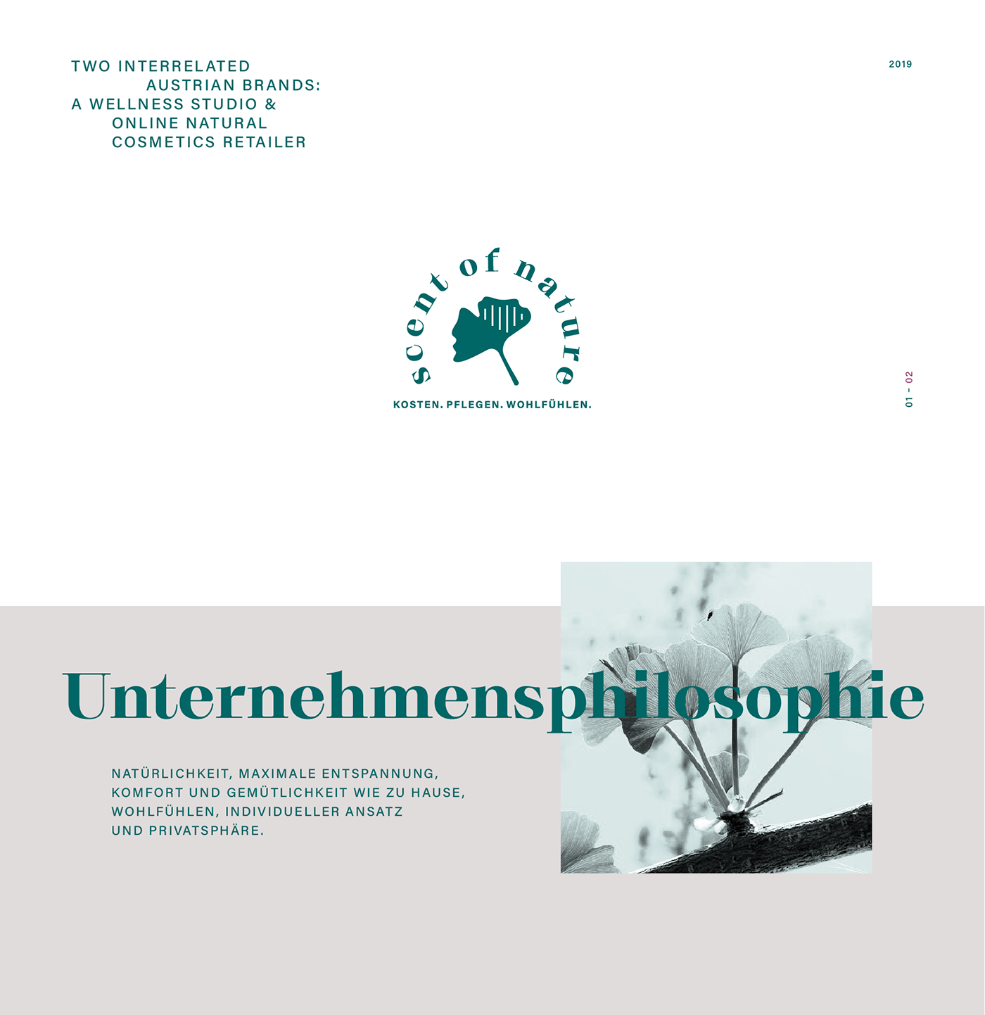
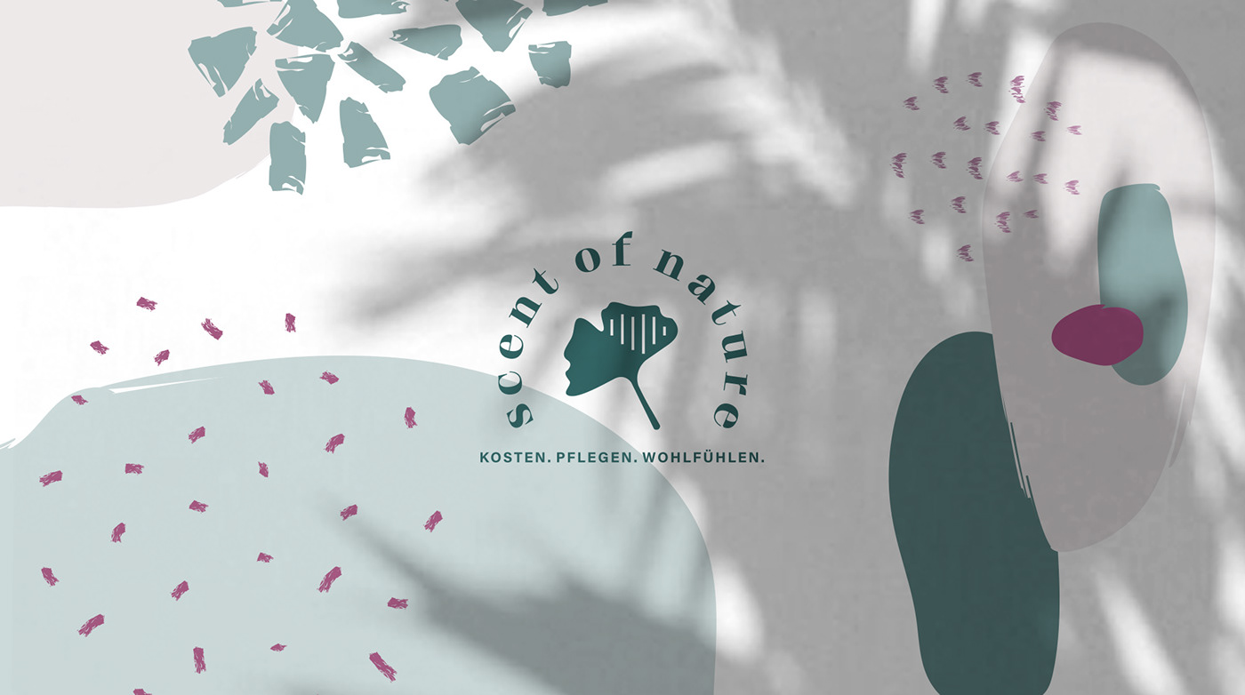

For Scent of Nature, we selected the Ginkgo biloba plant as its symbol. Charles Darwin defined Ginkgo as a “living fossil” because it has existed on Earth for 300 million years, and is currently the last surviving species of its plant family. The plant has a number of unique healing properties and has traditionally served as a symbol of immortality. Most importantly, it gracefully reflects the idea of unity in diversity, and diversity in unity—the very essence of holistic medicine.
For Holistic Wellness, we chose a hand—a symbol of care, human contact and aid, complemented by a spiral—a symbol of vitality. Spiral motifs can often be observed in nature; they serve as signs of growth and development, continuity, movement, breathing rhythms and of life itself.
Thus, a new umbrella brand (with the possibility of further scaling) that unites two co-brands, which share a common philosophy and graphic solution was born.


Перед нами встала задача создать единое концептуальное и стилевое решение для двух взаимосвязанных равноценных австрийских брендов: велнесс-студии и онлайн магазина натуральной косметики. На момент обращения оба логотипа имели несколько детское исполнение, что было проблемой для клиента, т.к бренд не попадал в сердце ЦА. Мы помогли сформулировать ценности компании: внутренний баланс, гармония тела и души, использование натуральных материалов, и придали брендам изящества, современности и простоты, выбрав актуальный антиквенный шрифт и био текстуры. Визуальный стиль стал теплым, доверительным, женским, одновременно передавая высокий уровень компетентности.
Для символики знака Scent of Nature было выбрано изображение растения ginkgo biloba, названного Чарльзом Дарвином «живым ископаемым», т.к существует на Земле 300 миллионов лет и не относится ни к одному из ныне живущих видов растений. Оно обладает уникальными лечебными свойствами и является символом бессмертия. А главное – отражает суть идеи единства в многообразии, и многообразия в единстве – базовую идею холистической медицины.
Символика знака Holistic Wellness – рука как образ заботы, человеческого контакта и помощи, дополненная спиралью – символом жизненной силы. Принцип спирали часто встречается в природе как знак развития, непрерывности, движения, ритма дыхания и самой жизни.
Таким образом, родился новый зонтичный бренд с двумя ко-брендами, объединенными общей философией и графическим решением, и с возможностью дальнейшего масштабирования.


