

Personal Branding 2: Electric Boogaloo
The most intensive side project I’ve worked on lately has been getting my personal brand into shape. This involved in-depth learning about proper typography, research into art movements, family history, and some long thinking.
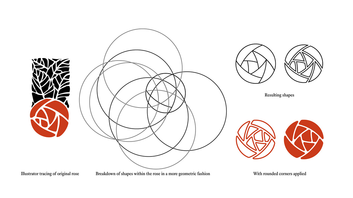
Roses and other flowers are common design motifs in the Roycroft style of art and design. As a person who enjoys plants, I felt that this would be a good combination of my history and something that I enjoy. I referenced a print designed by another artist, and abstracted it a bit. The choice to use a Roycroft style typeface was a given, and I found a suitable one with some nifty ligatures. I decided to use a serif typeface for the majority of the rest of the banding materials to bring in a traditional, print type of feel. I chose red as my brand/accent color because a majority of books and artworks printed by the Roycrofters are in black with red accents.

Growing up in the Western New York area, I’ve been familiar with the Roycrofters and their design style for a long time. My family has a history working in their shops and living in the East Aurora area, so I’ve always felt connected to the Roycroft movement. Walking around the Roycroft campus was a big part of my younger years, and I’ve enjoyed researching the Arts and Crafts movement as a whole. I wanted this family history to be evident in my brand, as I feel that’s where I get a lot of my creativity from.


