
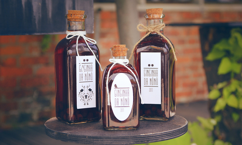
THE STORY BEHIND THE BRAND
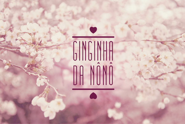
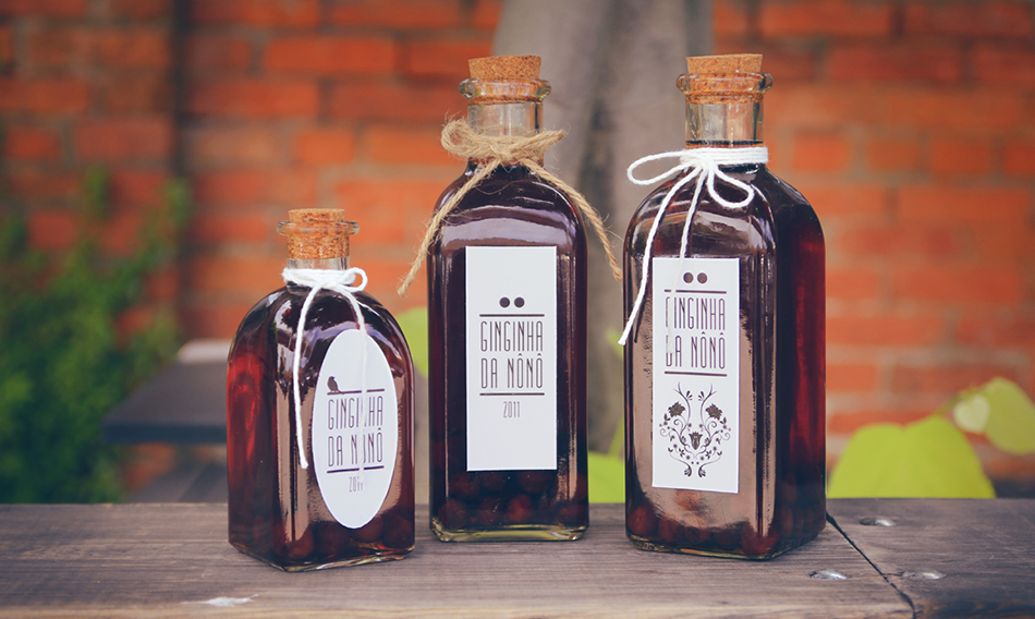
It has become a family tradition, that every year my mother brews this awesome liquor everyone loves: Ginginha ( the closest translation is cherry - but a more acid type). She usually offers it as a gift to her friends and members of the family. She asked me to create a label for the bottles, so I started experimenting and creating a whole brand around it. Nônô is a friendly nickname she got from her days in college, the beverage was named Nônô's ginginha.
The goal was to give it a traditional feel, but also adding a modern twist to it, being minimal in the design. For that, I chose to work in black and white, and to use basic elegant shapes & typopraphy, the bottles reminded me of old farmaceutics and alchemy where the content was always handmade. Everything here was handmade too.
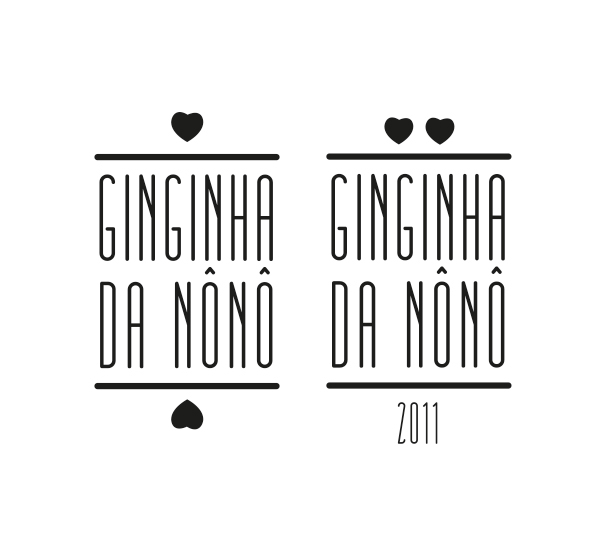
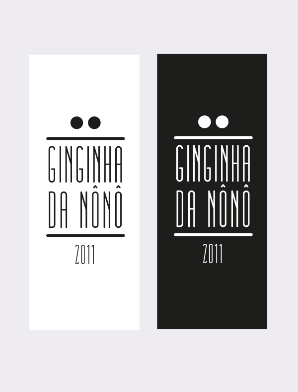
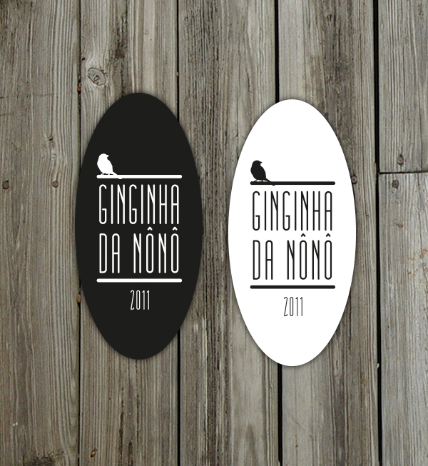
There are 3 different concepts that I experimented with:
- 2 circles simbolizing the essencial form of the cherry.
- 2 hearts symbolizing the essencial form of the cherry but also transmiting the care with which the beverage was brewed and being a gift of love.
- Portraying a bird that is known to feed from this cherrys and is usually seen around them.
My goal in making all these variations of the logo was to understand which one was more appealing to people, so that in the following year I could pick one of them to become the official logo.
Client: Mom <3
Personal Project


