

This piece depicts three world maps. The first map is about the countries in Olympic history. The second is about the sports and the third about the people who made it all: the athletes.
The first map represents the biggest Olympic medal winners: the greater the number of medals, the greater the area of the country. We can also view the ratio between gold, silver and bronze medals (this information is available for the top 20 of the medalist countries and for Brazil). We also got an extra map, with the greatest medalists “per capita” – Finland leads this category, with 0,057 medal per inhabitant.
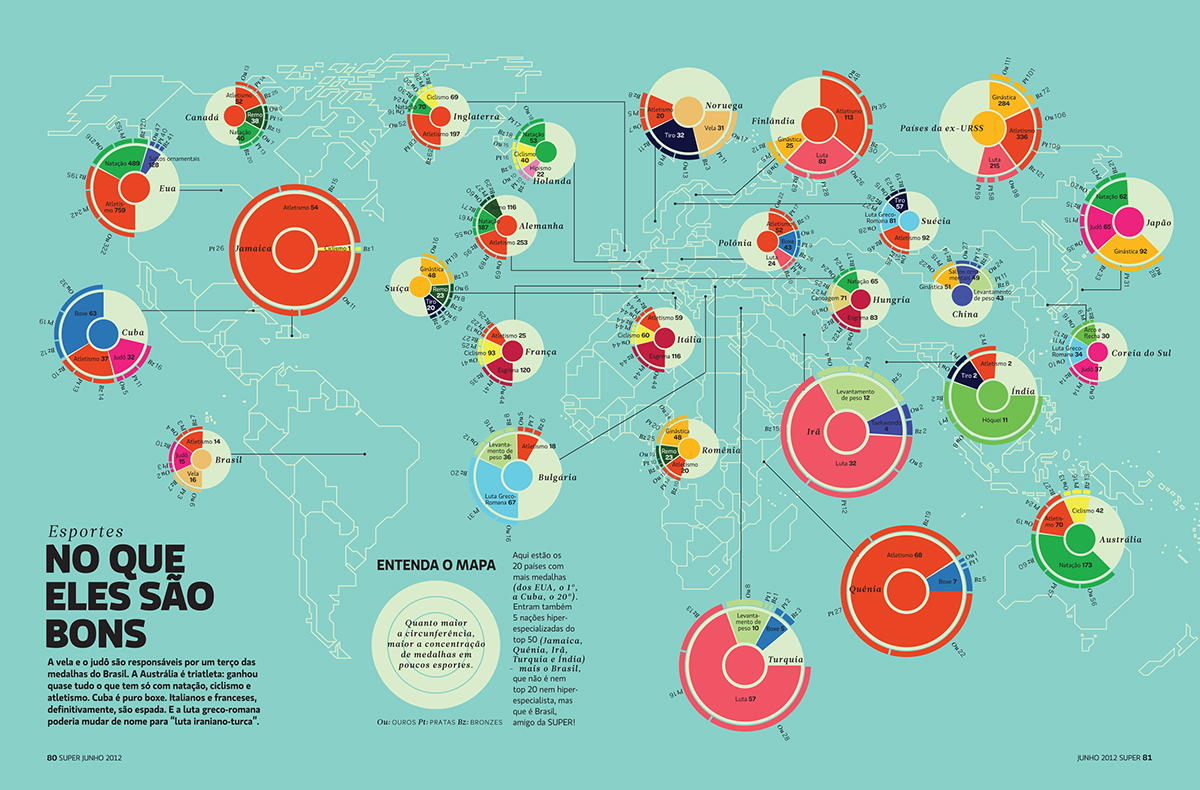
The second map represents the sports each country is “specialized” the most. With this “tool” the reader can easily find information like “Iran is highly specialized in wrestling and weightlifting” and that “India is a hockey superpower”. The more specialized the country, the bigger the circle that represents it.
The third infographic is a world map drawn with the names of the greatest medalists per country. It also depicts the top three medalists for the top 20 countries (plus Brazil), and show the ratio of gold, silver and bronze medals each one conquered.
The first map represents the biggest Olympic medal winners: the greater the number of medals, the greater the area of the country. We can also view the ratio between gold, silver and bronze medals (this information is available for the top 20 of the medalist countries and for Brazil). We also got an extra map, with the greatest medalists “per capita” – Finland leads this category, with 0,057 medal per inhabitant.
The second map represents the sports each country is “specialized” the most. With this “tool” the reader can easily find information like “Iran is highly specialized in wrestling and weightlifting” and that “India is a hockey superpower”. The more specialized the country, the bigger the circle that represents it.
The third infographic is a world map drawn with the names of the greatest medalists per country. It also depicts the top three medalists for the top 20 countries (plus Brazil), and show the ratio of gold, silver and bronze medals each one conquered.

