Development of an agile brand design system for a market leader in German internet telecommunications
Project description:
sipgate
Branding
Branding
Services:
Corporate Design
Art Direction
Communication Strategy
Motion Design
Illustration & Icons
Brand architecture
Corporate Design
Art Direction
Communication Strategy
Motion Design
Illustration & Icons
Brand architecture
Website:
sipgate.de
sipgate.de
In cooperation with:

What does the future of telecommunications look like?
sipgate has been working on this question since 2004, when they became the first telecommunications service provider in Germany to own and operate their own digital network. Today, hundreds of thousands of customers use their services daily – from free internet telephone connections to sophisticated telecommunications systems for companies and small businesses. However, their rapid development strategy was missing something – a common thread to communicate their corporate and product brand identity in an effective and memorable way.
Our task was to help develop a cohesive overall brand architecture and create a holistic visual system that fit the needs of this pioneer in telecommunications. Our idea: help sipgate become design leaders in the telecommunications industry by laying the foundation for profiled brand communication and clearly presenting their product portfolio through sound design principles.
Our task was to help develop a cohesive overall brand architecture and create a holistic visual system that fit the needs of this pioneer in telecommunications. Our idea: help sipgate become design leaders in the telecommunications industry by laying the foundation for profiled brand communication and clearly presenting their product portfolio through sound design principles.
Visual System – bringing out brand personality for the world to see
Personal, fair, honest, open, Lean and Agile. sipgate incorporates its core principles at the interface between the internet, communication, complexity, design, and simplicity. It was important to make these traits immediately recognizable when creating their new image. Therefore, we developed a new brand image around a unifying symbol that embodies these guiding principles. This symbol unifies the product portfolio while creating room for innovation and future development. The modular visual system makes it possible to design simple and effective brand communication that can be modified and adapted without losing the integrity of the brand design.
Logo system – the protagonists in the visual system
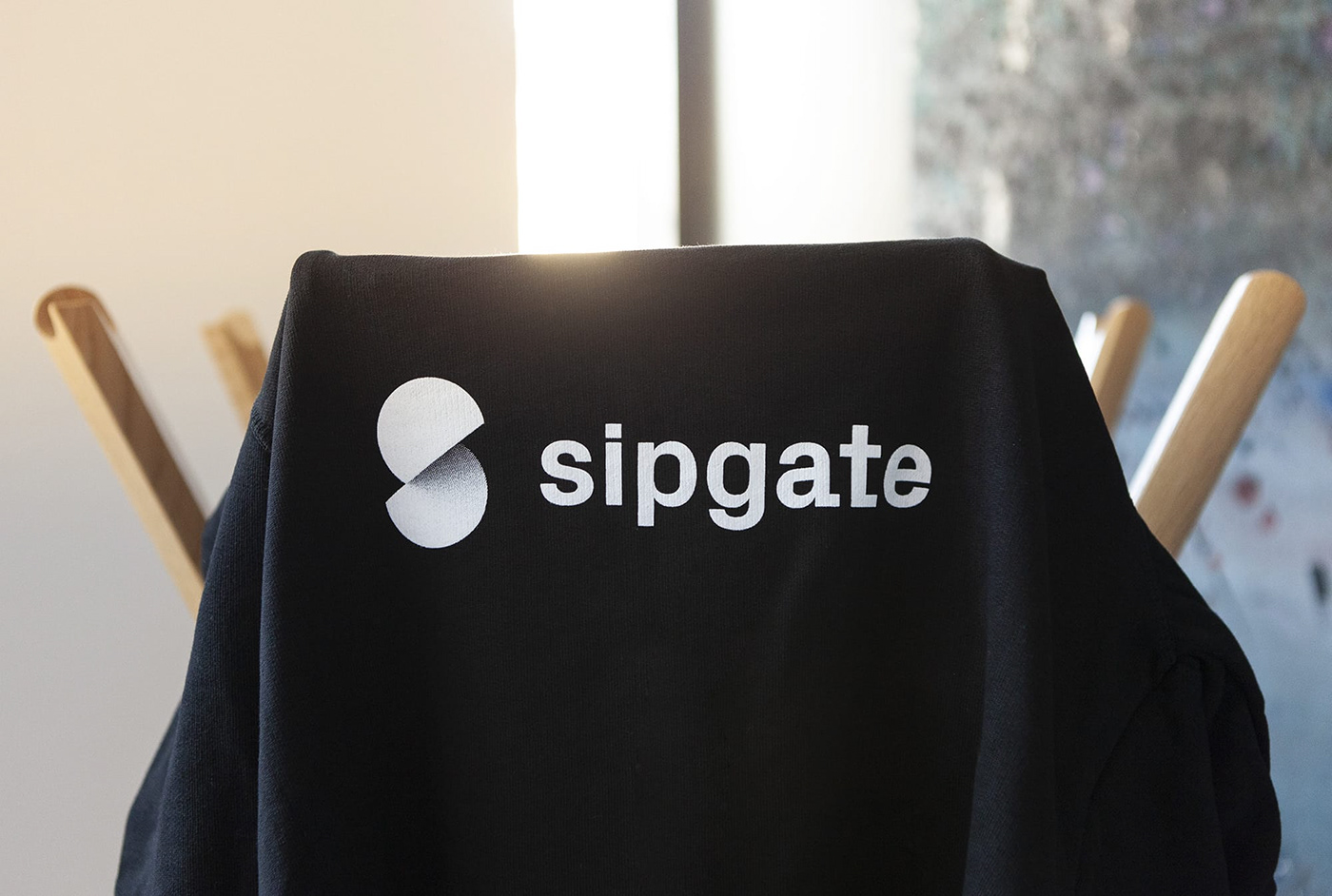
The new logo is the central feature for communicating sipgate’s overall and individual product branding. The logo uses the idea of an interface in its design: two separated circles at a 36° angle, complimenting each other to form an abstract S-shape. The corresponding word mark is set in the new PX Grotesk typeface.


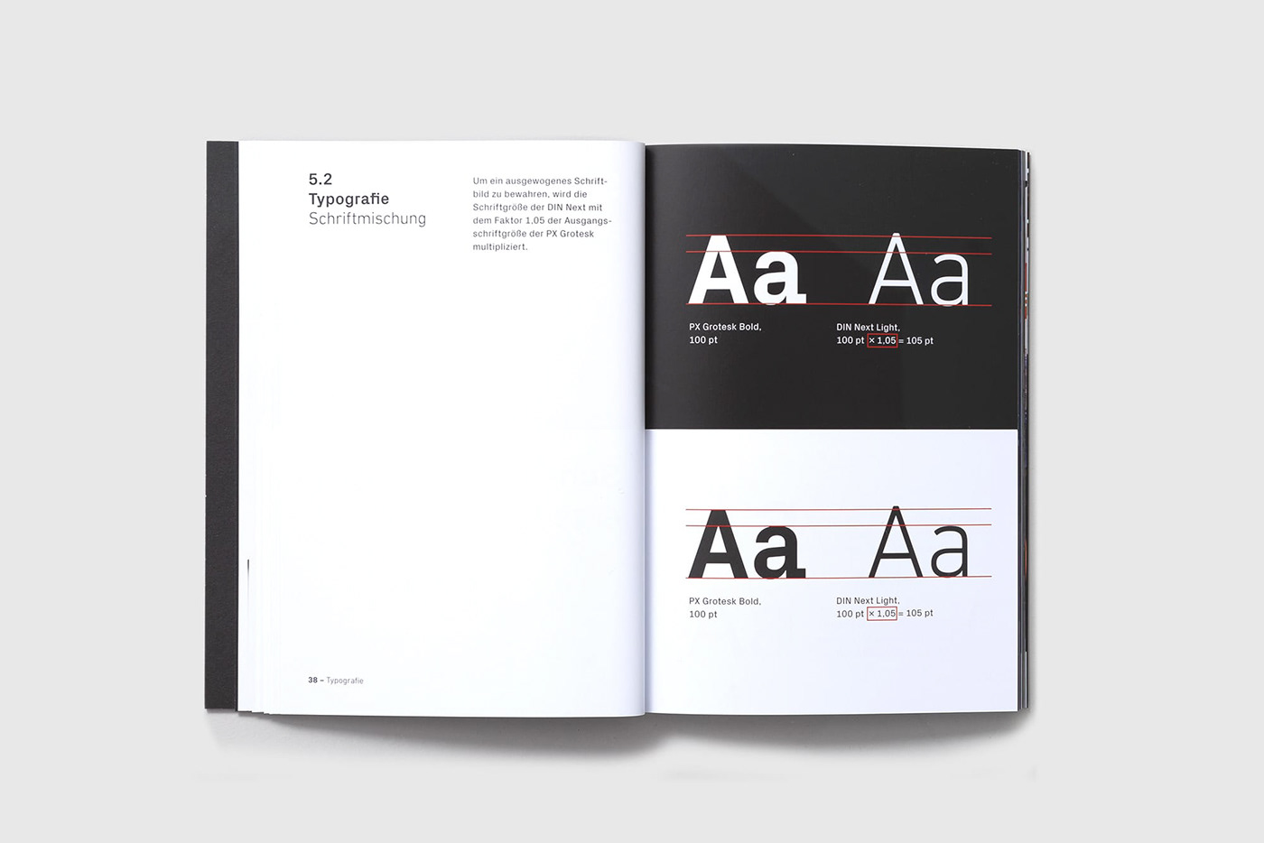
Typography - self-confident, unmistakable, and full of character
The use of two new typefaces significantly contribute to sipgate’s distinctive new brand identity. Particularly striking is the font combination in the product brands and headlines: technical yet playful PX Grotesk together with the linear DIN Next typeface. This interplay helps to create overall recognizability and emphasize important keywords.


Colors – create atmosphere, orientation, and consistency
The overall company branding uses black with different shades of grey and white. This combination creates an impression of high quality and natural elegance. Each product, on the other hand, is exclusively represented by a distinctive signal color combined with different color gradients.


Patterns – the graphic coding of the product portfolio
We incorporated the use of patterns to enhance the visual vocabulary of product communication with exclusive graphic elements, generated by a toolbox that combines three design elements derived from the logo: a rising 36° angle, separated circles, and color gradients. The different patterns create brand orientation by clearly differentiating the products from each other. However, they also generate cross-brand recognition through their unique and cohesive design language.


Icons & Illustrations – abstract services explained easily
Illustrations and icons graphically illustrate processes, services, or other technical aspects simply and concisely. We based their construction on a simple modular system, which directly incorporates design elements from the overall visual system. Particularly striking is the 36° angle, which determines the overall area distribution – making a visual reference to the logo and patterns used elsewhere. The illustrations seamlessly integrate into the sipgate brand world and create identity through their high recognizability and consistent design elements.


The Launch – introducing a radical re-design
Implementing the new design system takes the look and feel of a company and flips it on its head. In order to make the transition as pleasant as possible for employees, we created something special for them take home and enjoy. During the internal launch event, we presented all employees with a lovingly designed Brand Box. Physically experiencing the change helps establish a tactile feel to the new visual system, and makes employees part of the process.


Conclusion – The new visual system creates invaluable long-term benefits
The new brand design implementation was a success at sipgate, ensuring a new and consistent brand identity across all media platforms. From a customer’s point of view, the new brand design system presents a clear and structured product portfolio. From the company’s point of view, the design system provides efficiency and potential cost-savings by providing employees a toolbox for effective brand communication in their day-to-day business activities. Satisfied employees who identify with the new design not only enjoy working with it more – they wear it with pride.
However, our work is far from over. If we aren’t continuously innovating and improving upon the brand design, it runs the risk of becoming stale. Therefore, we treat the new visual system as a living interface that we continuously develop together with the sipgate team - through agile cooperation.
However, our work is far from over. If we aren’t continuously innovating and improving upon the brand design, it runs the risk of becoming stale. Therefore, we treat the new visual system as a living interface that we continuously develop together with the sipgate team - through agile cooperation.


