The Mark

The original Epoch logo had legibility problems at small sizes. While the E itself was the mark - the youth group needed something more modern and practical

With the mark we wanted something that could easily be used in almost any application.
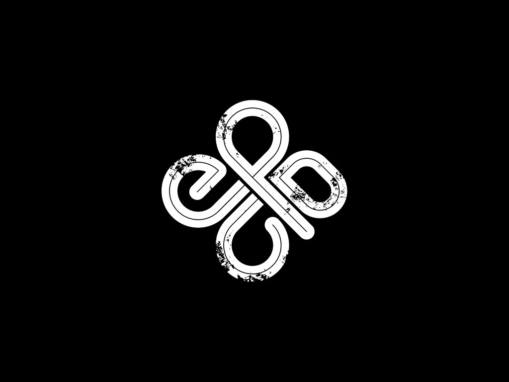
both the grunge version of the mark and the clean version are used interchangeably depeding on the application

Bulletins


Standard bulletin desings are printed in 3 colors and are handed out randomly to students

the mark works well in a variety of applications - each one randomly cropped in a corner
Shirts
Every youth group needs edgy shirts


Environmental

this backdrop added a dramatic youthful edge to the stage


Each Banner is 10ft wide by 20ft tall placed on the four walls of the room
